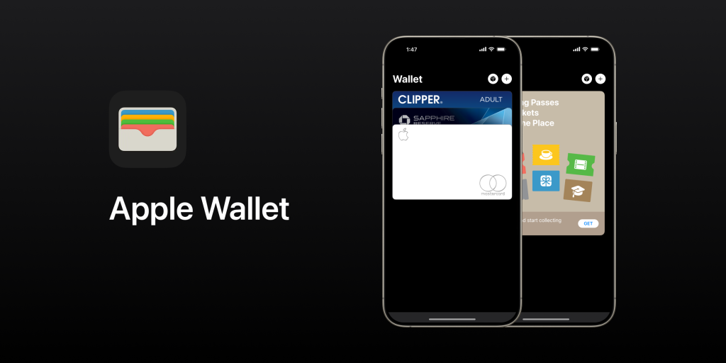
Apple Wallet has been around for quite a while, and what started as Passbook in 2012 (mainly for boarding passes, movie tickets, coupons) has become an app to make payments. In 2015 Apple renamed Passbook to Apple Wallet and since then it has gradually become something I can use for everyday payments, transit, IDs, and more.
I started using an Apple wallet recently after moving to New York, and this quickly became one of the most frequently used apps on my phone. I used it for so many payments that reaching for my physical wallet almost felt unnecessary. This made me notice the little design decisions that made the experience feel so effortless, and where it doesn’t.
1. Adding a card
The first thing I notice when I open Apple Wallet is how clean the interface is.The saved cards take up most of the screen, and there are only three main controls at the top, a “+” button, a search icon, and a three-dot menu. For a first-time user who wants to add a card the “+” works as a clear signifier. Even though it doesn’t say “Add Card,” the symbol is familiar to immediately understand what it is for. This is an example of knowledge in the head because everyone knows from other apps that “+” usually means to add something.
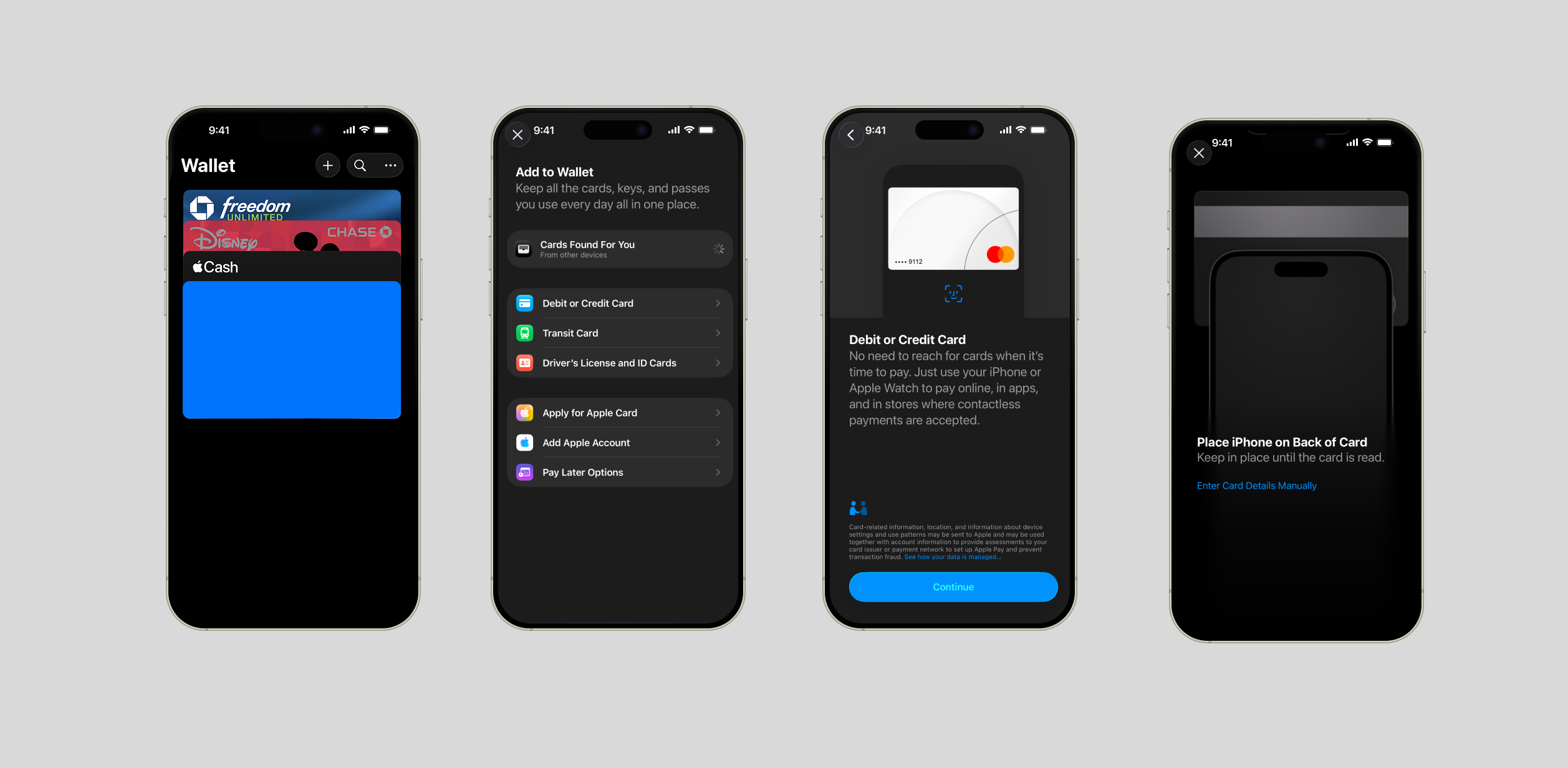
The interface has good discoverability because there aren’t any distracting elements on the screen, the main purpose of the page is to access your cards. The mapping is straightforward, I want to add something so I tap “+”. The action gives desired results making the Gulf of Execution straightforward.
2. Choosing and organising cards
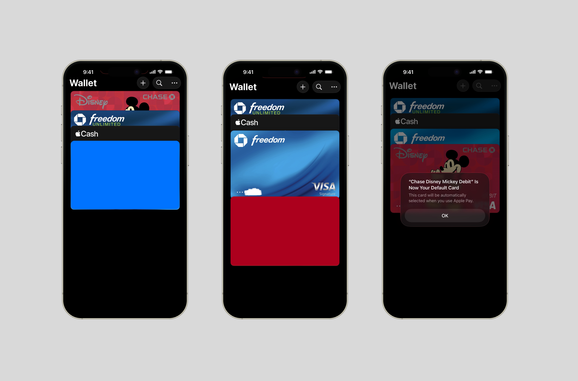
Apple Wallet uses a familiar visual by displaying saved cards similar to stack of physical cards. This gives the interface a clear conceptual model, like a physical wallet. The card placed at the front functions similarly to a card that would be kept accessible in a wallet. The interface also provides an affordance, cards can be selected, moved, and used for payment. The ui animation shows this by mimicking the movement of cards within a stack.
Weakness:
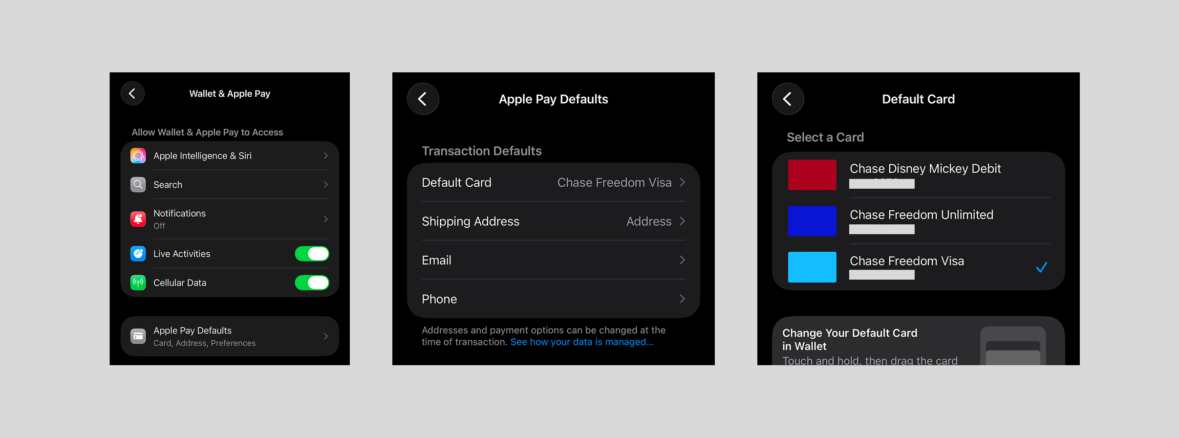
There is no strong signifier indicating that you can move the cards around and that the one on top is the card currently selected for default payment. Only Option to manually select the default card is in the settings app in IOS
Solution:
A small “Default” label or a stronger visual distinction could make the default card more discoverable, especially when multiple cards are stored in the wallet. A menu option within the 3 dots in the homepage to be able to manually select the default card.
3. Paying and knowing it worked
The payment process and experience in Apple Wallet designed so that it requires very little effort. The user double-clicks the side button, authenticates with Face ID, and has a clear signifier specifying to hold the phone near the payment reader.
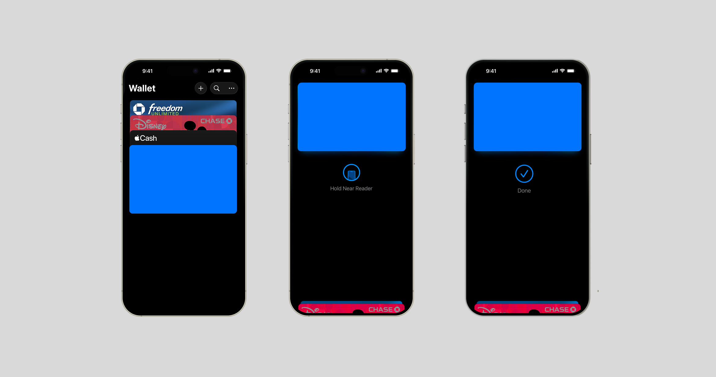
Only during initial setup, a visual signifier introduces the double-click action, after that gesture becomes knowledge in the head, through repeated use and long-term memory. The sequence also has a strong mapping ( bringing the phone close to the terminal, payment goes through). This makes the Gulf of Execution short because the steps needed to accomplish the goal are straightforward.
Weakness:
Apple relies heavily on a brief haptic response and sound as feedback. These signals confirm that payment has occurred, but do not provide enough information about the result of the transaction. In a busy environment, such as a subway station, haptic or sound signals can easily be missed. This creates a larger Gulf of Evaluation, unsure whether the payment was completed, how much was charged, or from which card money was debited.

Solution:
The payment confirmation should be communicated visually, instead of relying on haptics and sound, Wallet could display larger graphics showing “Payment Complete,” an immediate notification showing amount charged, card or account used. A strong visual confirmation can reduce the need to open the App and search transaction history to verify the payment.
Apple Wallet is convenient because, once the basic interactions are learned very little thought is needed. With good learnability selecting a card and paying feel almost automatic. But the most important interactions rely on learned gestures rather than obvious signifiers.