Apple Translate is a built-in iPhone application designed to help people communicate easily across different languages. Users can quickly translate text or speech, while Conversation Mode supports real-time communication between two languages.
- Translate
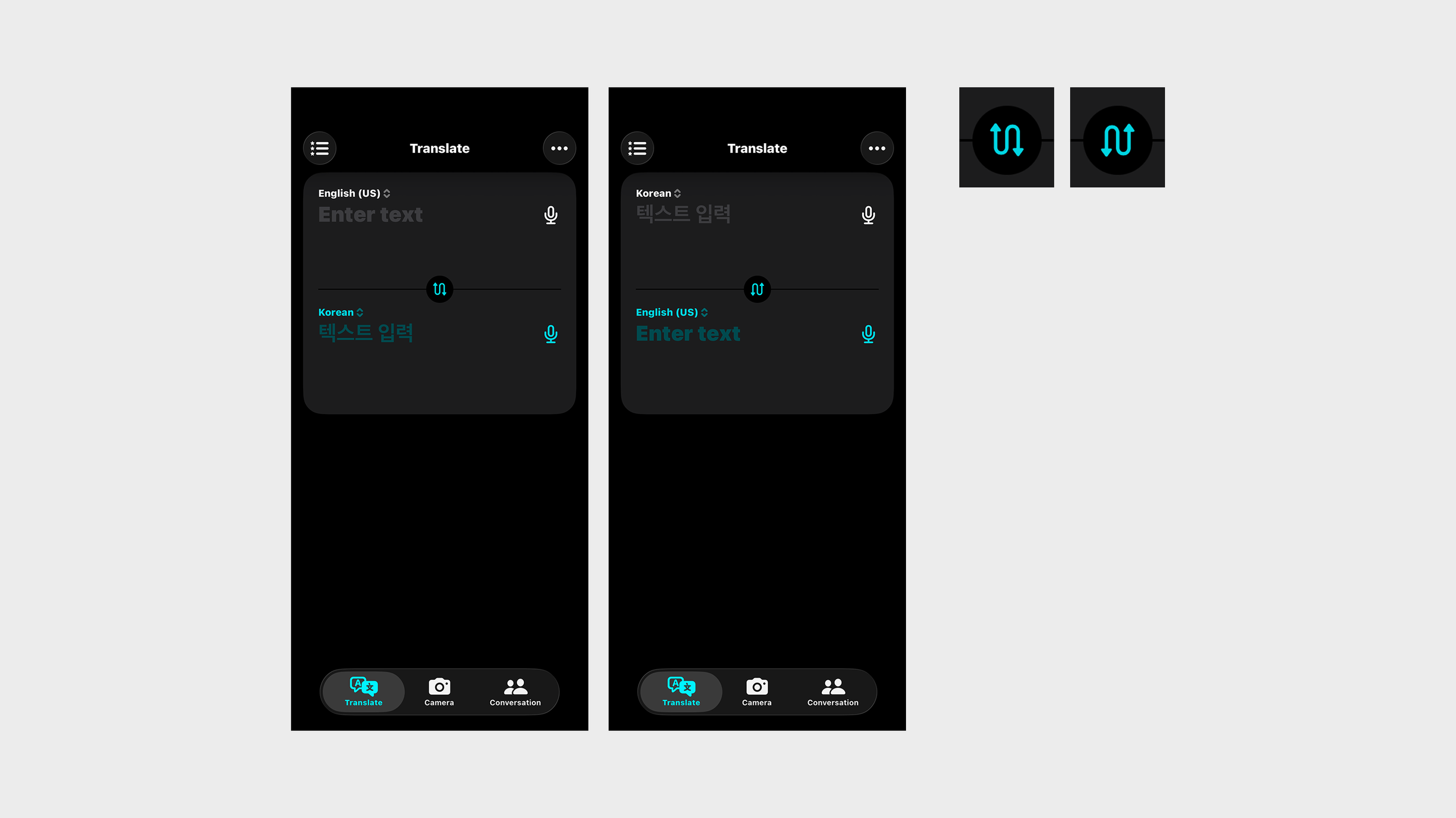
The language swap button is a good example of signifiers, mapping, and feedback. The opposing arrows visually signify that the two languages can be exchanged, while the button’s position between the language fields creates a clear mapping between the control and its effect. Once tapped, the languages switch positions and the arrow changes direction, providing immediate visual feedback.
- Favorites and Recents
The current structure places Favorites and Recents on the same screen, which has the advantage of allowing users to quickly access recent translations. In particular, since Recents contains information that is only temporarily retained, not creating a separate screen for it can be an efficient choice. However, Favorites contains information that users intentionally save, while Recents contains temporary information automatically generated by the system, meaning that the two serve different user purposes. Separating them into different tabs would allow users to clearly distinguish between “finding saved translations” and “finding recent translations again,” making the structure of each section better align with the user’s Conceptual Model.
- Camera
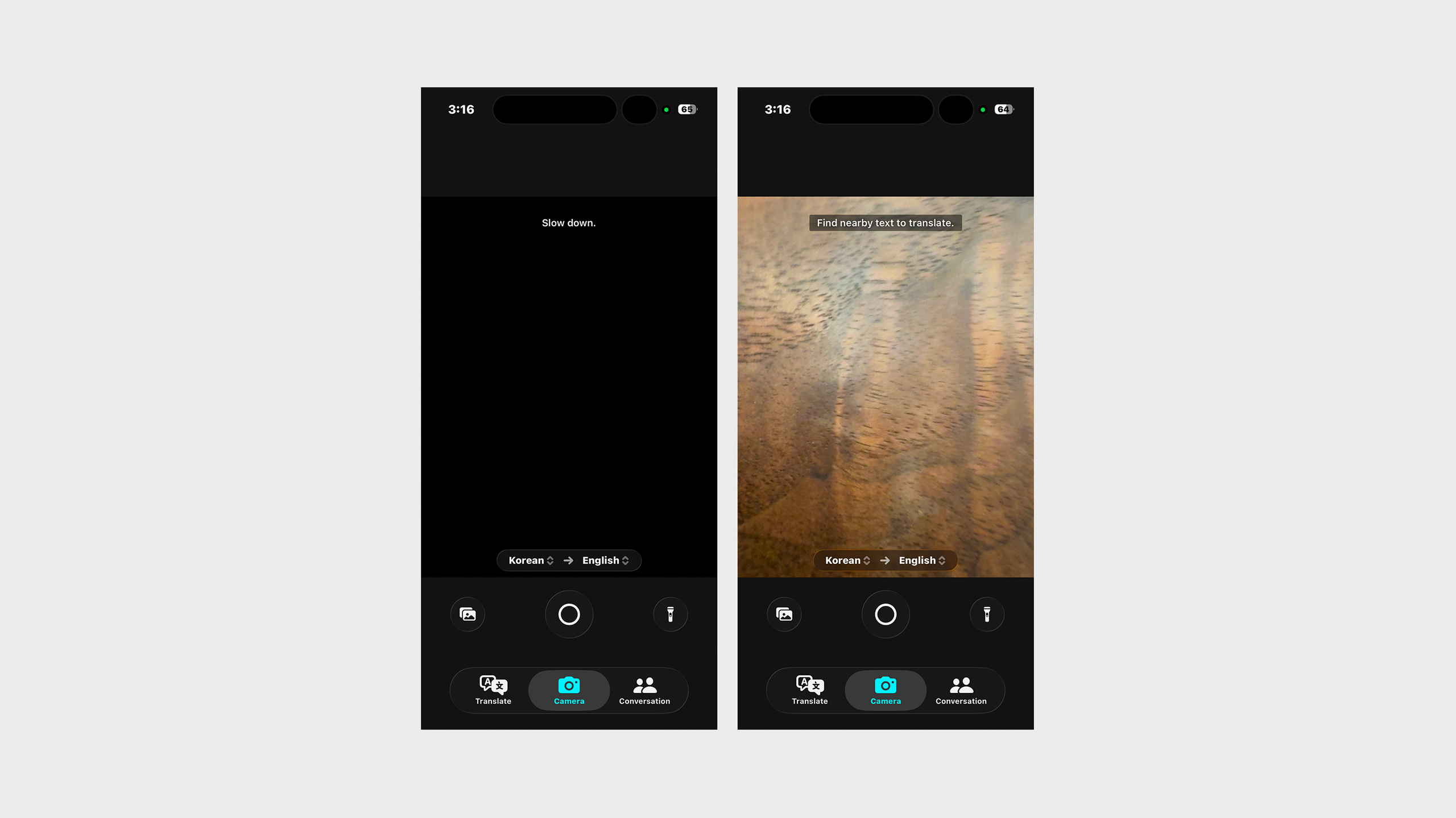
Unlike the general text translation mode, the camera translation mode does not provide a button to instantly switch between the two languages. Instead, it shows a one-way structure from the source language to the target language, such as Korean → English. This reflects the context of camera translation, whose primary purpose is to translate a language in front of the user into one they can understand. This structure works as a Constraint that reduces unnecessary actions. At the same time, it reflects the actual translation process from the original text to the translated text, helping users form a Conceptual Model of how the function works. Users can select each language directly without having to switch between the two languages, and they can immediately understand the current translation direction through the arrow. Also, instructions such as “Slow down.” and “Find nearby text to translate.” appear at the upper center of the screen while using the camera. They use noticeable colors and opacity so that users can easily see them without blocking the camera view. This provides clear Feedback that immediately responds to the user’s current actions while minimizing visual distraction from the actual translation target.
- Conversation
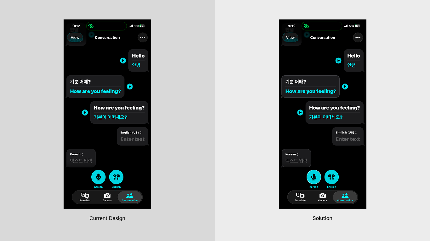
The Conversation View distinguishes the two speakers by placing their speech bubbles on the left and right. However, because both speech bubbles use the same color, there are not enough visual cues to quickly distinguish between the speakers. To improve this, I added a line to one side of each speech bubble and language button to represent each language. These additional Signifiers help users distinguish the speakers more clearly and understand the conversation flow more quickly by strengthening the Mapping between the language selection and the corresponding conversation.