Zara’s website allows users to browse, compare, and purchase clothing and accessories online. This critique follows a typical user’s shopping journey through the site, including the experience of general browsing, product comparison, and item selection.
Browsing Products: Adjusting the Page Layout
On the majority of product category pages, users are first met with a large editorial-style image. While this may evoke a sense of luxury at the visceral level, it reduces browsing efficiency at the behavioral level. This makes the ability to adjust how many products appear at once through the “VIEW 1 2 3” feature particularly useful.
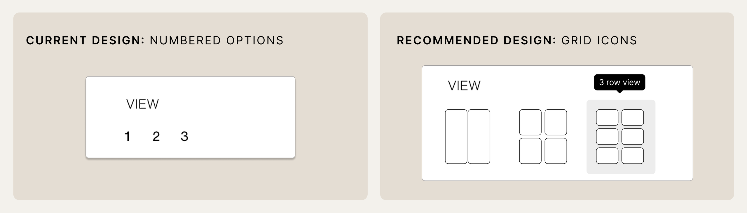
However, because the wording and numbers give little indication of what each option represents, they act as weak signifiers and hinder understandability. As a result, the system image provides limited guidance on how the feature works, so users may have to rely on trial-and-error to form an accurate conceptual model.
In regard to discoverability, the selected number is only subtly visually distinct from the unselected numbers, widening the Gulf of Execution by making it less obvious that the numbers are clickable. However, if a number is selected and the layout updates accordingly, the immediate feedback helps to bridge the Gulf of Evaluation by clarifying that the numbers represent the number of rows displayed.
Recommendations:
- Replace “1 2 3” with grid icons that preview each layout to strengthen signifiers, feedforward, and natural mapping.
- Prioritize knowledge in the world and improve understandability by including tooltips that appear once users hover over the grid icons (i.e., “3 row view”).
- Improve feedback and discoverability by making the selected option more visually distinct (e.g., through stronger contrast).
Exploring Color Options: Interpreting the Swatches
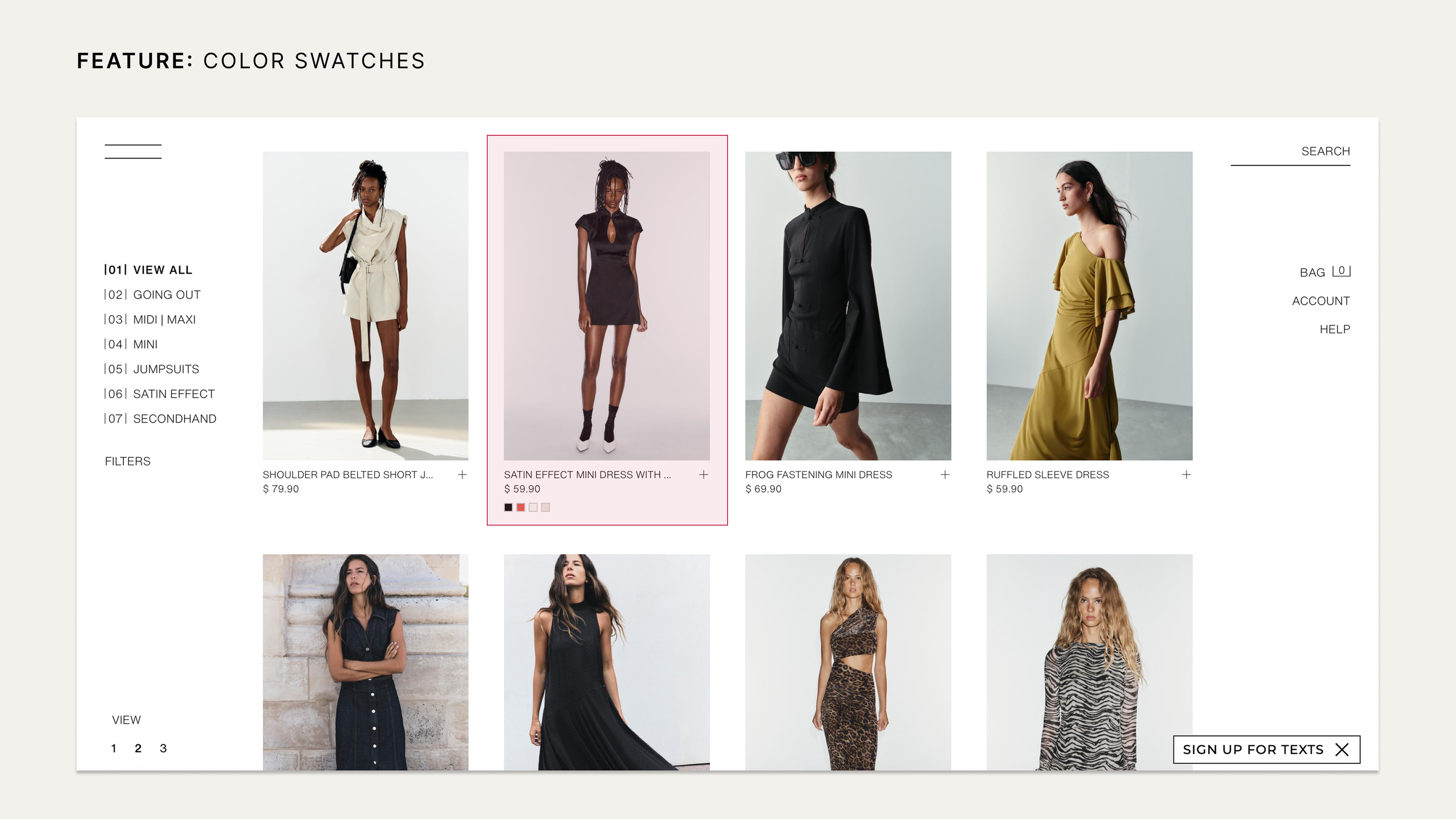
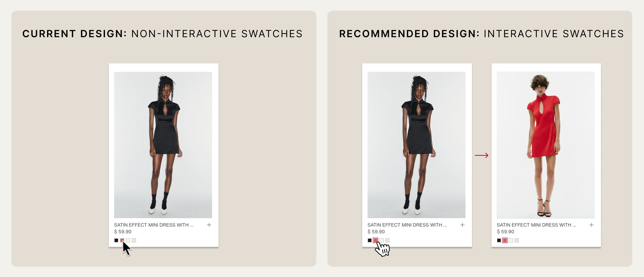
For certain products, Zara includes color swatches that act as signifiers that alternate color options are available. Given that this is a common convention across e-commerce stores, users may draw on knowledge in the head to expect that selecting a color will preview that option on the same page.
Because this interaction is only available on individual product pages, these swatches act as misleading signifiers, suggesting an interaction that the collection pages do not actually afford. Consequently, this can conflict with users’ established conceptual model of how color swatches typically behave within product cards.
Recommendation:
- Enable color swatches to be selected directly on collection pages, narrowing the Gulf of Execution by aligning the interaction with established e-commerce conventions.
Finding Your Fit: Size Recommender
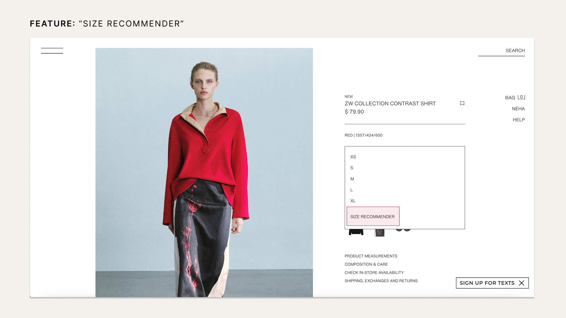
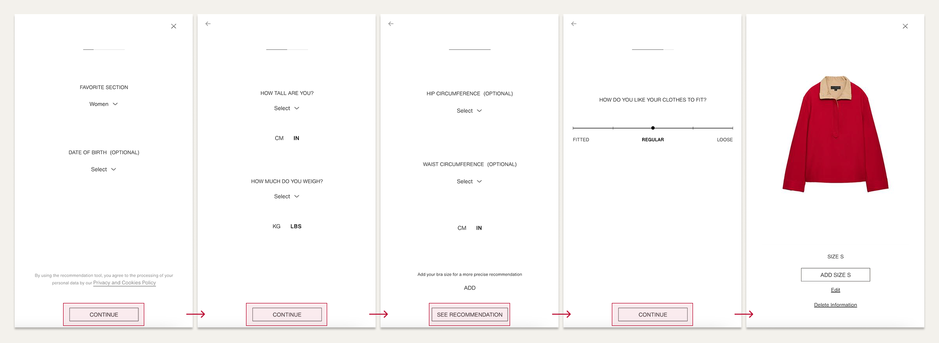
When users are ready to include an item to their cart, they must select “ADD” and are then presented with a list of sizes. At the bottom is the “SIZE RECOMMENDER” feature, a clear signifier for sizing assistance. Once selected, users receive immediate feedback as it opens a modal asking a short series of questions to determine their size.
Once responses are saved, users’ item-specific size recommendations are automatically applied across Zara products, placing knowledge in the world throughout the website. Overall, this strengthens the behavioral level of design by providing a more seamless experience with reduced uncertainty.
Product Availability: Next Steps
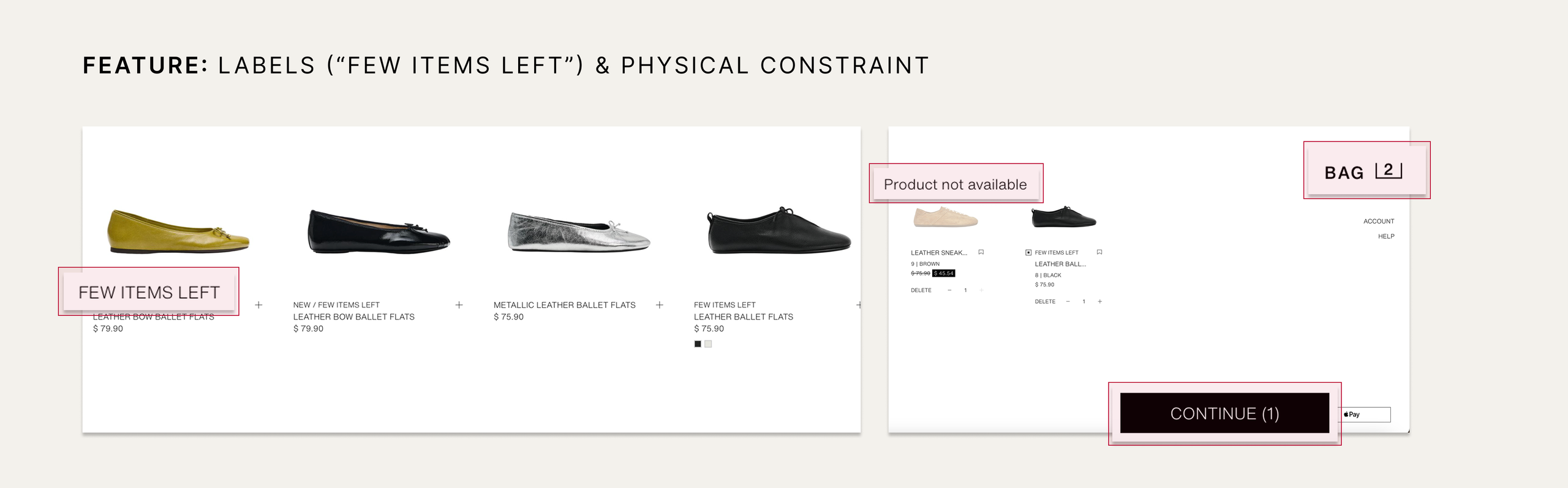
When it comes to product availability, Zara’s website effectively prioritizes visibility, using clear labels and visual cues as signifiers to keep users informed about an item’s status and available next steps.
For instance, the “Few items left” label supports understandability by placing knowledge in the world about otherwise unavailable inventory information.
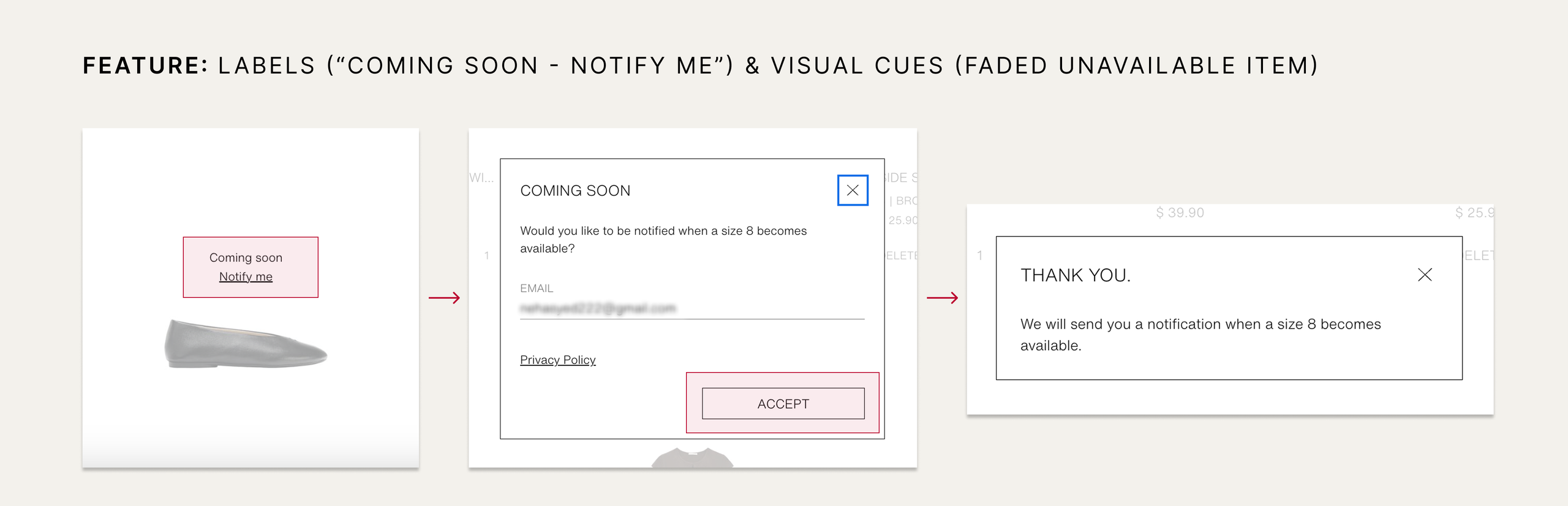
Additionally, items that become unavailable while they are in a user’s cart appear as visually faded, following an established cultural convention that signifies that the item is out-of-stock. The unavailable item is also automatically excluded from checkout, creating a physical constraint that prevents the user from purchasing it.
If an unavailable size is expected to return, Zara shows a “Coming soon” label with an underlined “Notify me” option. While the underline acts as a signifier that it is clickable, “Notify me” provides feedforward that users can sign up for an availability alert. After submission, immediate feedback confirms that an email will be sent when their size is available. Ultimately, this supports prospective memory and reduces cognitive load by letting users rely on the system rather than memory.
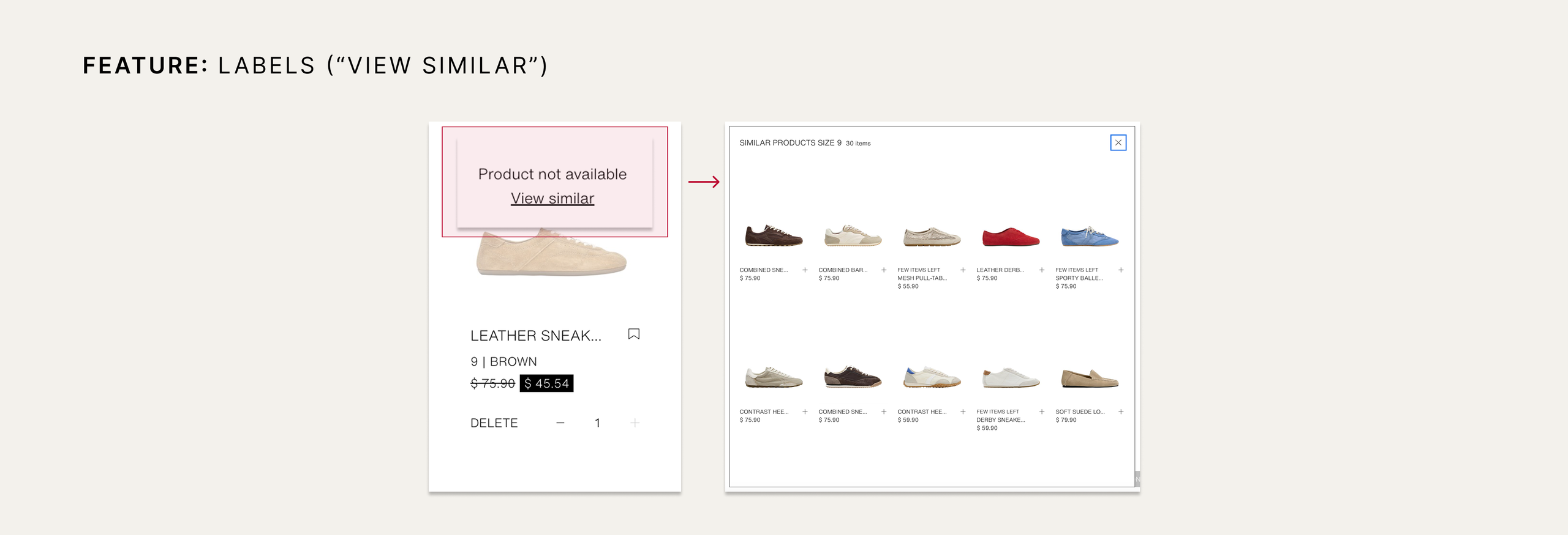
If the size will not be restocked, the underlined “View similar” option acts as an effective signifier and provides feedforward by indicating that selecting it will show relevant alternatives.