Introduction
Letterboxd is a social platform centering around movies. Its main features are rating and reviewing movies, adding movies you wish to watch later into a “Watchlist,” and interacting with your friends’ reviews. This critique goes through these three main user flows and outlines how to improve them.
Reviewing a movie
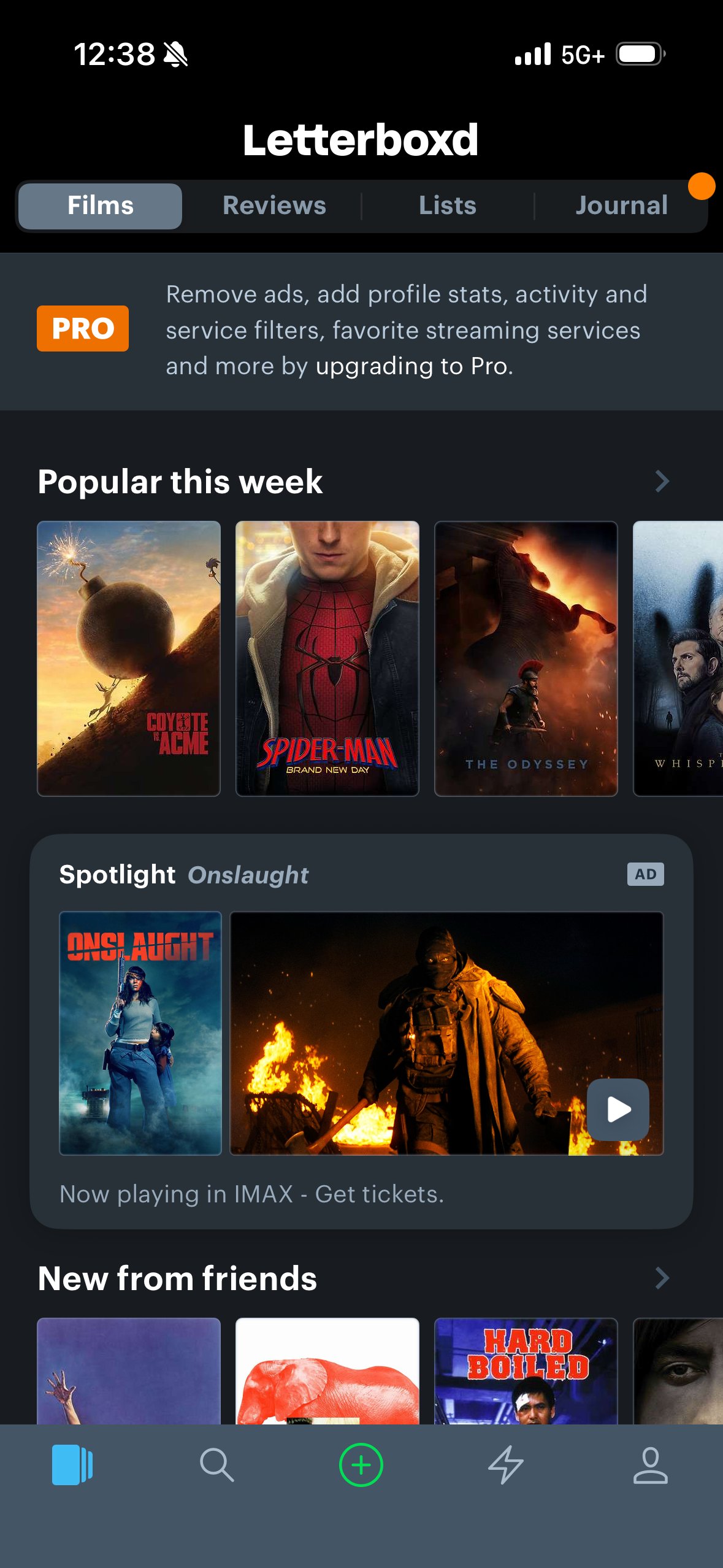
The bottom navigation bar (Figure 1) has multiple signifiers that suggest to the user what affordances it allows when selected. For example, the magnifying glass icon suggests that the user can search things when it is selected.
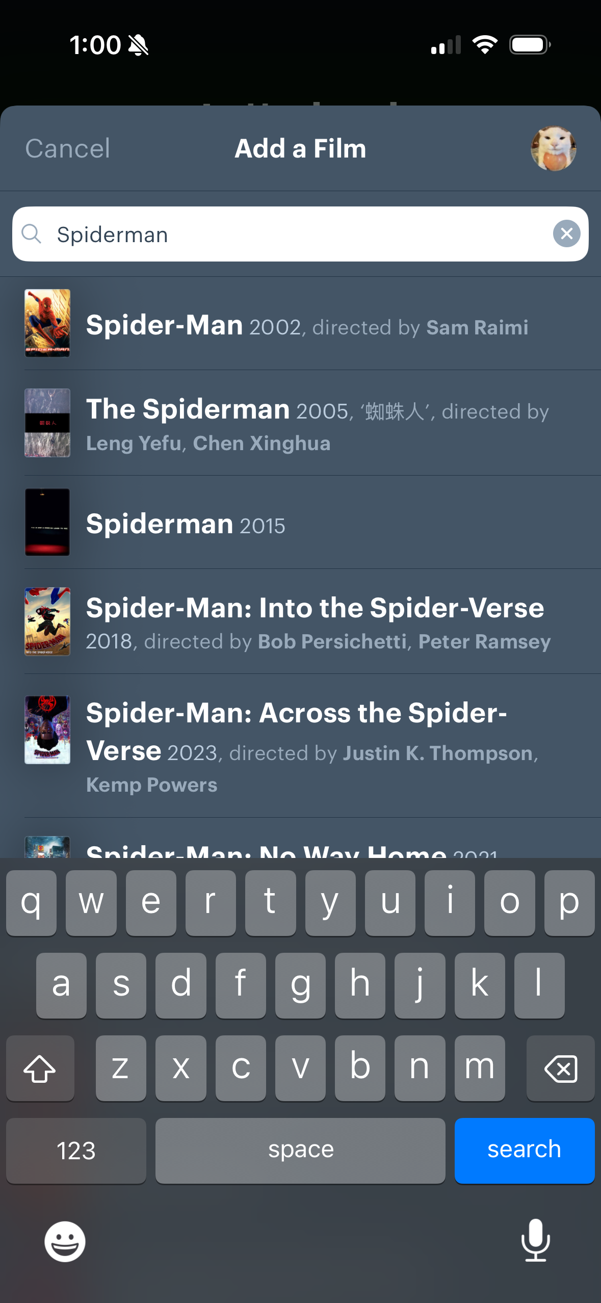
Since reviewing a movie is the primary function of Letterboxd, it has high discoverability. There are multiple paths to review a movie. The green plus (Figure 1), the search page (Figure 2), or clicking on any movie in general will all allow users to review a movie. Specifically, the bright green plus icon (Figure 1) that stands out against the dark background signifies creating a post and makes the primary action clear. This relies on the user’s mental model, where the plus icon usually indicates you’re creating or posting something.
After clicking the bright green plus icon, the search bar (Figure 2) pops up. As users start typing the movie name, multiple movie options appear, giving instant feedback that the search is working. This bridges the Gulf of Evaluation, as the feedback confirms they’re making progress towards their goal.
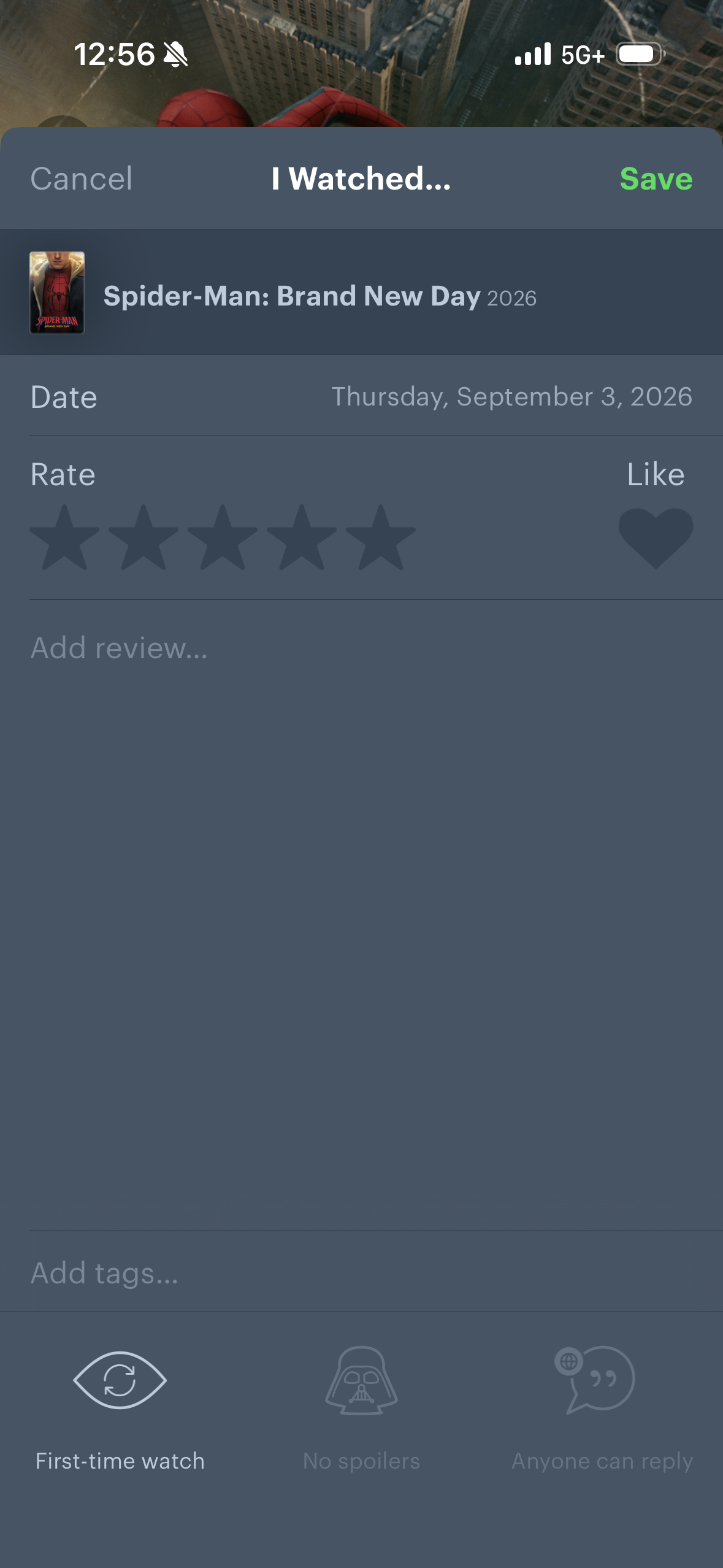
Finally, when users choose the correct movie, the review page (Figure 3) appears. The labels, such as “Rate,” “Review,” and “Add tags,” make use of knowledge in the world. Users don’t have to remember which section affords what feature. There are even constraints on certain actions, such as “Spoilers” and “Who can reply,” where the user cannot access these options unless they have written their review. This bridges the Gulf of Execution, as users can understand clearly and plainly what actions to take.
Adding a movie to your watchlist
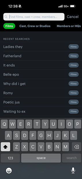
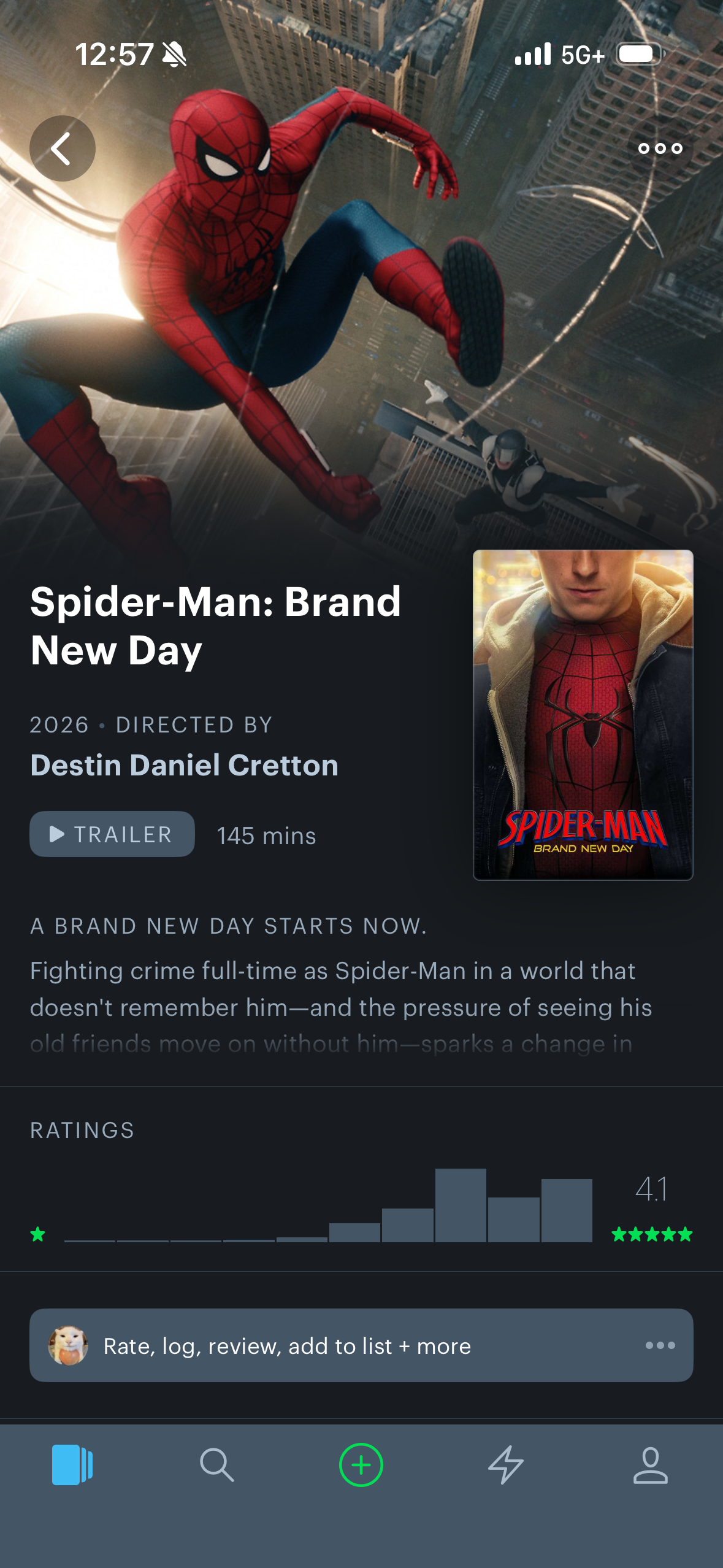
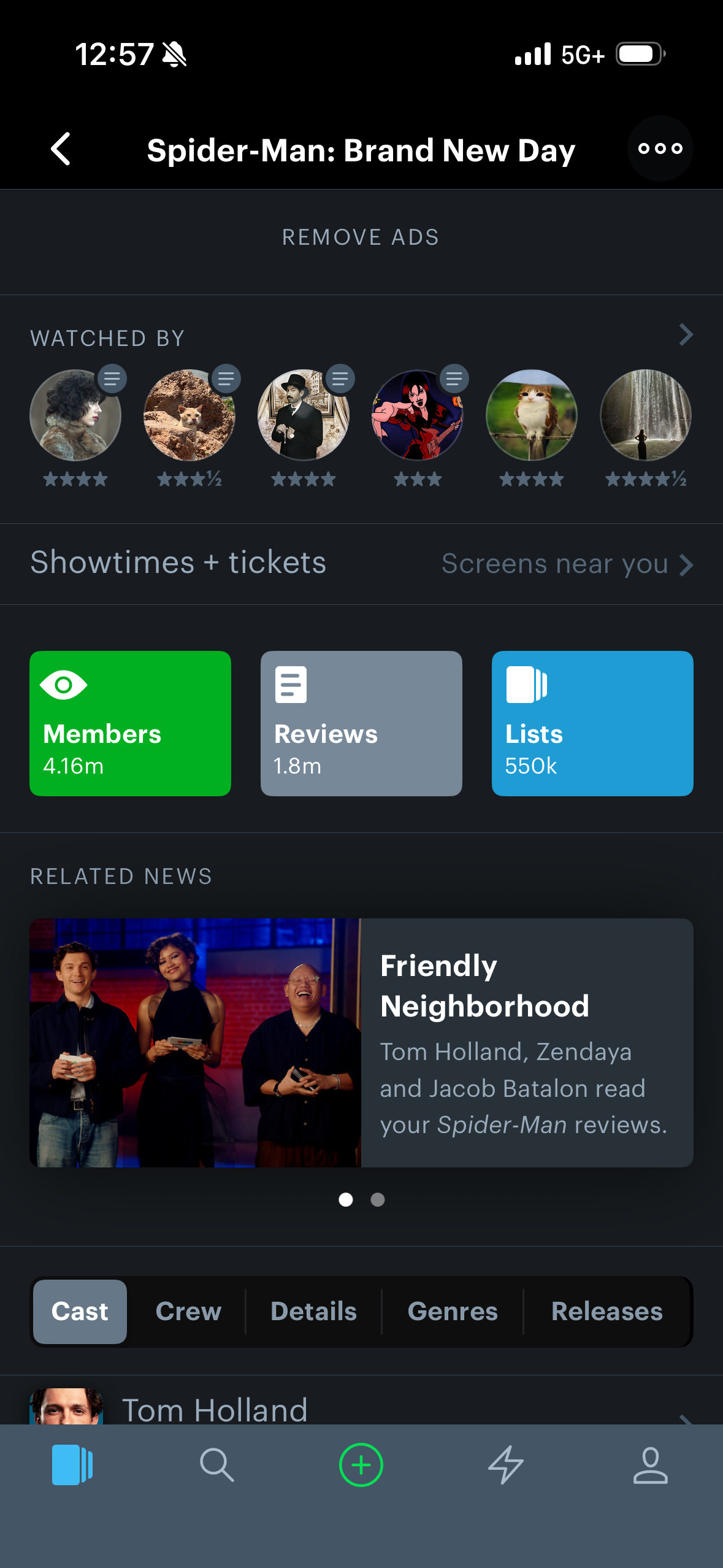
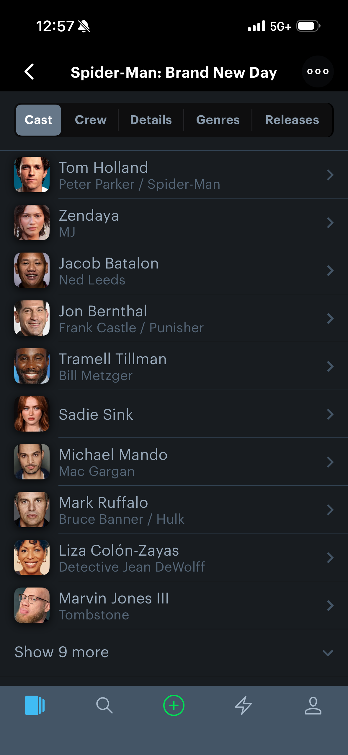
Adding a movie to your watchlist isn’t readily apparent. First, users must look up the movie (Figure 4) and go to its page (Figure 5). On the positive side, movie details are easily discoverable and aren’t hidden behind buttons. As you scroll down the movie page, related information is grouped together. For example, the general ratings (Figure 6) and your friends’ ratings are in close proximity. The related credits, including actors and crew pages (Figure 7), are grouped together, which follows natural mapping.
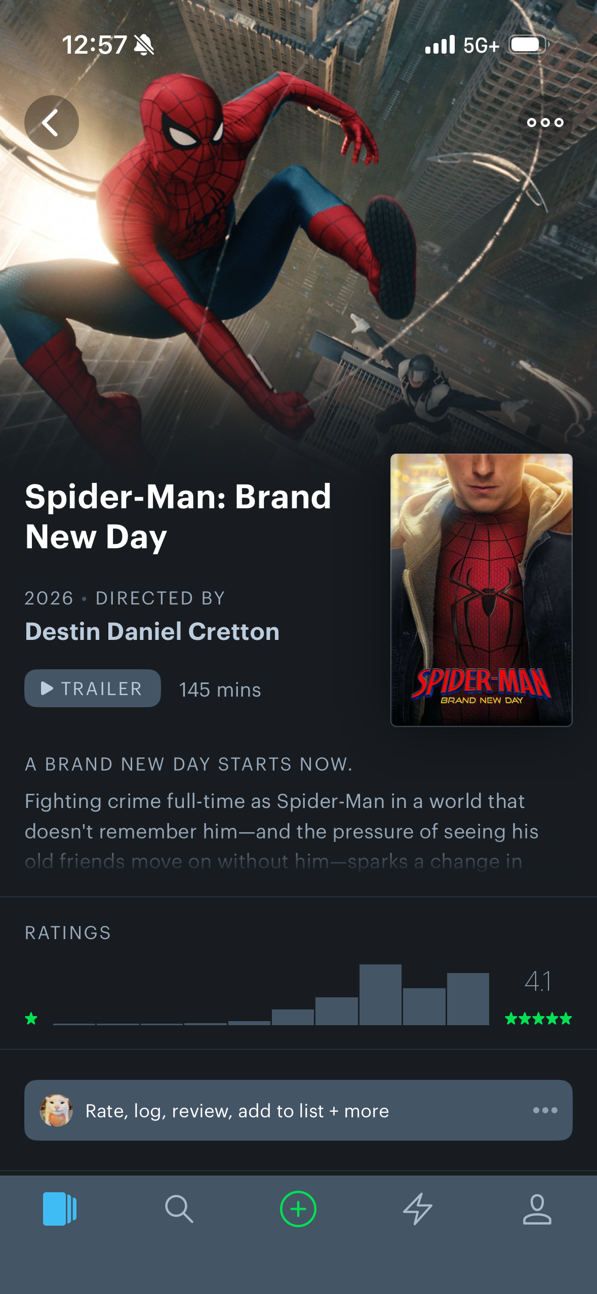
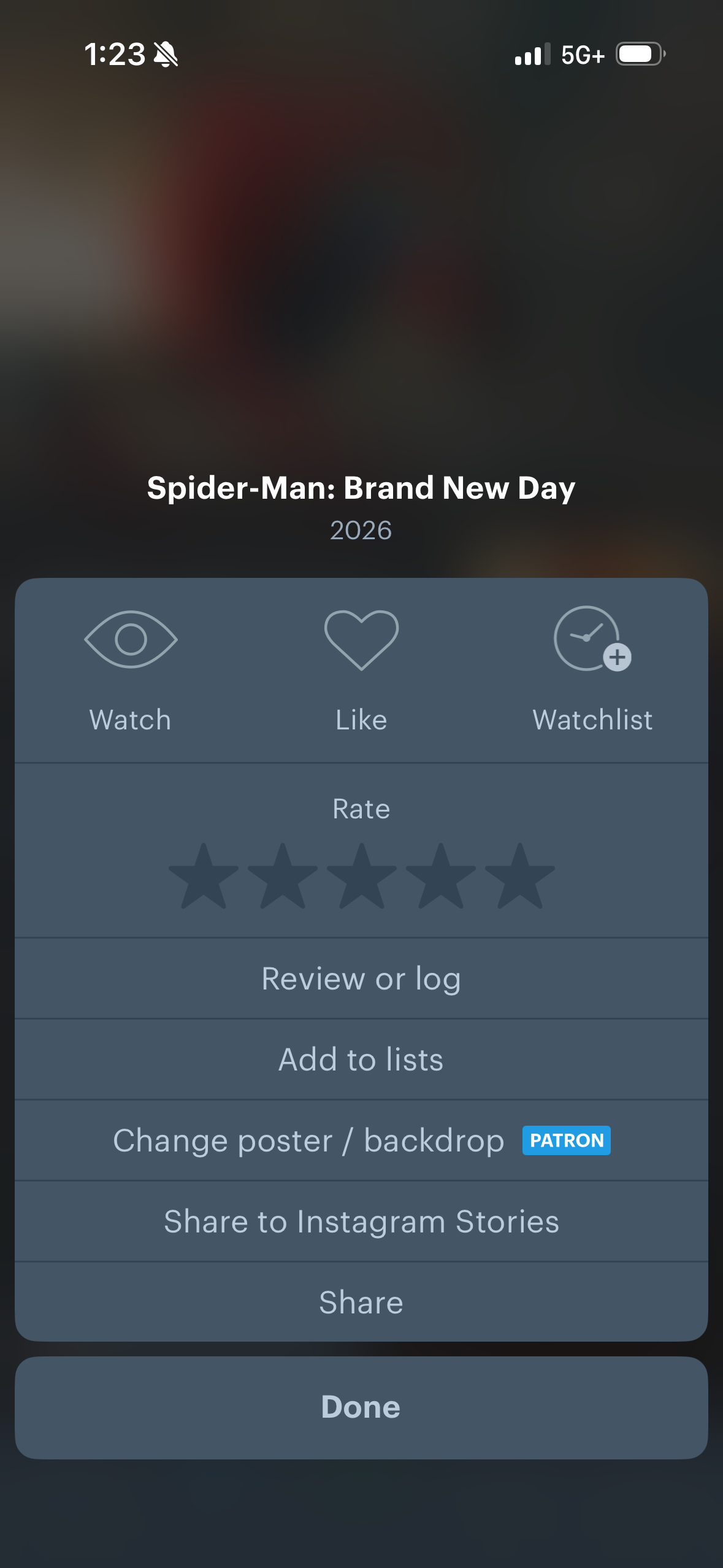
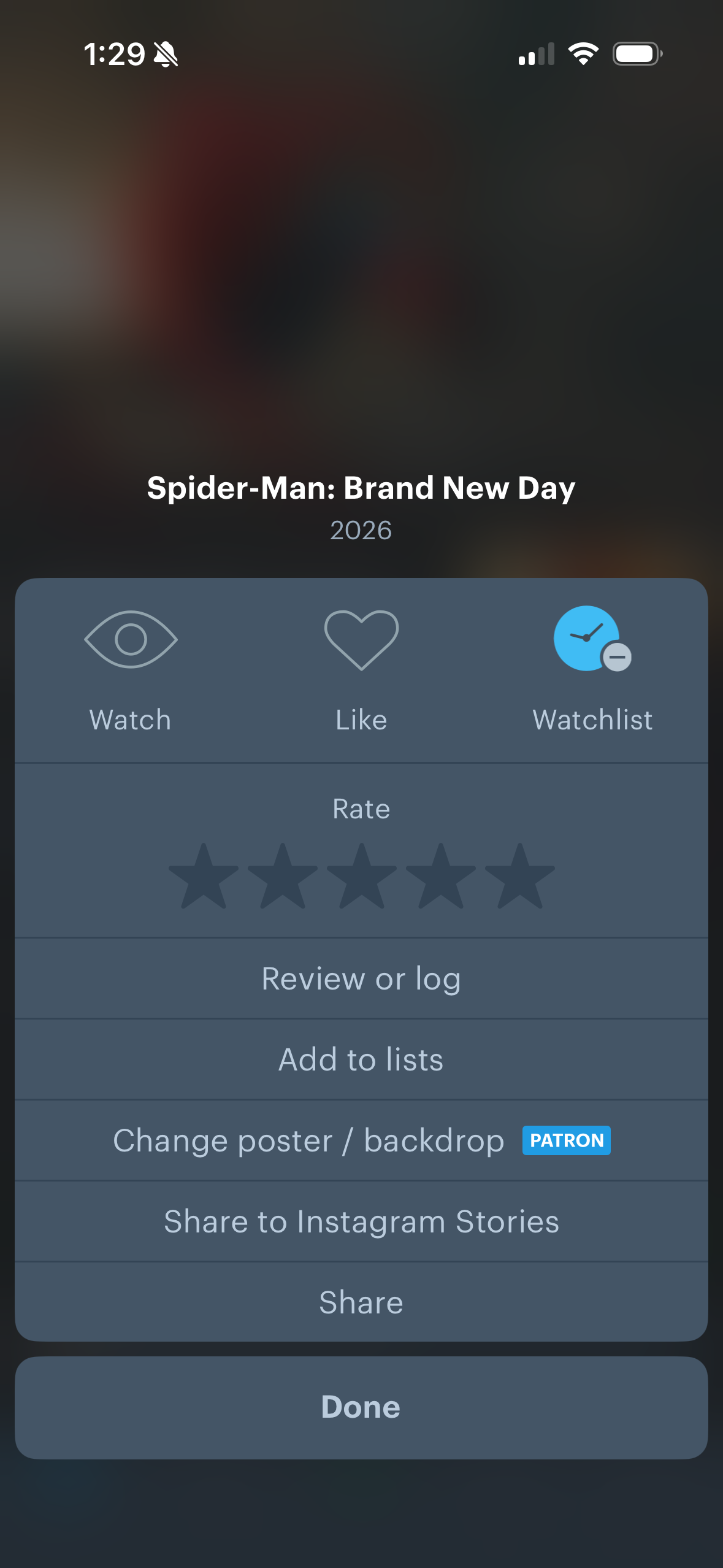
However, adding a movie to your watchlist is hidden behind the ellipsis icon (Figure 8). Multiple important actions besides the watchlist are hidden behind this icon, including reviewing, rating, and adding it to a list (Figure 9). Furthermore, the icon’s transparency (Figure 8) makes it harder to see on lighter backgrounds. Besides accessibility standards, this leads to poor discoverability. First-time users especially do not have a good understanding of the app and may be unsure of the complete set of affordances it allows. The watchlist feature may go undiscovered entirely. Though, once you press “Watchlist,” it does give instant feedback by turning blue (Figure 10).
As a solution, I would move the important features on the movie page and add strong signifiers, mimicking the “Members,” “Reviews,” and “Lists” options (Figure 6). This would increase their visibility and therefore increase discoverability of the features.
Viewing friends’ reviews
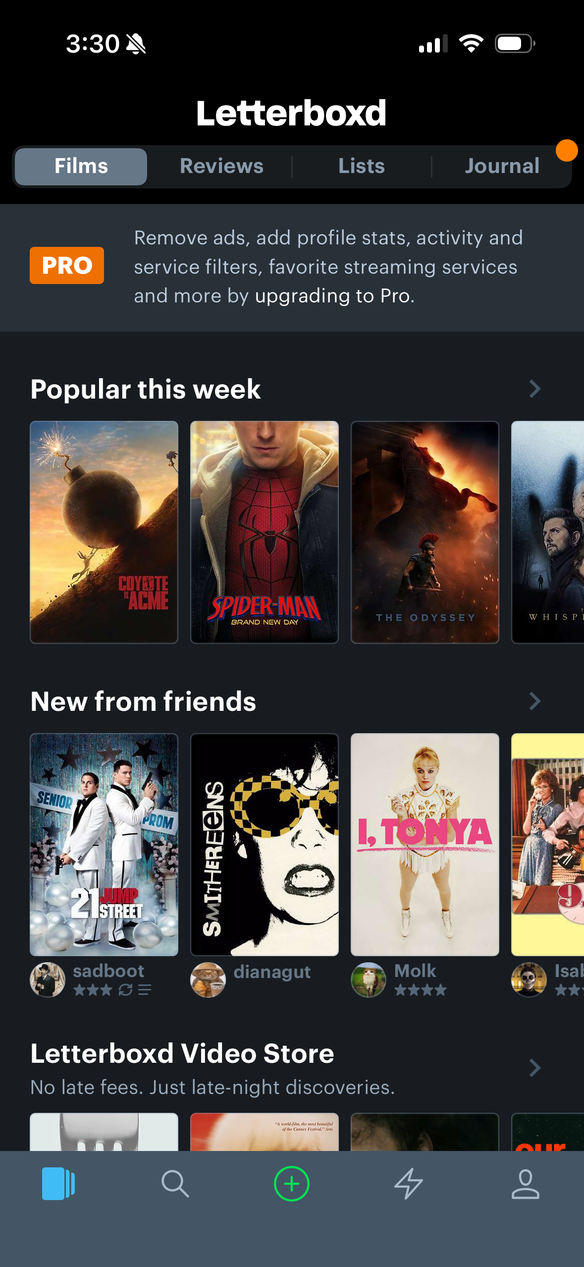
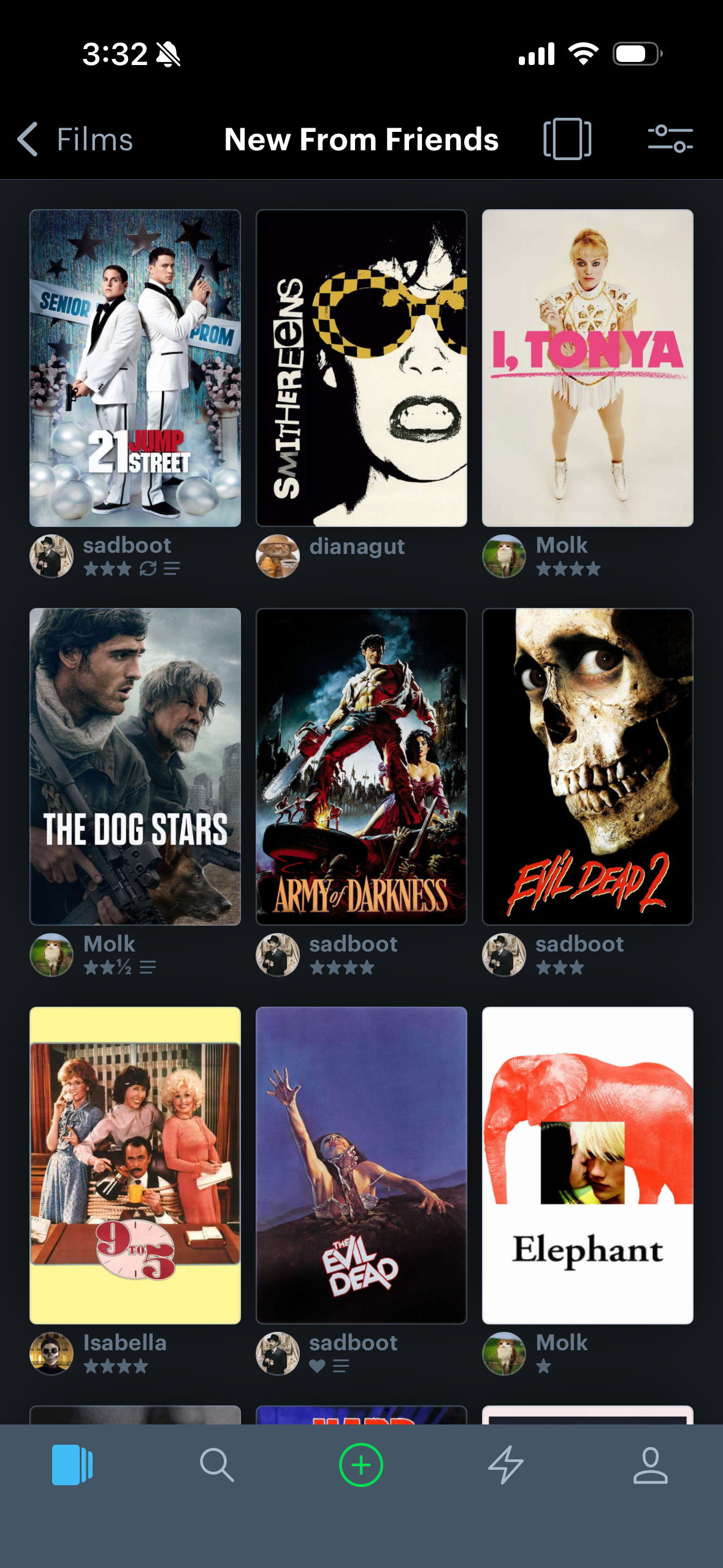
The first thing you see when opening the app is recent reviews your friends have made (Figure 11). This makes the feature highly discoverable. The caret icon (Figure 11) suggests that you can click this label and see more activity. The “New from friends” label and your friend’s profile picture and name (Figure 12) suggest that it’s a friend’s review. If you go to a movie’s page, it’s also highly discoverable there. The comment bubbles, stars, and label signify that they’ve reviewed it.
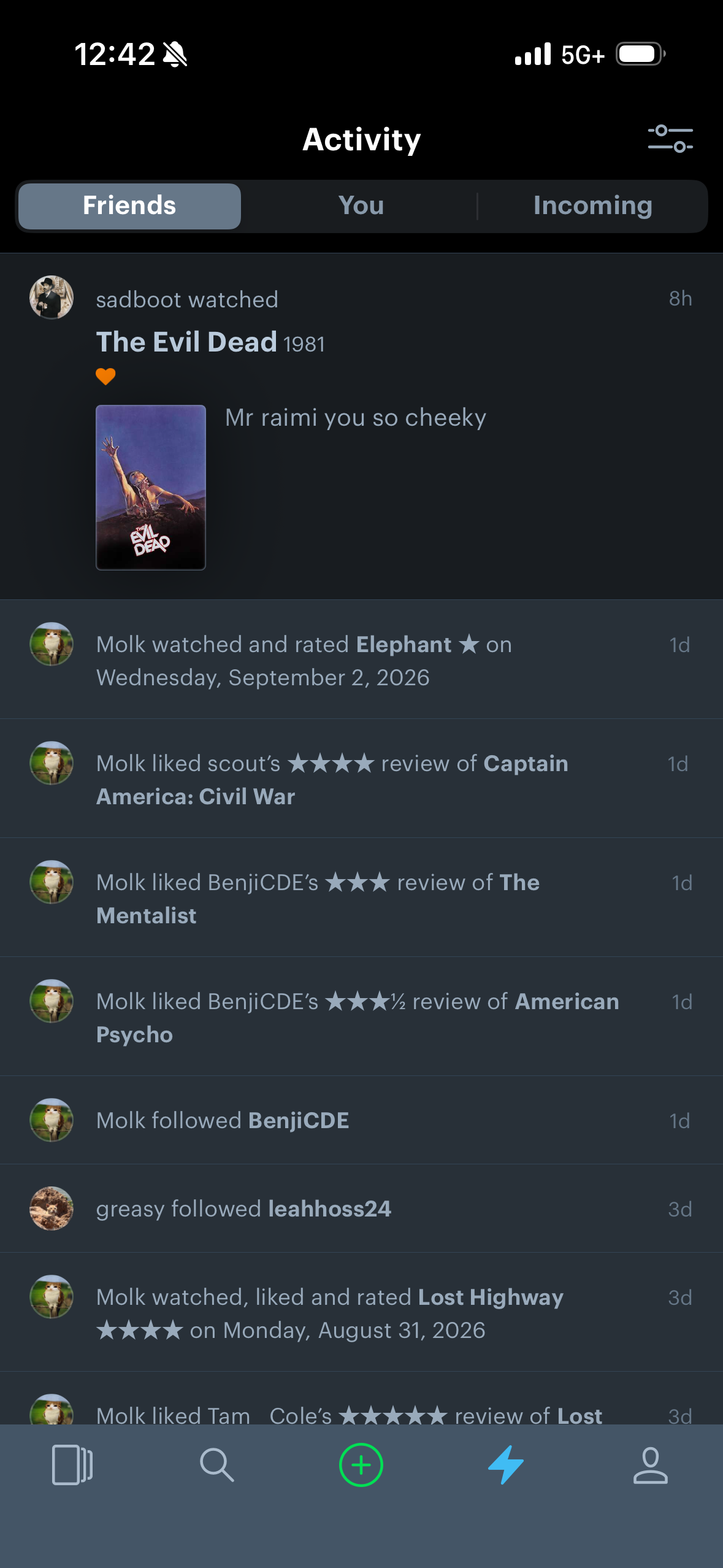
You can also access their reviews through the activity page (Figure 13). The activity page, which holds your friends’ reviews, is represented by a lightning bolt icon, which is not consistent with industry standards. This choice of signifier is weak. It disrupts the user’s mental model and enhances confusion.
As a solution, I would align the conceptual model to the users’ mental models. Instead of a lightning bolt icon, I would change it to a friend icon or chat bubbles to represent activity.
Conclusion
Overall, Letterboxd is a well-designed app. Its strong attributes include the discoverability and feedback during the movie review user flow. However, Letterboxd has room for improvement. Its weak attributes include poor discoverability of the “Watchlist” feature and specific choices in icons.