
Gregorys Coffee is a mobile application that allows users to place pickup orders for beverages, food, and other products from its eponymous cafe brand. Users can also join the cafe’s rewards program through the app to earn points toward discount or free-item coupons.
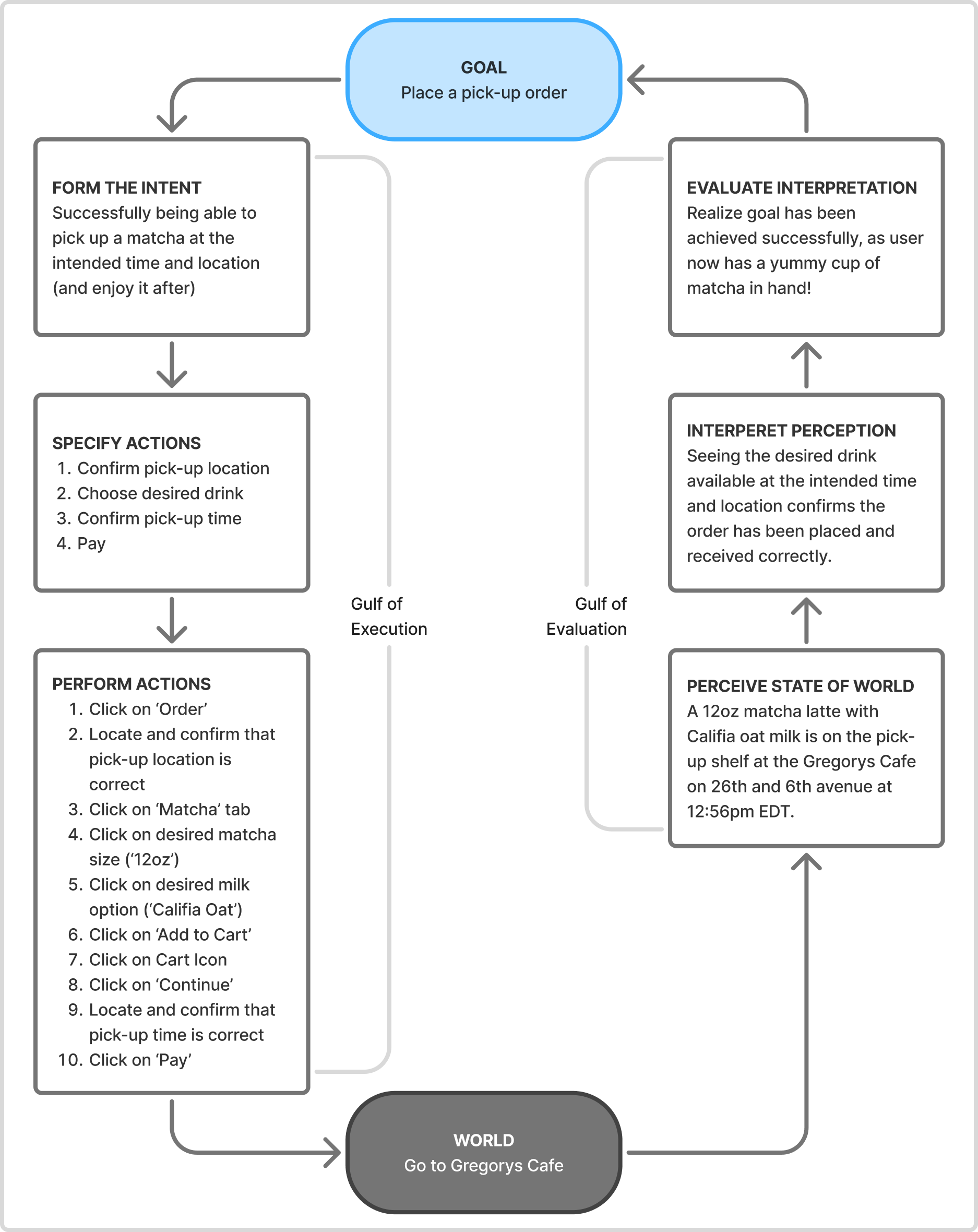
Figure 1
This critique focuses on pages users see when ordering a beverage, where their experience throughout the flow can be mapped onto Don Norman’s cognitive model, Seven Stages of Action (Figure 1).
Home page
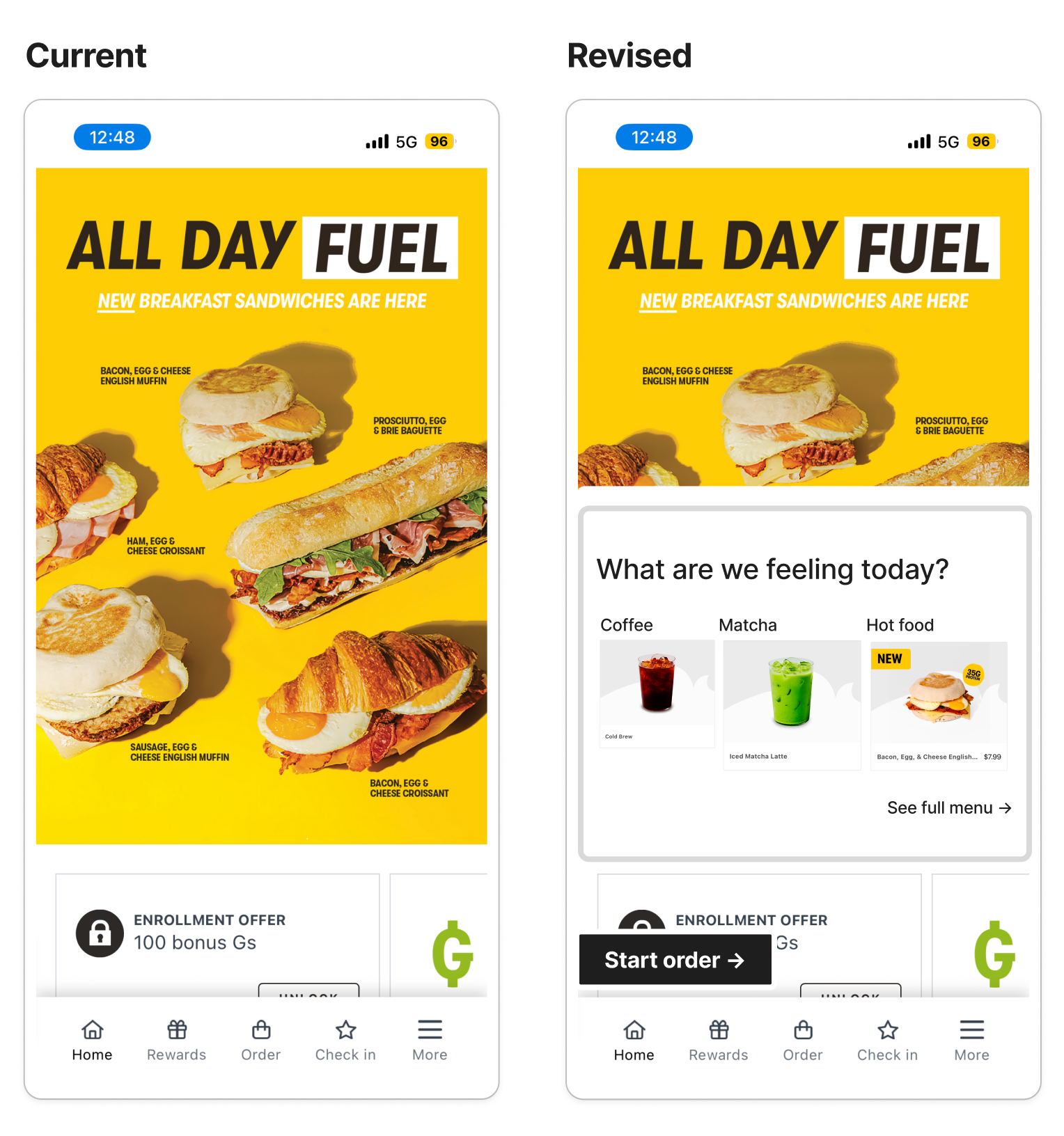
Figure 2,3 – Current (Left) vs Revised (Right)
After logging in, the user lands on the home page (Figure 2) and is met with a non-clickable brochure of new breakfast sandwiches, a rewards program enrollment offer, and the action menu at the bottom of the viewport. The user’s primary action, which is to order, is only available via the “Order” button on the action menu. While the order functionality is afforded, its discoverability is weak as the signifier is minimally visible. What can be done better?
The mockup on the right (Figure 3) suggests two fixes. First, the app could display popular menu categories as an additional affordance to place an order. This fix also makes some user options immediately available, possibly reducing several performed actions in the aforementioned Seven Stages of Action (Figure 1). For example, users no longer have to click “Order” or the “Matcha” tab to order a matcha, as they can select the “Matcha” category directly on the home page. Another fix the mockup suggests is to add a more visible ‘Start order’ signifier to increase discoverability. The black button above the action menu, for instance, stands out from other page elements through its color contrast and bold text.
Item Selection & Customization
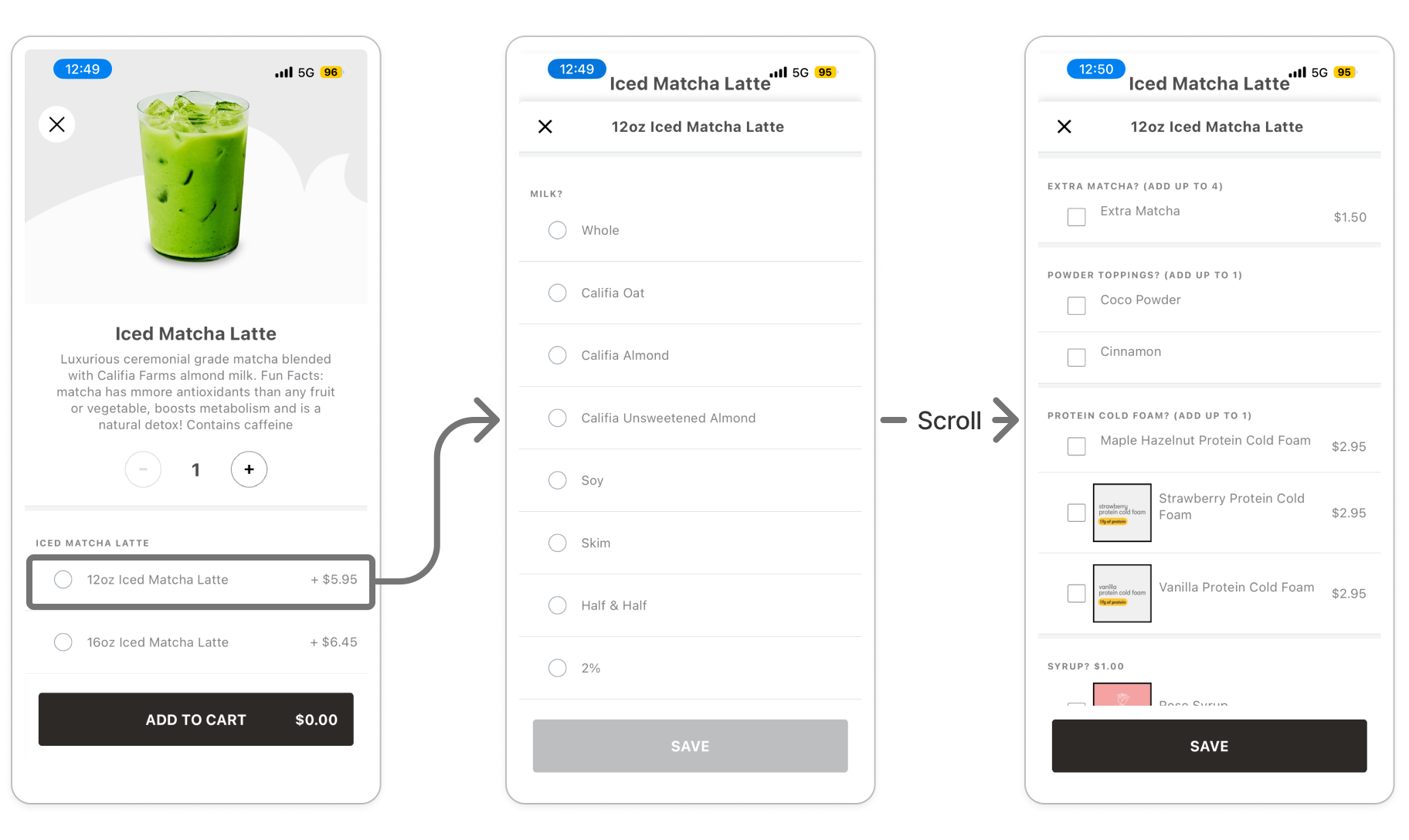
Figure 4
After the user selects their beverage size, they are presented with additional customization options (Figure 4). Milk type is a required field, while other fields such as toppings or syrup are optional. Although the milk options are fully visible on screen, the optional fields are only visible upon scrolling down. This creates a gap between the actual and perceived affordance, as no signifiers indicate the page is scrollable. As a result, users may think that the optional add-ons are on another page or that they do not exist at all. Adding a scroll bar or tightening up the padding on each milk selection radio button to reveal parts of the optional fields can add a clear indication that there is more content available on the page.
The lack of scrollability signifiers pairs interestingly with the feedback on the “Save” button, where selecting a milk type activates it by changing color from grey to black. While this feedback appropriately communicates that the user completed the required fields, it does not convey any information regarding the optional fields. For instance, a user may see the save button activate, assume the milk selection was the only customizable option on the page, and click the button to proceed. Even feedback that is accurate on its own may compound the effects of a design error on the same page.
Review & Order
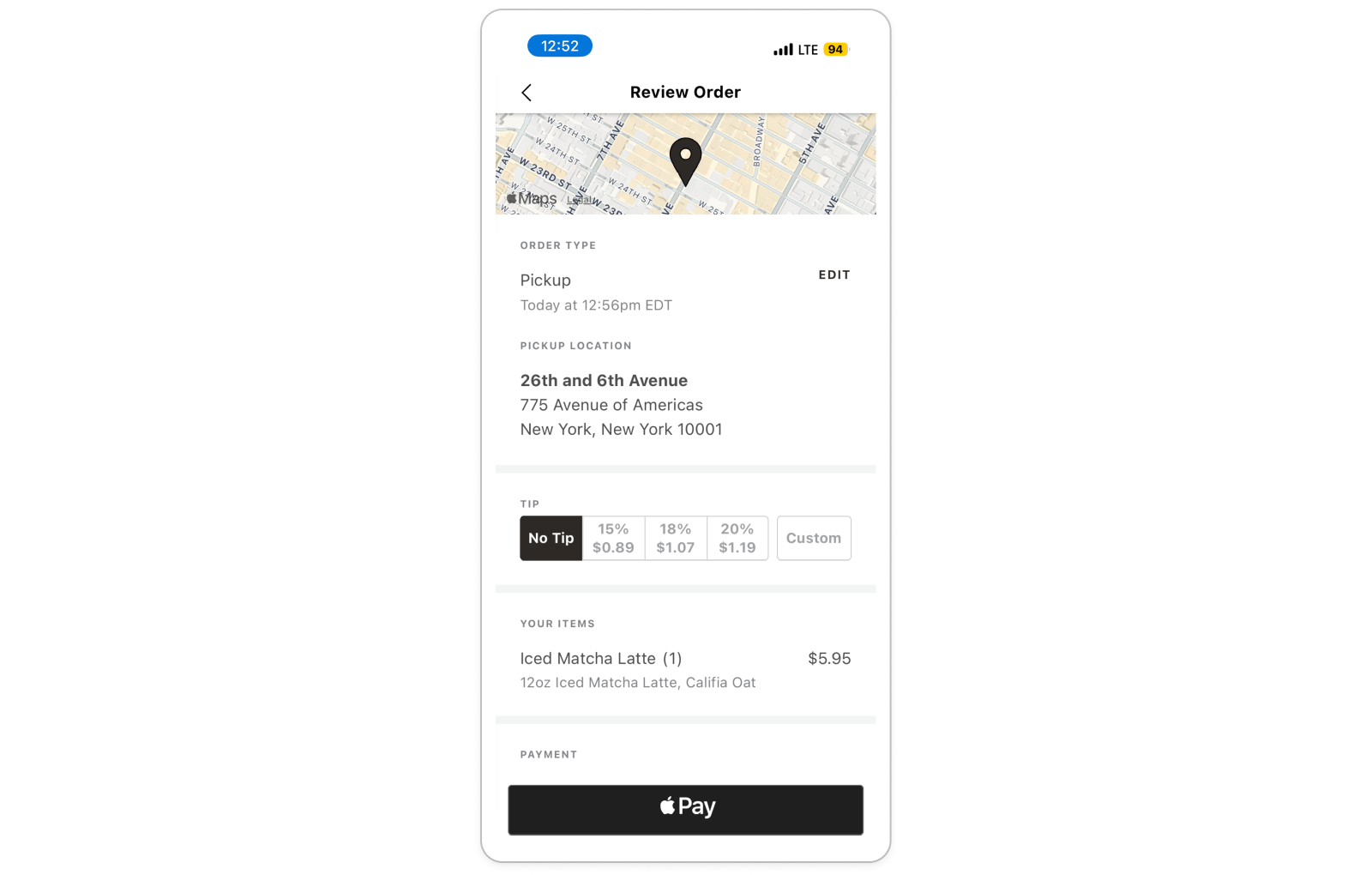
Figure 5
Review & Order
The Review & Order page (Figure 5) is the final step of the order flow. It follows a pattern found in many other applications that require payment (e.g., Amazon, Uber Eats, Dunkin’, etc.) where the user confirms their order and pickup details, selects a payment method, then clicks the “Pay” button to complete their transaction. This page evokes the user’s knowledge in the world, as it draws from familiar conventions that they have encountered before. As users do not have to recall their knowledge in the head to find crucial information, it reduces the user’s cognitive load and allows them to scan the page content with ease.
Conclusion
The Gregorys Coffee application sufficiently allows users to achieve their goal, as it includes necessary affordances and evokes recognizable design patterns on certain pages. However, the user experience could be further improved, mainly by increasing the visibility of key signifiers such as the “Start Order” button and optional add-on selections.