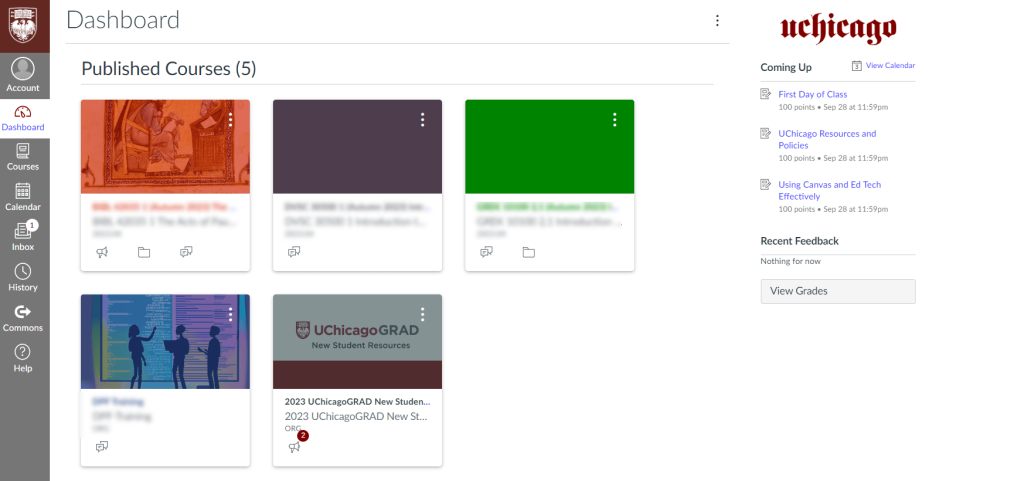
Canvas is one of the top learning management platforms used by schools and institutions, helping organize digital classrooms and support online learning. It serves as a central hub where students and teachers communicate and manage coursework, including assignments, quizzes, and grades. Image Source: University of Chicago Academic Technology Solutions, “Five Tips for Using Canvas as a Student.”
Submitting Made Simple
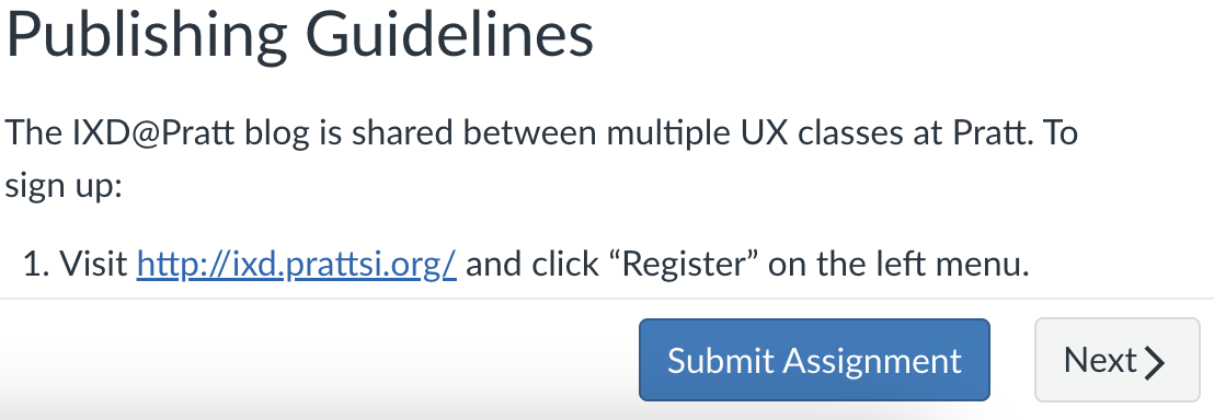
Canvas provides various affordances throughout its interface and uses signifiers to communicate where these actions can be performed. Interface features like raised buttons and blue underlined links signify that you can click them. Scroll bars signal that there is more on the page, and empty boxes afford typing. One feature particularly useful for students is the interface’s visual cues when submitting an assignment. Canvas guides you through the submission process, making it easy to see which actions are available and which formats are accepted. When submitting an assignment, Canvas makes it easy overall to figure out, “What can I do?” and “How do I know how to do it?”
Finiding Feedback
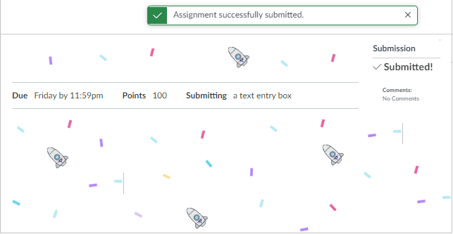
Feedback in Canvas is pretty straightforward for submissions, but it tends to fall short on visibility and reliability when students review feedback later on. Confetti appears when a submission is successful, giving the user clear, instant feedback and narrowing the user’s gulf of evaluation by confirming the action was completed.
However, instructor feedback can feel divided. PDF annotations, the professor’s comments, and rubric feedback require the student to look in multiple places, which can be confusing. The concept of mapping can fix this. A split-screen “Feedback Dashboard” could have one side showing the instructor’s PDF annotations and the other showing the rubric and comments. This layout would make the relationship between the submitted work, the teacher’s feedback, and the grade received clearer.
Where Does Everything Go?
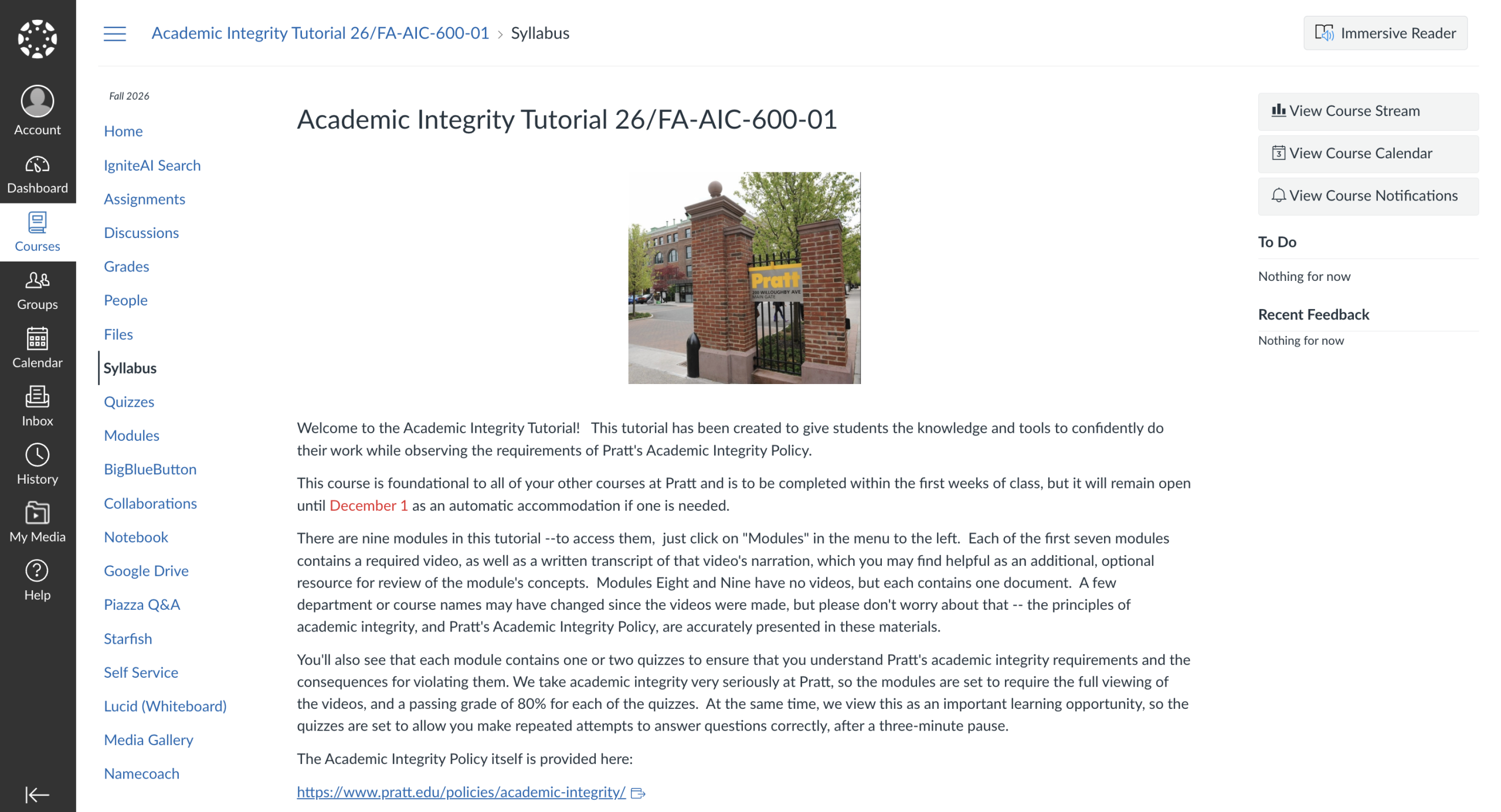
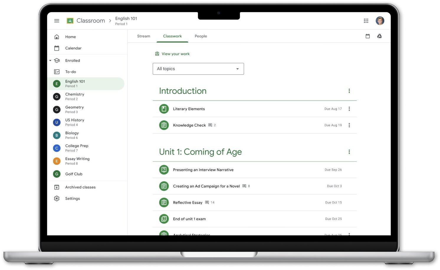
Another platform comparable to Canvas is Google Classroom. Google Classroom appears more user-friendly because it relies more heavily on knowledge in the world. This makes it easier for students to recognize where the information is located rather than having to remember it. Canvas seems to be designed around the teacher’s organization rather than the student’s, requiring students to rely more heavily on their knowledge in the head. Canvas might allow a teacher more options for organizing information than Google Classroom. But for a student, learning what a specific teacher includes in their “Assignments,” “Modules,” and “Home” tabs might not come intuitively.
When I first started using Canvas, I thought that all of my teachers posted everything that needed to be done before class in “Assignments” and was confused about what “Modules” even meant. As a result, I missed out on important readings in “Modules.” Reflecting on my experience, it feels as though students must first develop a conceptual model of how Canvas is structured before using it effectively.
On the other hand, Google Classroom has a simpler workflow. It goes from Stream, Classwork, and People and even provides a clear “To-Do” list. The simpler flow reduces the mistakes a student can make, especially when looking in the wrong section and concluding that they have nothing assigned. Hence, implementing Google Classroom’s approach of providing a more standardized location for coursework could reduce ambiguity for student users.
Keeping Track of Due Dates
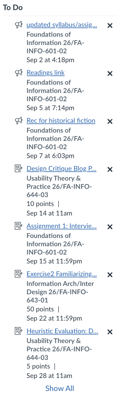
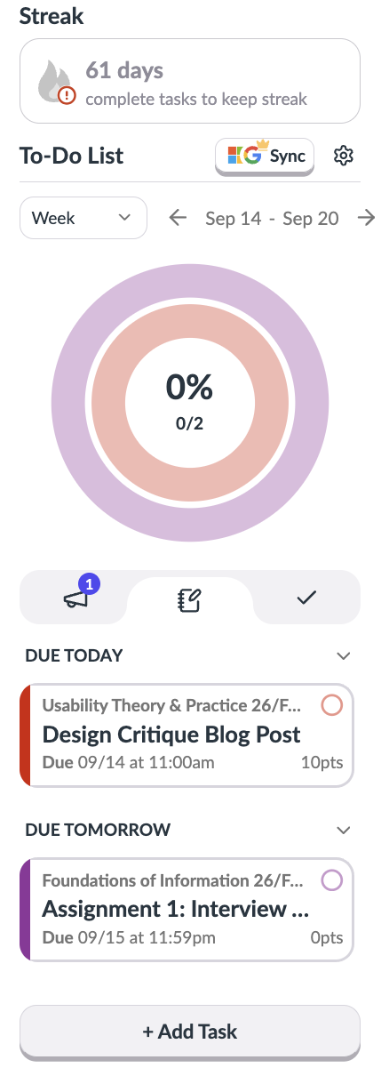
Canvas’s workflow leads to a larger problem: the lack of a clear-cut To-Do list. Although Canvas shows deadline information, it does so in a way that is neither very comprehensive nor easily visible. Discoverability is not that great since the sidebar is limited to a certain number of tasks, inconveniencing students and forcing them to navigate elsewhere to see what they have to do. I have had to install an extension for Canvas to keep up with the work in an organized manner.
To address this issue, Canvas can incorporate a customizable to-do widget right on its main dashboard. It would display due dates chronologically, support calendar syncing, allow students to mark tasks as complete, and incorporate other dashboard widgets. Having this information immediately visible would improve discoverability and reduce the amount of information students would have to remember, placing more knowledge in the world.