Introduction
HungryPanda is an international food delivery and grocery e-commerce platform that specializes in Asian cuisine and Chinese food. Its primary focus is to serve overseas Chinese communities and people who enjoy Asian food outside of Asia.
Home Page & Login
The home page of the HungryPanda app demonstrates strong discoverability by letting users browse before creating an account. The search bar, category icons (“BBQ”, “Bubble Tea”, “Asian”), and deal banners are all visible and interactive the moment the app opens. Nothing blocks a first-time user from their goal, finding food without being interrupted by registration. The account requirement does not disappear; it reappears before an order can be placed.
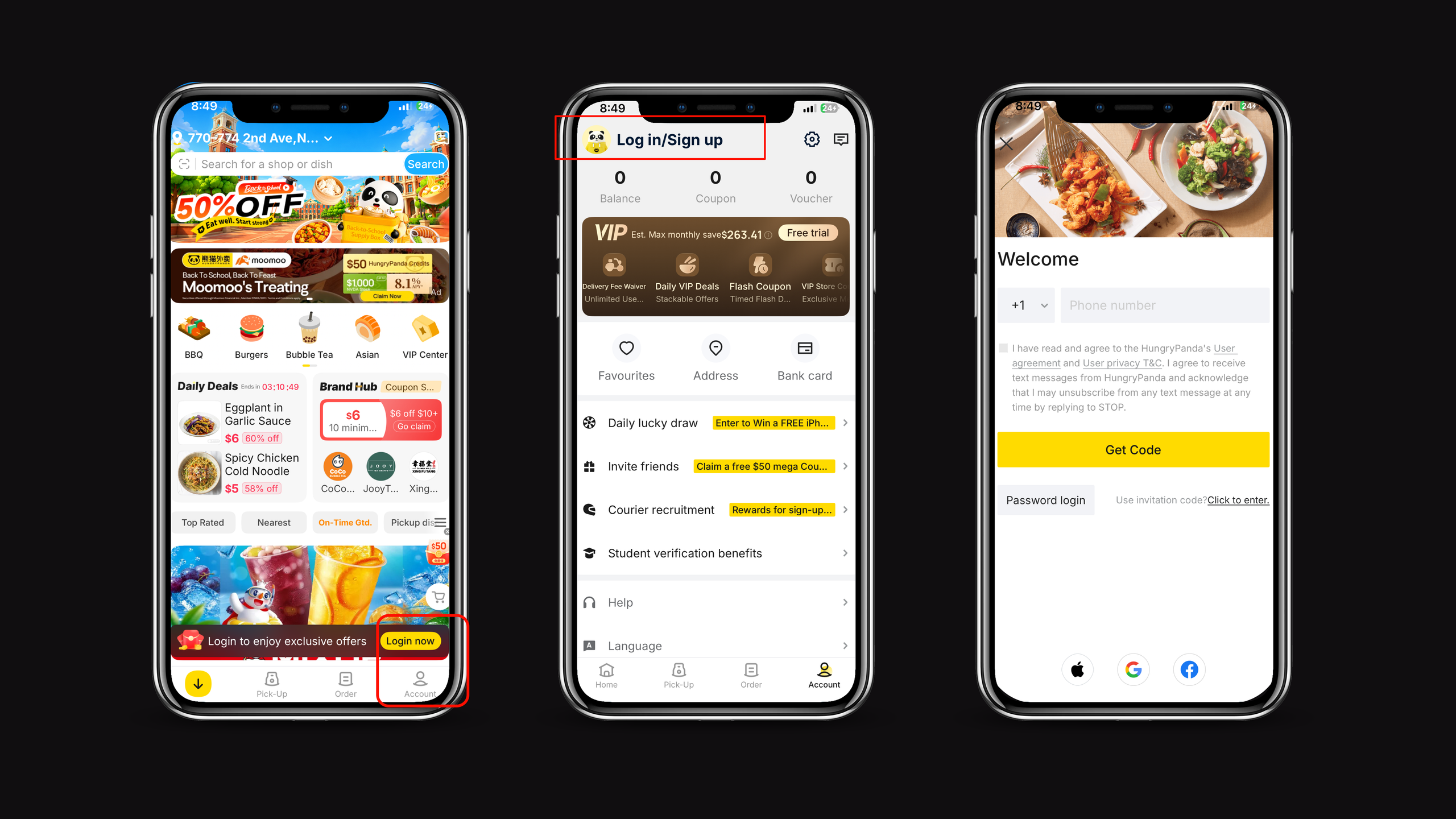
This reflects a well-designed conceptual model because the app signals that browsing and logging in are two separate tasks. The category icons are also a good use of natural mapping; a bubble tea cup icon maps directly to the bubble tea category, so users don’t have to figure out random symbols. Logging in is handled through signifiers; the “Login now” banner and log in/sign up button on the account page clearly indicate where to go if and when the user wants an account. By putting the login requirement at checkout instead of the front door, HungryPanda keeps the gulf of execution narrow for users who are still just browsing.
Search Bar
When it comes to searching for items, the white bar with the blue search button next to it at the top of the page is a clear signifier of where to start. After typing something like “Tea”, the app gives immediate feedback by showing related shops that might carry it, confirming the system registered your input. After pressing Enter, you get every store carrying a match, filterable by categories like “Lowest Price”, plus a preview of each store’s products that match the search before you click it. This maintains the gulf of execution narrow from typing to comparing to opening a store; every step maps directly onto what the user is trying to do. Once you do decide you like a store, all you have to do is click on the name, and it will lead you to the respective ordering page.
Ordering
Once on the store’s ordering page, you can scroll through their options, and if an item has customizable options, they appear as a pop-up before it can be added to the cart. This pop-up acts as a constraint, forcing the user to finish customizing before the item is committed, avoiding a gulf of evaluation later at checkout, when a wrong order would be harder to catch. Once in the cart, the system gives clear visibility of system status: address, coupon discounts, tax, and total are all shown before you pay, so nothing is hidden.
Delivery Driver Tracking
HungryPanda’s delivery tracking creates a wide gulf of evaluation. For example, on multiple orders I have made, the app has shown the driver 0.5-2 miles away and their little car/bike icon not moving or very far away. Then he/she calls me, saying they are downstairs. The tracker gave feedback but didn’t match the real state of the system, so I could not trust what I was looking at. This is a conceptual model problem; the app’s model of the delivery didn’t reflect reality closely enough to be useful. A fix would be adopting real-time GPS tracking similar to DoorDash or Uber Eats, where the drivers’ pin updates continuously and matches their actual location. This would close the gulf of evaluation by giving users feedback they can rely on, instead of a rough estimate.
Conclusion
HungryPanda’s strongest design decisions come from constraints and forcing functions in the login page, cart customization, and cost details before payment. Where the app falls short is that feedback does not match reality in the delivery tracking. Overall, HungryPanda shows a solid understanding of how to guide users through execution, but can still improve on reporting system states back to users.
Citations
Norman, D. A. (1988). The design of everyday things. Doubleday/Currency.