Chipotle is a fast-casual restaurant that serves build-your-own Mexican inspired meals, including burritos, tacos, bowls, and quesadillas; and the app is designed to recreate the in-person ordering experience digitally. Don Norman, in his book, The Design of Everyday Things, argues that good design goes beyond aesthetics. An interface should have clear mapping of what a user can do, provide feedback after an action, and work in a way that matches the user’s expectations. Browsing the Chipotle app through Norman’s eyes, there are two areas where the app works especially well, and two design choices that make ordering dinner more frustrating than it needs to be.
1. Meal Customization
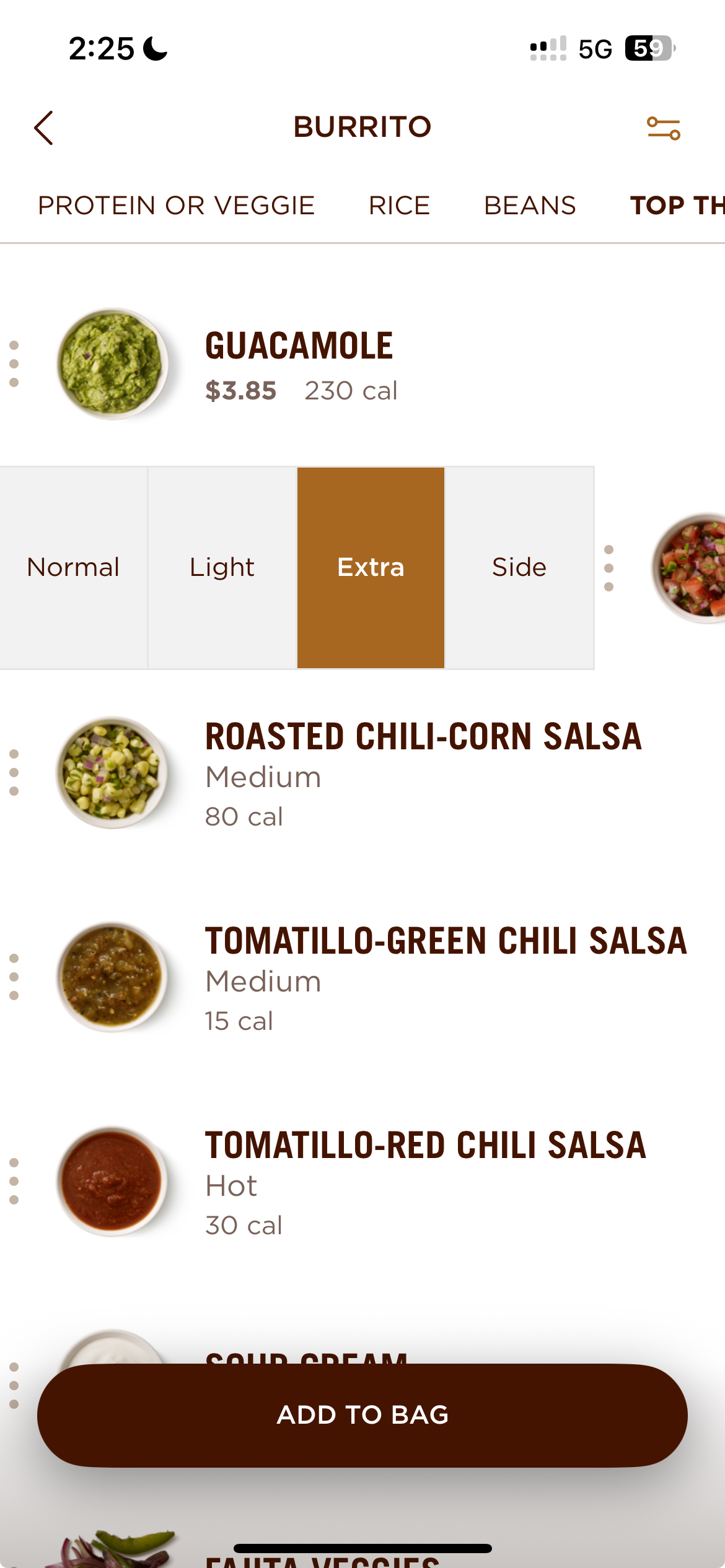
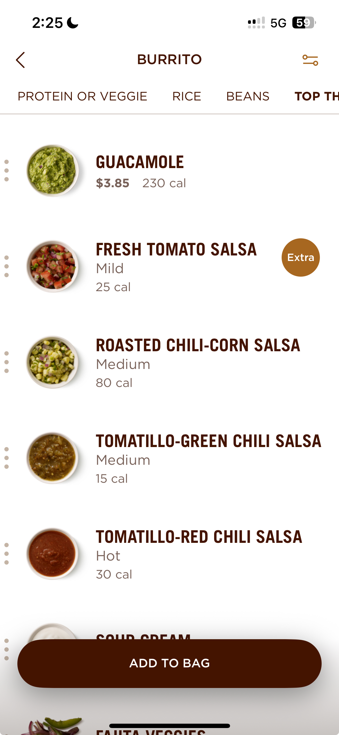
For example, users can swipe a topping, such as the tomato salsa, to reveal additional customization options. After they make a selection, the app shows that choice on the right side of the screen. The three dots on the left hand side also let users know there are other options available (which is a good signifier).
This is a good example of Norman’s idea of Natural Mapping, where an action works and responds the way a user would naturally expect it to. Swiping the topping to reveal customization options feels natural and avoids the need for a dropdown menu or additional screen.

2. Cart Memory
Another feature that the Chipotle app does well is cart memory. If a user adds an item to their cart and closes the app, it will still remain when they return, even several hours later. This reflects Norman’s concept of knowledge in the world vs knowledge in the head, because the app stores the order instead of relying on the user to remember it. This makes it easier to return and finish an order later, and can also reduce frustration. The only limitation is that the cart is cleared after 24 hours.
3. Tip Screen
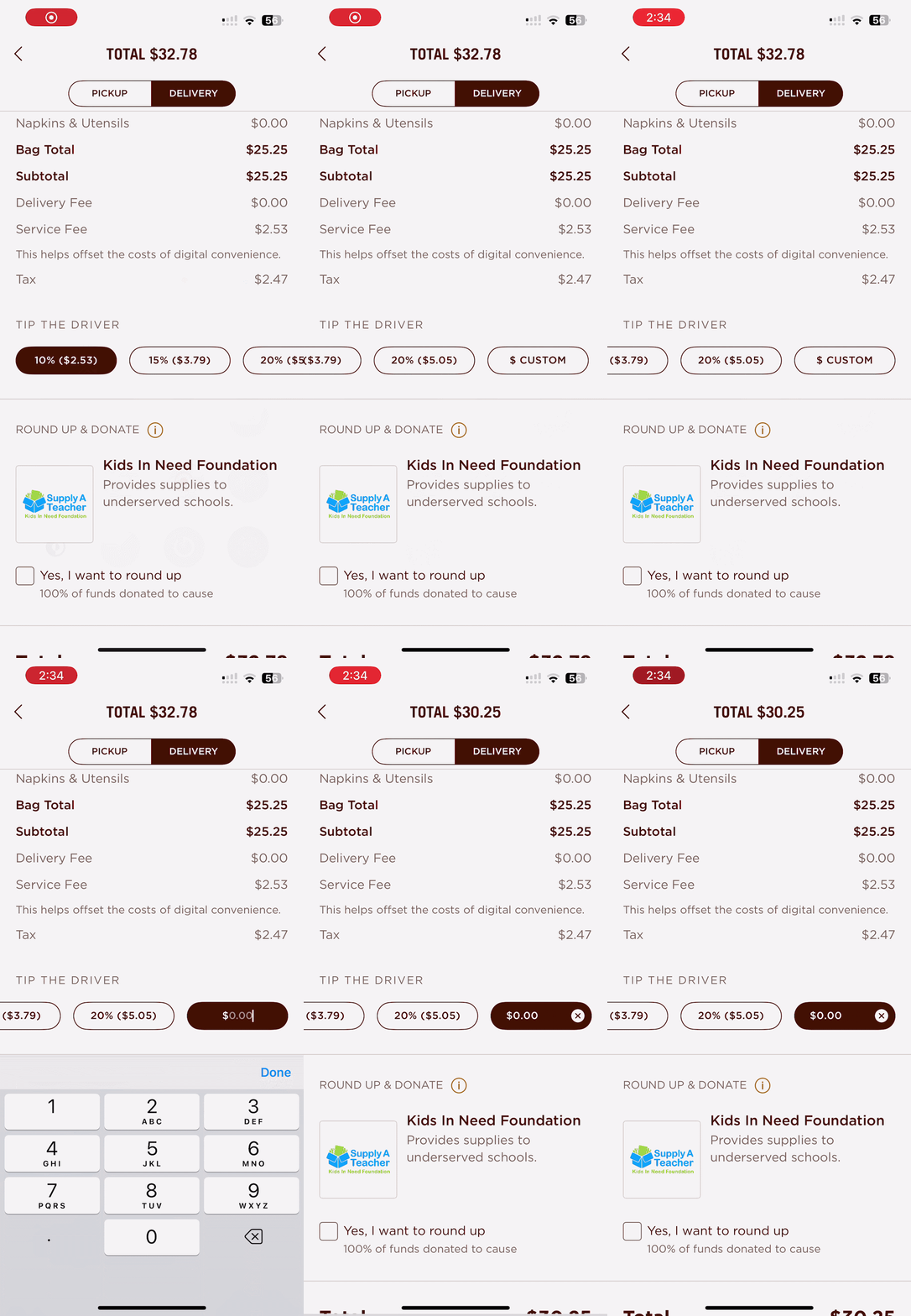
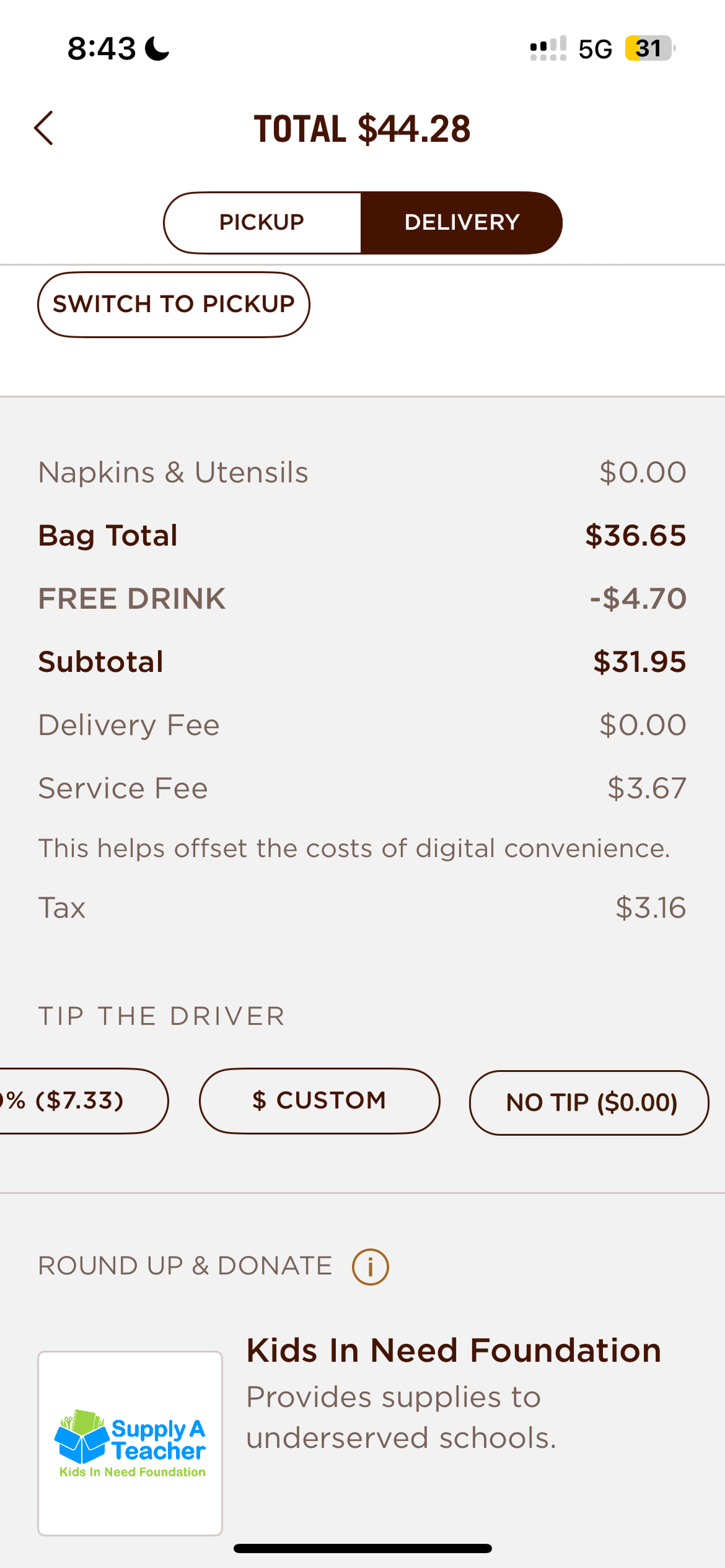
One area that has some room for improvement is the tip screen. A pro is that each percentage option (10%, 15%, 20%), shows the exact dollar amount that users can tip, which gives them a useful feedforward before making a choice. However, there isn’t a visible “No Tip” option. Instead, users have to select “Custom” and manually enter “$0.00”.
This calls back to Norman’s concept of cultural constraints and conventions, as many users may expect a clear “No Tip” option alongside the other choices rather than having it hidden under “Custom”, due to other delivery apps having that option.
The other tipping options are much more noticeable, as the percentage buttons are large and clearly visible, while choosing “No Tip” takes an extra step. A simple fix would be to add a “No Tip” button with the same size and visual weight as the other tipping options. This would give not tipping a clear signifier, and make it just as easy to find.

4. Order History
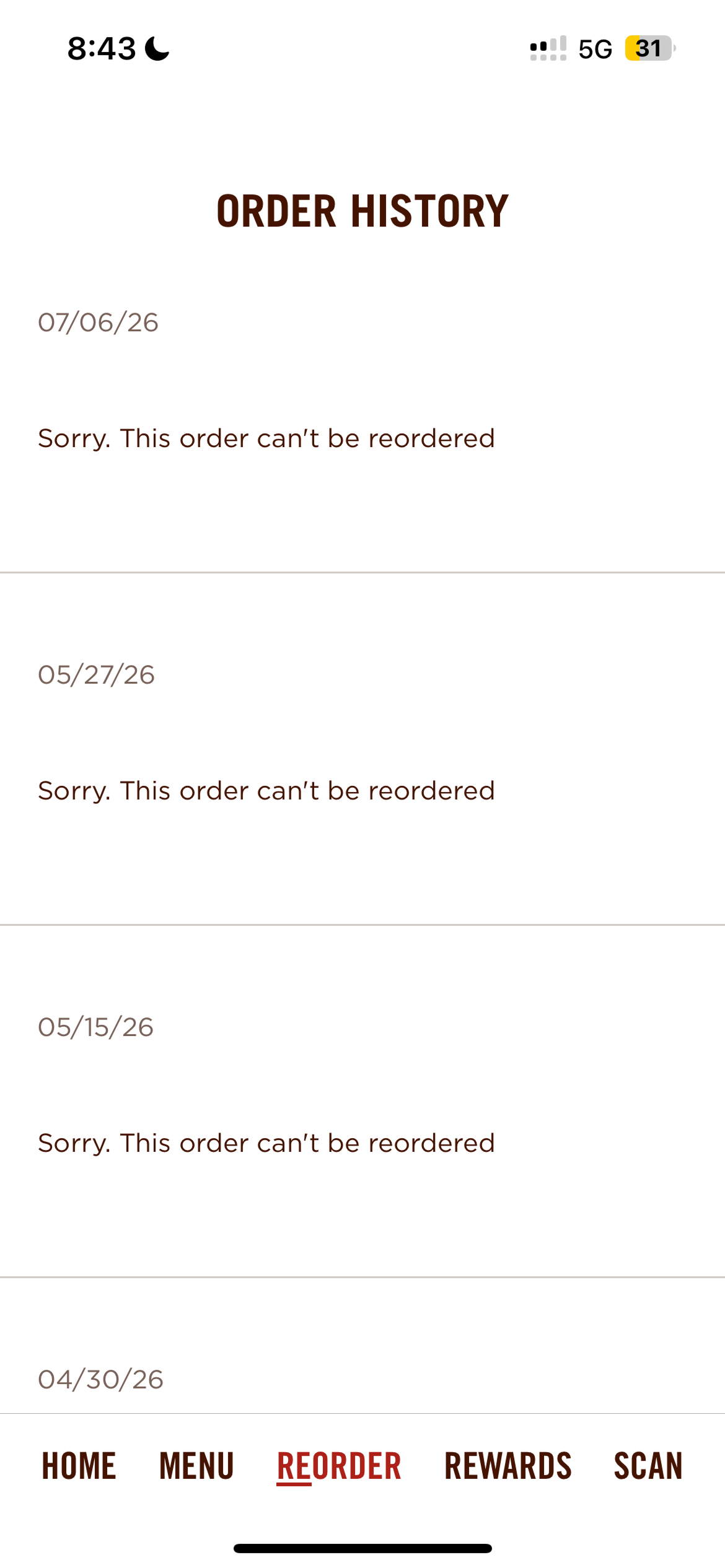
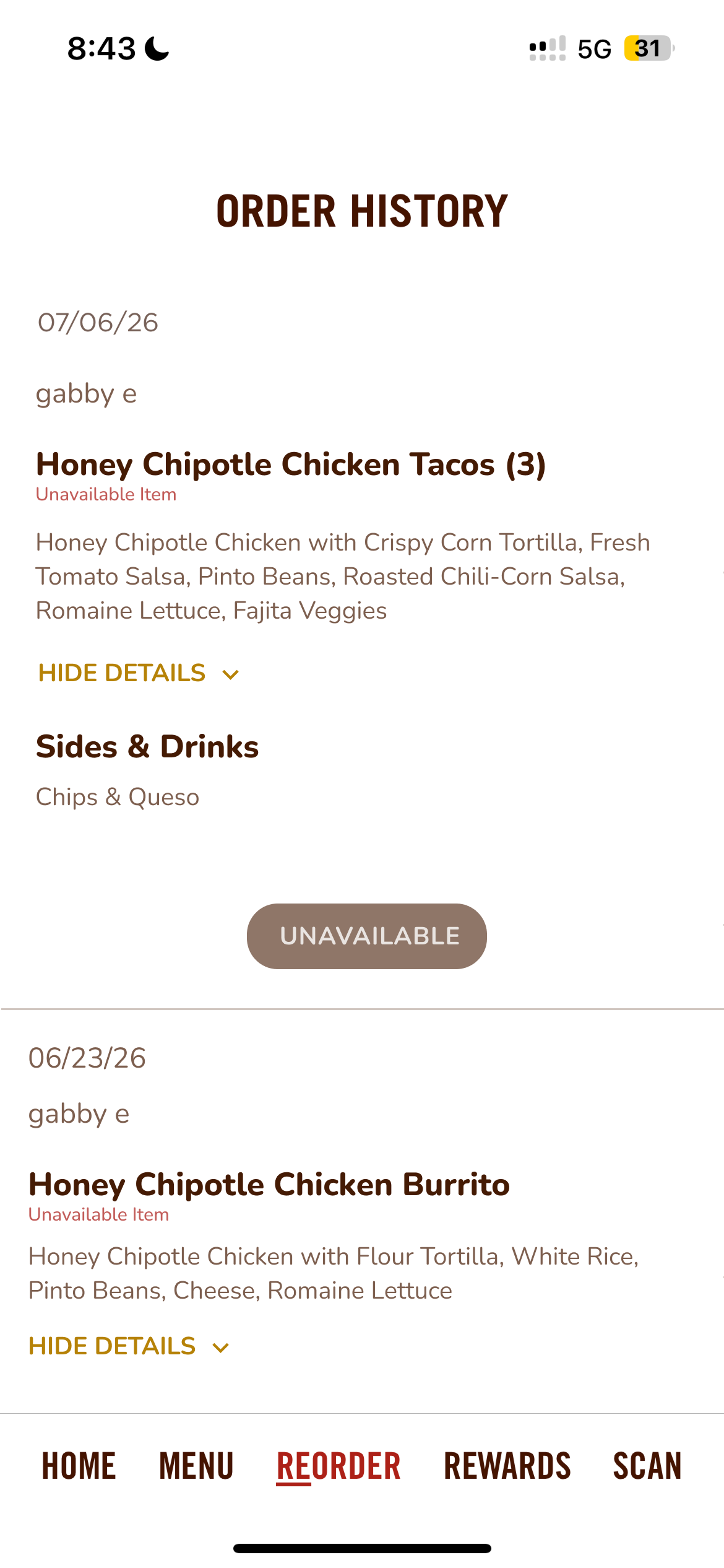
Finally, the order history has a major issue when a past order includes an item that has been discontinued. Instead of showing a previous order with a discontinued item and marking that one item as unavailable, the entire order fails to load. This creates a Gulf of Evaluation issue as the user gets little to no feedback about what went wrong.
It also goes against the user’s conceptual model of an order history. Most users would expect past orders to remain available to view, even if an item has been discontinued. Without an explanation, users may assume the problem is their phone or internet connection. A better solution would be to keep the order visible, mark discontinued items as “unavailable”, and bar the user from adding them to the cart.

Overall App Rating: 4 out of 5 Stars (⭐️⭐️⭐️⭐️)
Overall, the Chipotle app is easy to use and handles the online ordering process well, especially when it comes to customization and saving information for the user. The issues with tipping and order history do not ruin the experience, but they do make ordering slightly more tedious, and show how small design choices can still affect usability.