For the past year or so, I’ve been wearing a WHOOP band: the screen-less fitness band that measures strain, recovery, and sleep solely via a companion app. It’s a particularly compelling case study for Don Norman’s The Design of Everyday Things because WHOOP made a radical bet: take away the display and put all the intelligence in software. That bet has resulted in some of the clearest interaction designs I’ve seen, as well as some of the most confusing moments, and the pattern behind both is more compelling than any single screen.
1. The Recovery Score: Bridging the Gap of Evaluation

WHOOP shows you one number each morning, 0–100%, inside a red, yellow or green ring. This is a solid conceptual model combined with a natural mapping. The colour scheme directly borrows from a stoplight, a mapping that is already hardwired into most people’s heads, so “red” instantly translates to “proceed with caution” with no learning curve. More specifically, this design closes what Norman calls the Gulf of Evaluation, the work required to look at a system’s output and know what it means. A raw HRV or resting heart rate number would require the user to interpret it; the colour and 0-100 scale do that interpretation for them, so there is almost no cognitive translation required between “seeing the ring” and “knowing my state”. The feedback is instant and unmistakable: you open the app, you see the colour, and you know your state.
2. The Journal Feature: Closing the Full Action Cycle

Each night, WHOOP prompts you to log around 30 behaviours, such as alcohol, caffeine after noon, screen time before bed, reading and more. Once there are enough entries, the app points out a pattern: “On nights you read before bed, your recovery was 8% better.” This is a strong conceptual model because it doesn’t just report data; it builds a personal cause-and-effect theory of your body, which is what Norman argues good design should do rather than leaving the user to construct that theory alone from raw numbers. It also fits neatly into Norman’s seven stages of action: the user forms a goal (“Does alcohol actually hurt my sleep?”), executes it by tracking the behaviour, and critically, WHOOP closes the loop by evaluating the result for the user via the correlation report, rather than leaving them to put together the link themselves days or weeks later. That closed loop is what differentiates a real feedback mechanism from a system that logs input and never returns to it. Oura’s “Tags” feature does something similar, confirming that the approach is a deliberate, repeatable pattern in the wearables space, not a fluke.
3. The Double Tap Gesture: Missing Signifiers
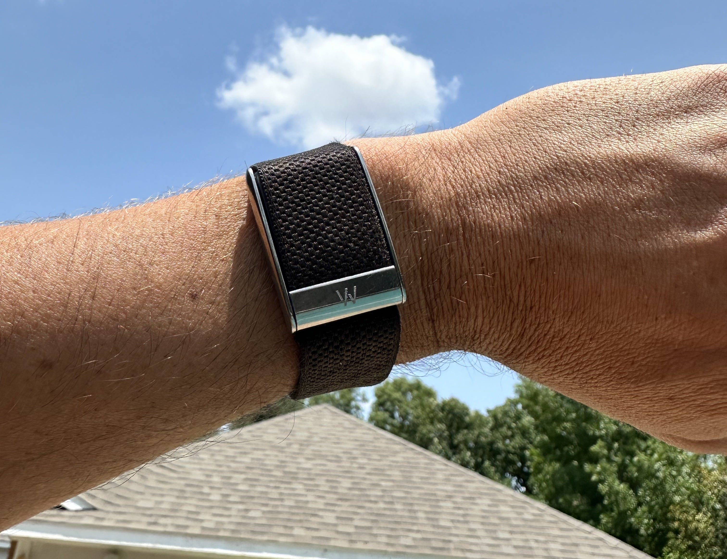
To assess the remaining battery on the band itself, double-tap the sensor housing, and a tiny LED flashes a colour. The physical band has no indication that tapping does anything: no seam, no icon, and no change in texture to suggest interactivity. Norman is very clear: an affordance without a signifier is functionally useless, for users have no way of discovering it. I only found out about this gesture from a YouTube video months after buying the device; it’s not part of onboarding, and there’s no way to accidentally discover it. This gesture fails functionally like the Sleep Score menu below—both features lack a clear path for discovery, one missing a physical cue and the other a search bar.
Fix: Put a faint laser-etched ring or dot on the housing to denote the tap zone, a low-cost, low-power signifier that doesn’t need a screen. Compare that to AirPods cases with a single tiny status LED next to the lid, a minimal visual cue that says “something is happening here” without requiring a full display.
4. Burying Settings Three Menus Deep

If you want to change something as basic as sleep goal hours, you have to go to Profile → Preferences → Sleep → Sleep Goal. No search. This creates a large Gulf of Execution – the gap between what a user wants to do and the steps the interface requires them to actually do it. I’ve seen first-timers give up before they find it, guessing at menu labels as they go.
Fix: Add a persistent search bar to the top of the Settings tab (like iOS Settings) so users can type “sleep goal” and go right there, instead of having to guess the right hierarchy. This saves taps and also bridges the gulf by letting the user state their goal directly rather than translating it into a sequence of menu choices.
Conclusion
The pattern across all four examples is not really about screens vs. no screens; it’s about which gulf WHOOP chose to close and which one it left open. Its two strongest moments (the Recovery Ring and the Journal) work because they do the user’s interpretive work for them: one collapses a gulf of evaluation instantly with colour, while the other closes it slowly over weeks by actually finishing the action cycle instead of dropping the user mid-loop. Its two weakest moments (the double-tap and the settings depth) both fall down the same way regardless of whether one is hardware and one is software. There’s a real capability, but there’s nothing about the interface that indicates where to locate it. As Norman insists, effective design not only makes things possible but also makes them visible, and WHOOP demonstrates that removing a screen heightens the stakes of that promise, as there is no display to hide behind when a signifier is absent. With a few targeted fixes, an already thoughtful design could close the last few gaps between what WHOOP can do and what its users can actually find.
“All design concepts and terminology referenced are drawn from Don Norman’s The Design of Everyday Things (Revised and Expanded Edition, 2013).“