Introduction
Day One is an iOS and Android-supported writing application that allows users to quickly compose, edit, retrieve, and share daily journal entries. This blog will provide a user experience overview of the newest iOS version of Day One, focusing specifically on commonly-used features within the app’s Today page, Journal Entry screen, and [historical] Journals page.
Note: the bold/italicized phrases below refer to design concepts introduced by Don Norman in his book The Design of Everyday Things.
The Today Page
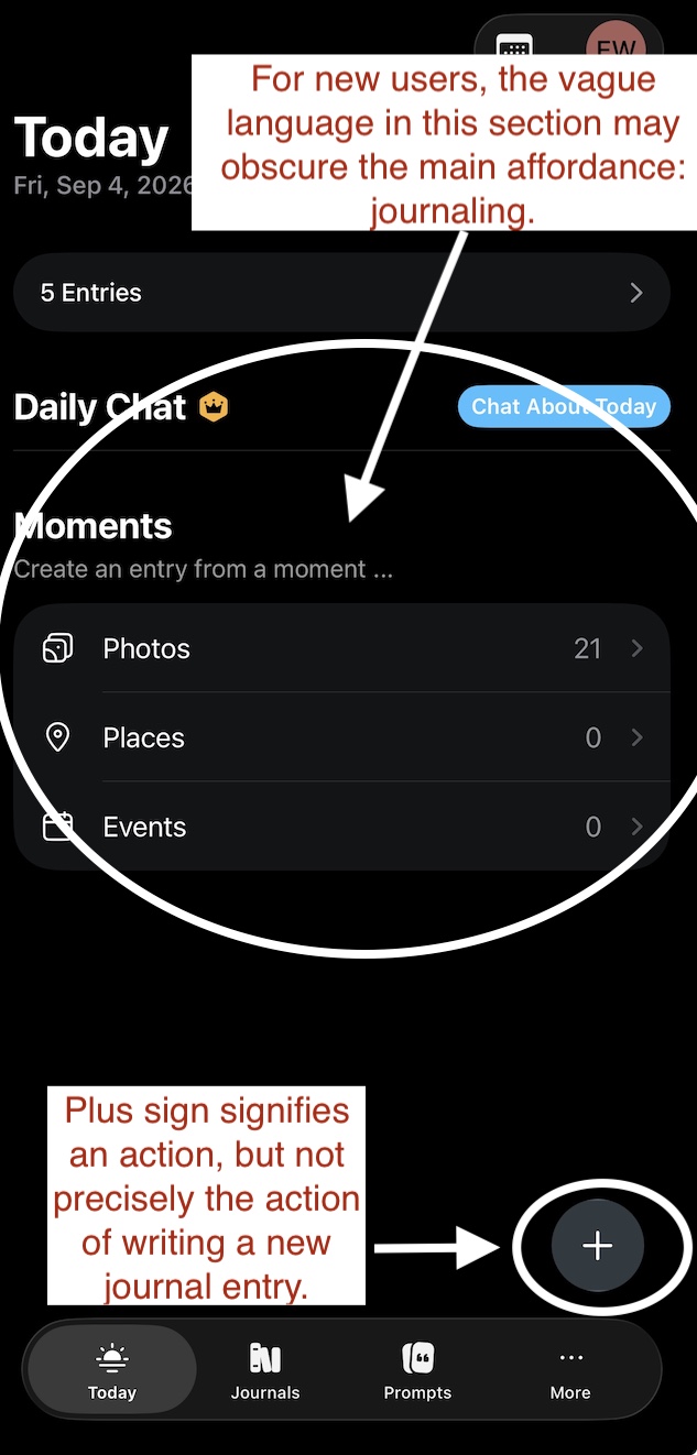
After unlocking the app with a discrete numerical code, new users are directed to the “Today” page of Day One. (Existing users who have not accessed the application recently may also be directed to the Today page). This screen permits users to begin several follow-on actions, including composing a new journal entry, retrieving earlier entries, and syncing photos, locations, and event notifications from other apps for inspiration. These affordances are indicated by subtle signifiers that are organized within a clear hierarchy of main headings and sub-headings. For example, in the photo below, the right-facing arrow beside the term “5 Entries” signifies the ability to view an entry from earlier in the day simply by pressing the carrot. Likewise, the gray-shaded “Today” icon in the bottom toolbar signifies the option to press the other toolbar items in order to toggle between functions. Selecting any of these operations produces immediate feedback via the darkening of the selected text or image and the instant loading of a new page or screen.
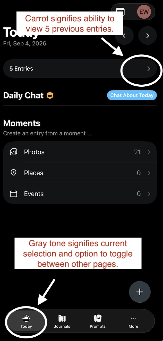
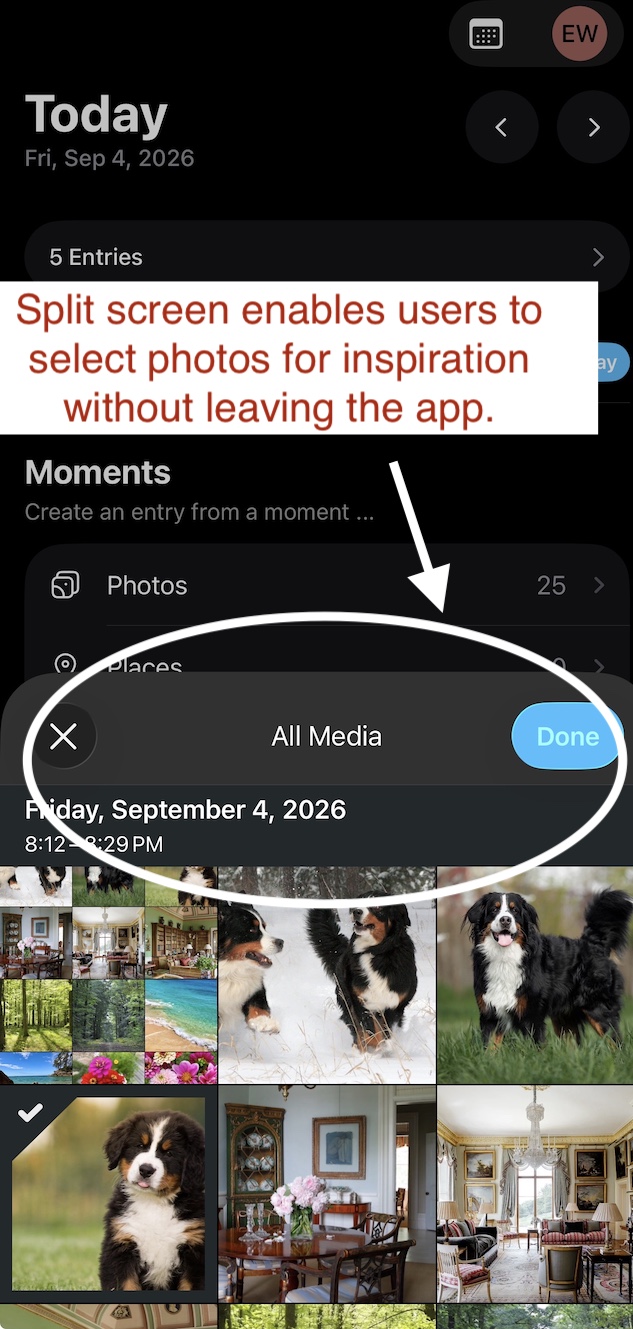
These features are supported by a logical conceptual framework that mirrors common mental models of how a digital journal should work. Controls for syncing photographs or event notifications with the Day One app are prioritized in the center of the page and map directly to the user’s photos and default calendar through a shared screen format. This permits the user to remain in the Day One app while retrieving images and event descriptions for easy inspiration. Crucially, this order of functions mimics the usual sequence of a traditional paper-based journal entry: an event or experience occurs, which leads to inspiration, which in turn prompts the user to begin writing. Here, the app’s natural mapping of a typical cognitive process reduces the decision-making burden on the user and leads to a more seamless writing experience.
It’s worth noting that the Today page is limited by a minor issue of discoverability. Overall, it skews towards experienced users who have an intuitive knowledge of its operations. For new and less frequent users, two points of friction may arise. First, the excessive amount of textual information, none of which directly references writing, may cause delays in processing the main purpose of the app. Second, even once this purpose is assumed, inexperienced users may struggle to access the control that leads to the most frequent operation: journaling. This is because, while the encircled plus-sign icon in the bottom right corner of the screen cues the reader to press down for a follow-on function, it is not obvious that this operation will lead to a fresh journal entry page.
Fortunately, these issues can be overcome with simple fixes. To ensure that the main purpose of the app is apparent as soon as the user reaches the Today page, the title of the page can be changed from “Today” to “Today’s Journal” and the sub-headings can be adjusted to more directly reference the act of journaling. For example, the sub-heading “Create an entry from a moment” can be changed (without increasing the word count) to “Journal about your photos and events.” An equally simple fix applies the new entry icon in the corner of the screen. Changing the plus sign to a pencil or other writing-oriented graphic would more clearly signal that pressing the icon produces a fresh journal page.
The Journal Entry Screen
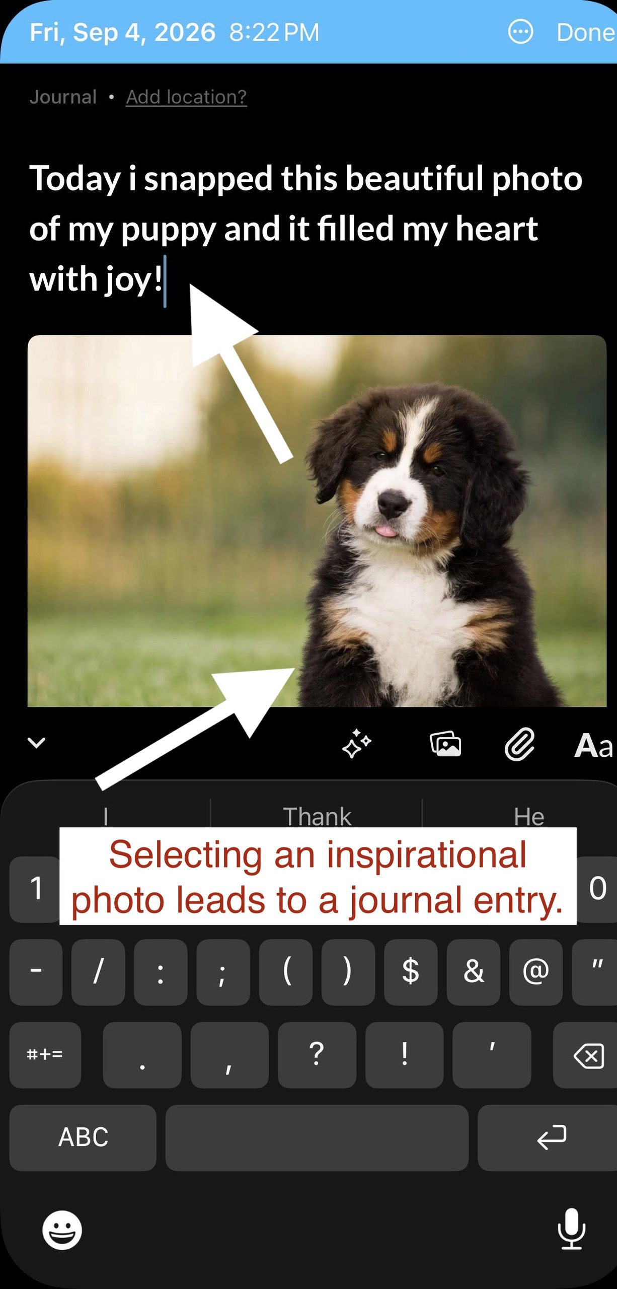
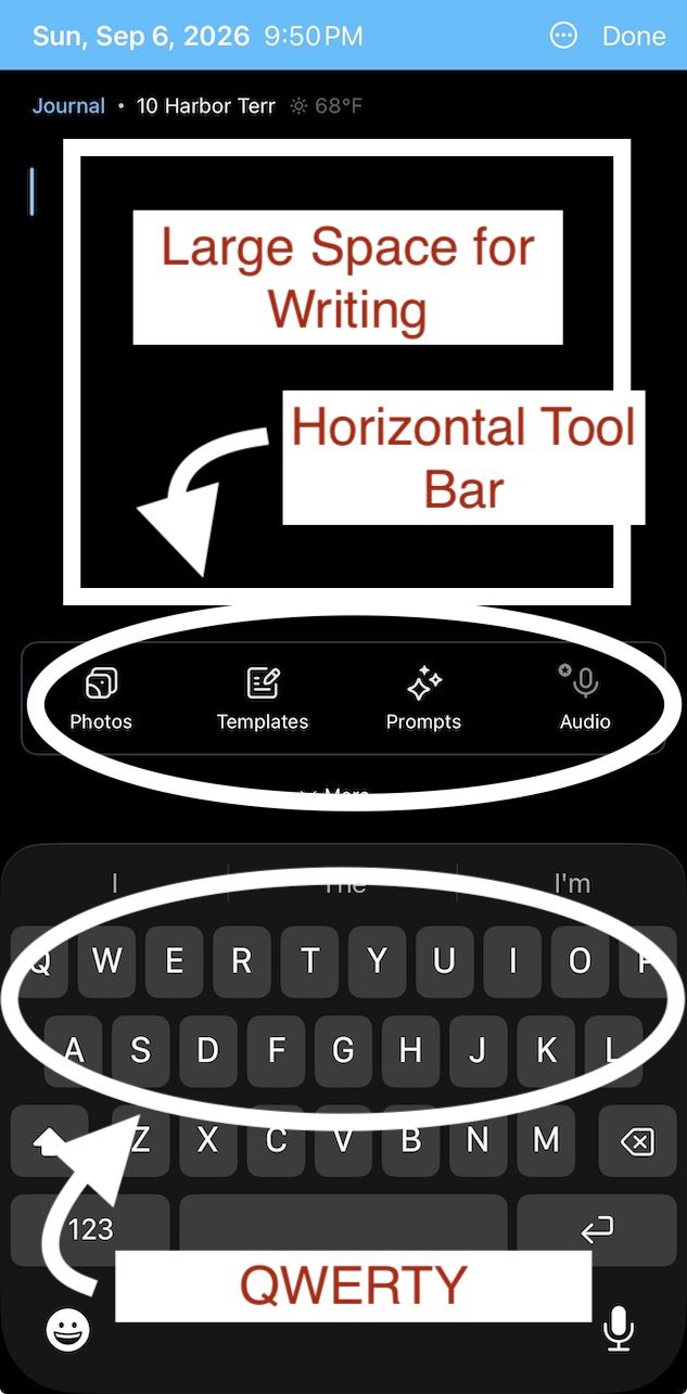
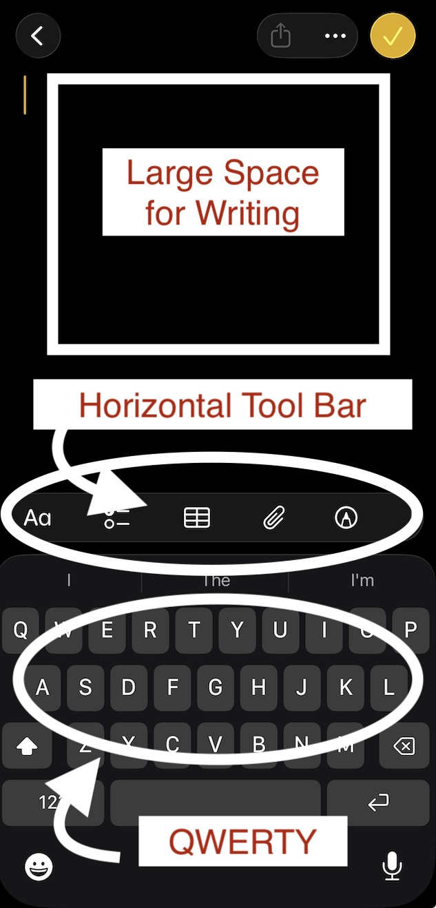
In contrast to the flaw observed on the Today page, the journal entry screen, where users actually compose their entries, features a plain, tightly-constrained design that guides users to the main purpose of the app. It accomplishes this not only by eliminating most affordances other than writing, but also by approximating a familiar system design that users immediately associate with writing: the iOS Notes app. As shown in the image comparison below, both Day One and Notes feature a blinking cursor, an expansive blank screen, and a QWERTY keyboard with an expanded horizontal tool bar. The familiarity of the journal screen reduces the need for cognitive processing and enables the user to get right to the task of journaling.
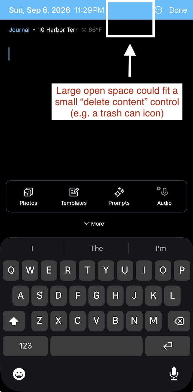
If there is any flaw to speak of regarding the journal entry screen of Day One, it’s the lack of discoverability of the delete function. Similar to the Notes app, Day One’s “Move to Trash” function, arguably one of the most common tasks on iOS-based writing and notetaking apps, is hidden beneath an overflow menu even though the top and bottom tool bars reserve space for at least one additional icon. A simple fix would be to use negative space at either end of the screen to include a trash can icon.
The (Existing) Journals Page
Once the affordances above are realized and users begin journaling, they can view their existing collection of completed journal entries at any time by pressing the Journals option, cleverly symbolized by a small graphic of several book volumes, located on the horizontal tool bar at the bottom of each Day One page. Once open, the Journals page affords users the ability to view historical journals either in a vertical list, in the form of a monthly calendar, or according to the specific media (e.g. photos) or location associated with them. These affordances are signified by a horizontal menu bar in the middle of the screen with the options “List,” “Calendar,” “Media,” and “Map.” Further signifying the user’s ability to select a particular view, the default or chosen option appears white and features a small marker bar beneath it.
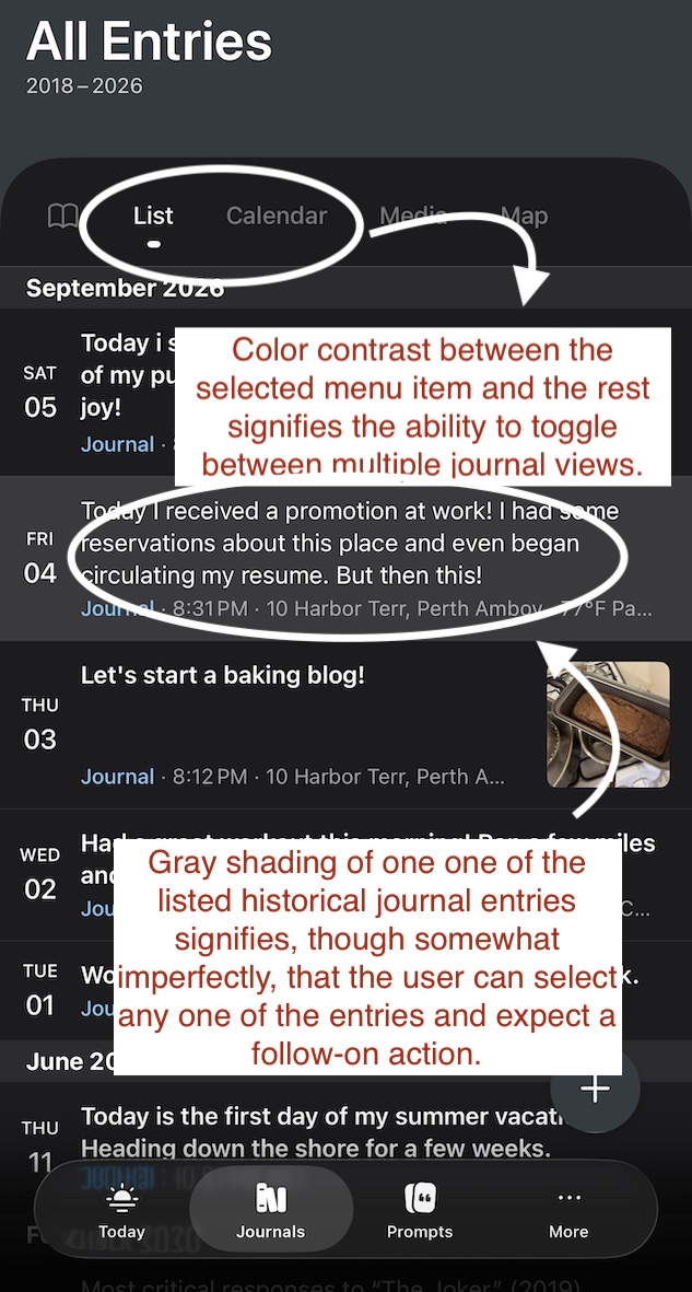
Notably, the main portion of the Journals page lacks explicit signifiers for important follow-on actions. There is no clear nudge for the user to press a truncated journal entry in order to view its full text. A signifier only appears if the user intuits this affordance by pressing down on one of the listed entries. The truncated entry will briefly turn gray and lead to its full-text version, and, as shown in the image above, the selected entry will appear gray when the user returns to the list of journals. This is an odd case of a signifier occurring after an action. A similar lack of discoverability occurs after the user is transferred to the full text version of a selected entry. The full text screen affords editing, but this action is not immediately perceived because there is no visible control for the action of writing, not even a blinking cursor. Here again, the user must test the editing function by touching the screen. In both cases, however, I would resist the temptation to add an icon or additional signifier. The brief gulf of execution that results in either case is likely outweighed by the distraction of an additional control on an already content-heavy screen.
Summary
Since its founding in 2011, the Day One app has developed into a sleek, responsive, and intuitive application whose integration of multiple operating system features (photos, calendar, etc.) provides a pleasant and robust digital journaling experience. Its clever reference to the familiar Notes app ensures that users will easily flow into the writing process with minimal extraneous effort. With a few minor improvements to initial discoverability on the main page, the app promises to become the private writing tool of choice for on-the-move digital diarists.