Zotero is a free, open-source reference management application designed to help researchers collect, manage, annotate, and cite scholarly sources in a relatively easy, organized way. Researchers can capture research papers and citation metadata directly from digital libraries, publishers, and digital databases, then annotate PDFs and take notes within the app itself.
The Goal
The user has forgotten their username and account email, so they try to find that information from an already logged-in device.
Home Screen
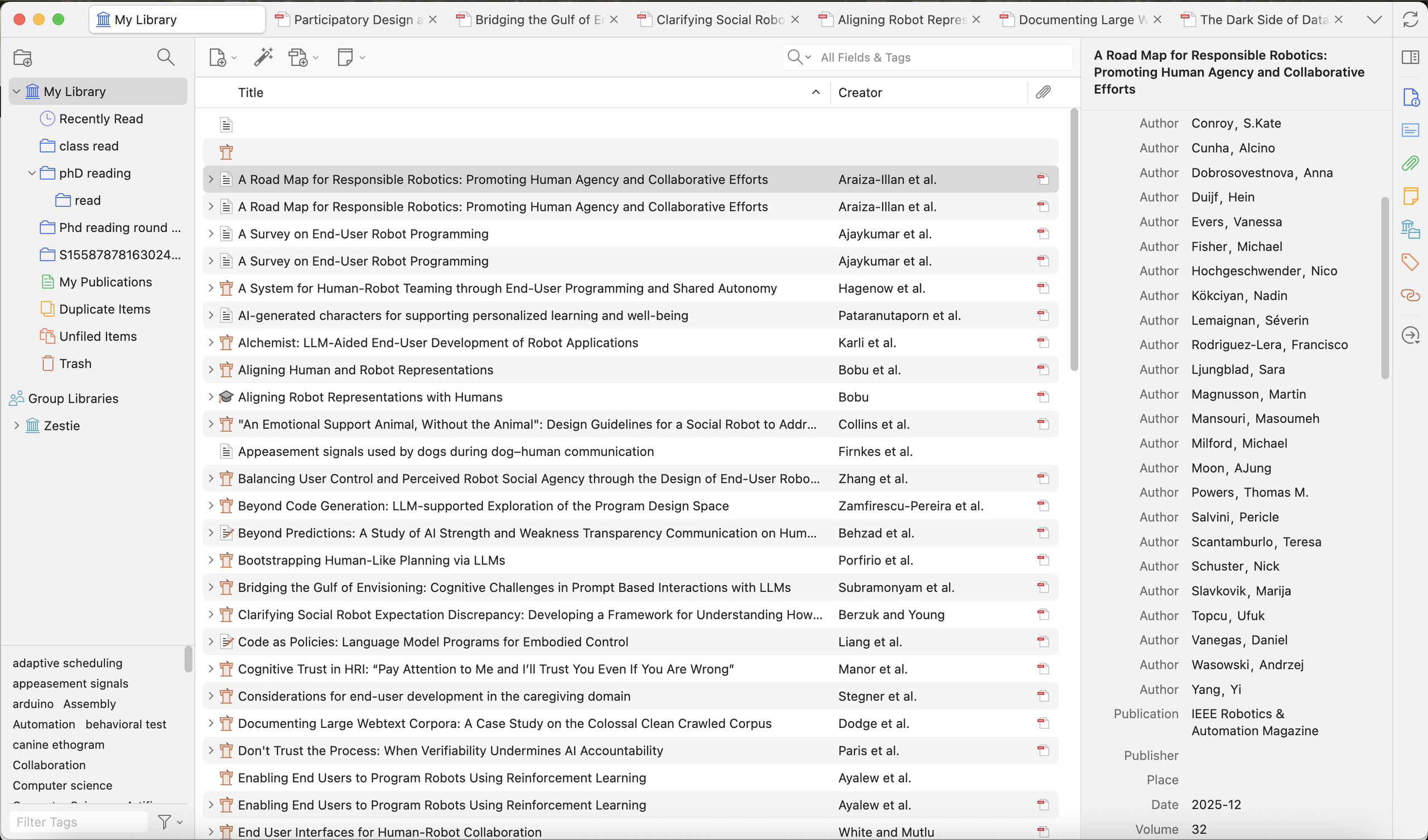
The home screen follows a very standard layout that is similar to most text editor/reader applications. For selecting and reading files, it makes good use of Knowledge in the world, letting the user navigate the folder directory effortlessly. The tab “My Library” and its child tabs act as signifiers and inform the user that the directory sidebar affords the action of navigating folders at different layers.
The Gulf of Execution
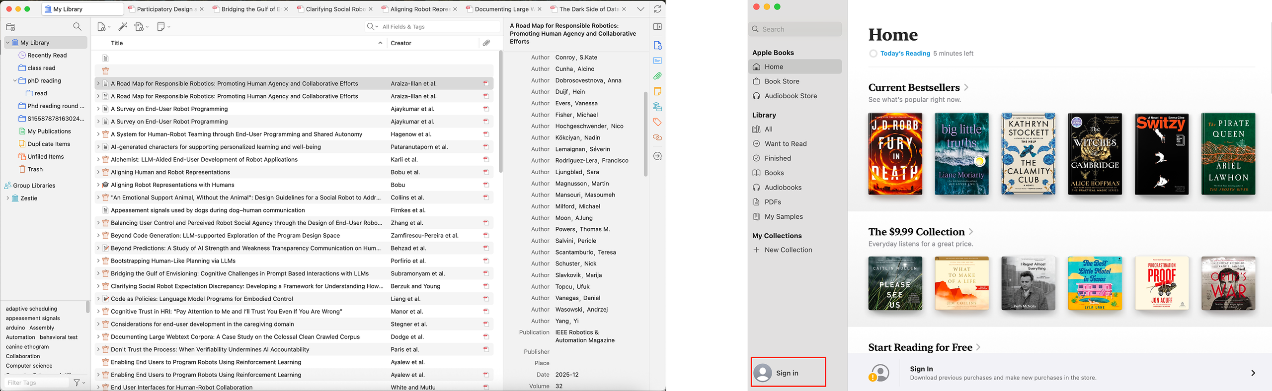
However, for the user’s task of retrieving account information, Zotero fails to bridge the gulf of execution. There is no visible and clear path to this goal. This stems from the misalignment between the designed layout and the user’s conceptual model formed from using similar apps. Users may form a rough plan of finding a signifier indicating profile-management actions, such as a profile icon with a username (see Figure 2 comparison), and expect to go from there. In Zotero, this kind of signifier is entirely missing, leading to poor discoverability of such affordances. The user has to rely on knowledge in the head, memorizing the whole flow step by step or recalling from past experience, which isn’t always reliable.
Dropdown Menu
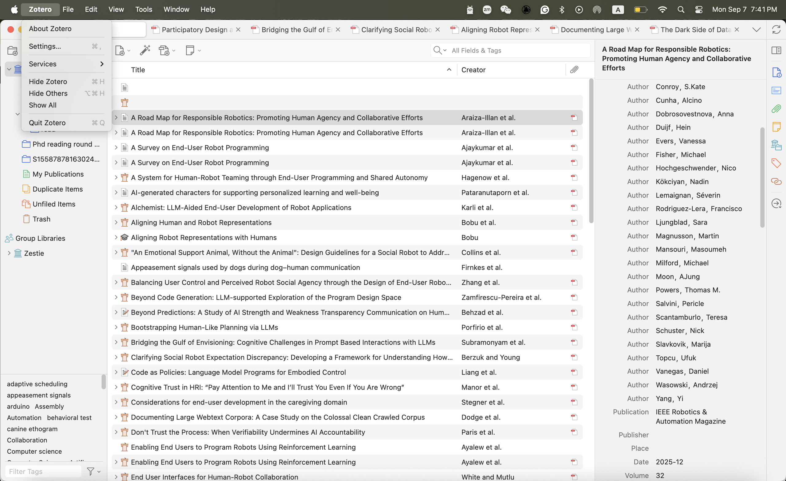
The designed first action is to click on “Zotero” on the macOS toolbar to open the drop-down menu (Figure 3), which, again, may be misaligned with the user’s conceptual model. In most conventions, the items in the system toolbar usually afford the actions of configuring the entire app, such as quitting the app or reviewing the service statement. Grouping account-level affordances with system-level ones may result in a mapping issue. The user could be unsure about whether their action will affect the entire app (e.g., quitting the app) or just their account, leading to the risk of slips.
The Gulf of Evaluation
Although highlighting the app name and opening a dropdown menu provide strong feedback for the user’s click, they don’t offer evaluative feedback on whether the user took the right action to move closer to their goal (Figure 4). It fails to bridge the gulf of evaluation because the labels are vague (e.g., settings, services) and may not clearly signal that the user is on the right track to finding their account information. In other words, users have to guess whether clicking on service or settings will bring them to account information.
Overlay Screen – General
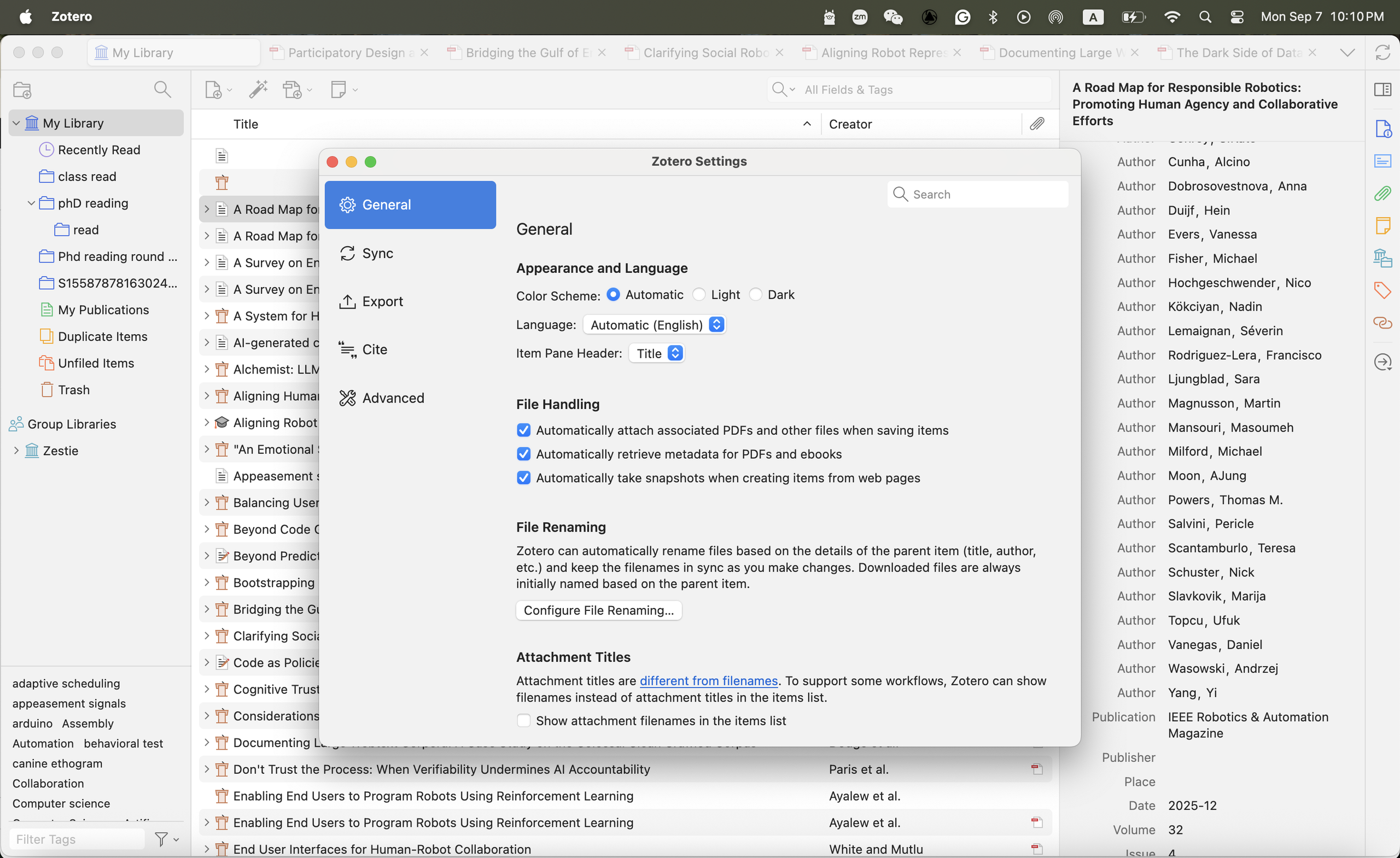
Once the user finds out that the correct next step is to click Settings, they will land on an overlay screen that defaults to “General” (Figure 4). This screen also widens the gulf of evaluation by compounding mapping and discoverability issues. None of those labels on the left sidebar clearly signal the affordance of retrieving account information.
Overlay Screen – Sync
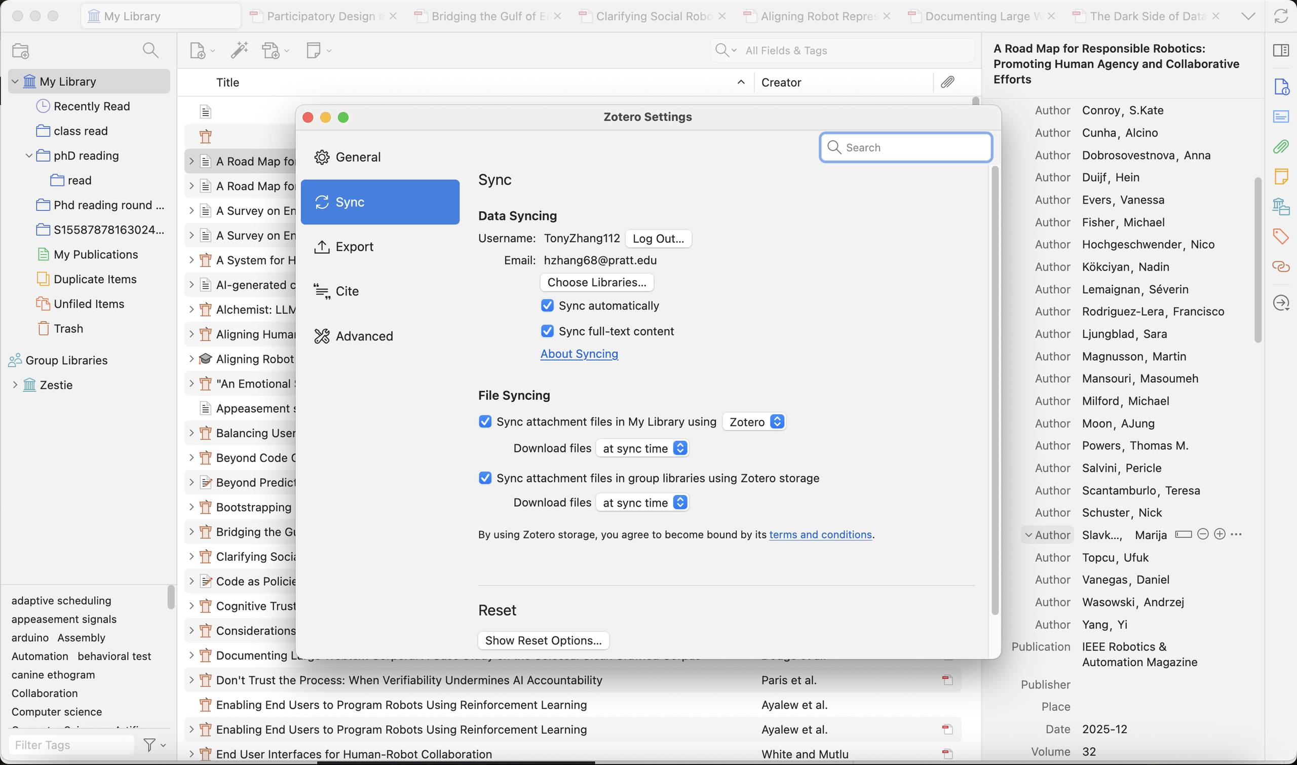
The user cannot use the knowledge in the world to infer the next action, but instead has to rely on the knowledge in the head to memorize that they can find their account information under the “sync” tab (Figure 5). In addition, mapping account information under “sync” also violates the user’s conceptual model, as the term is more commonly associated with data storage and synchronization than with identity or account management.
Design Recommendation
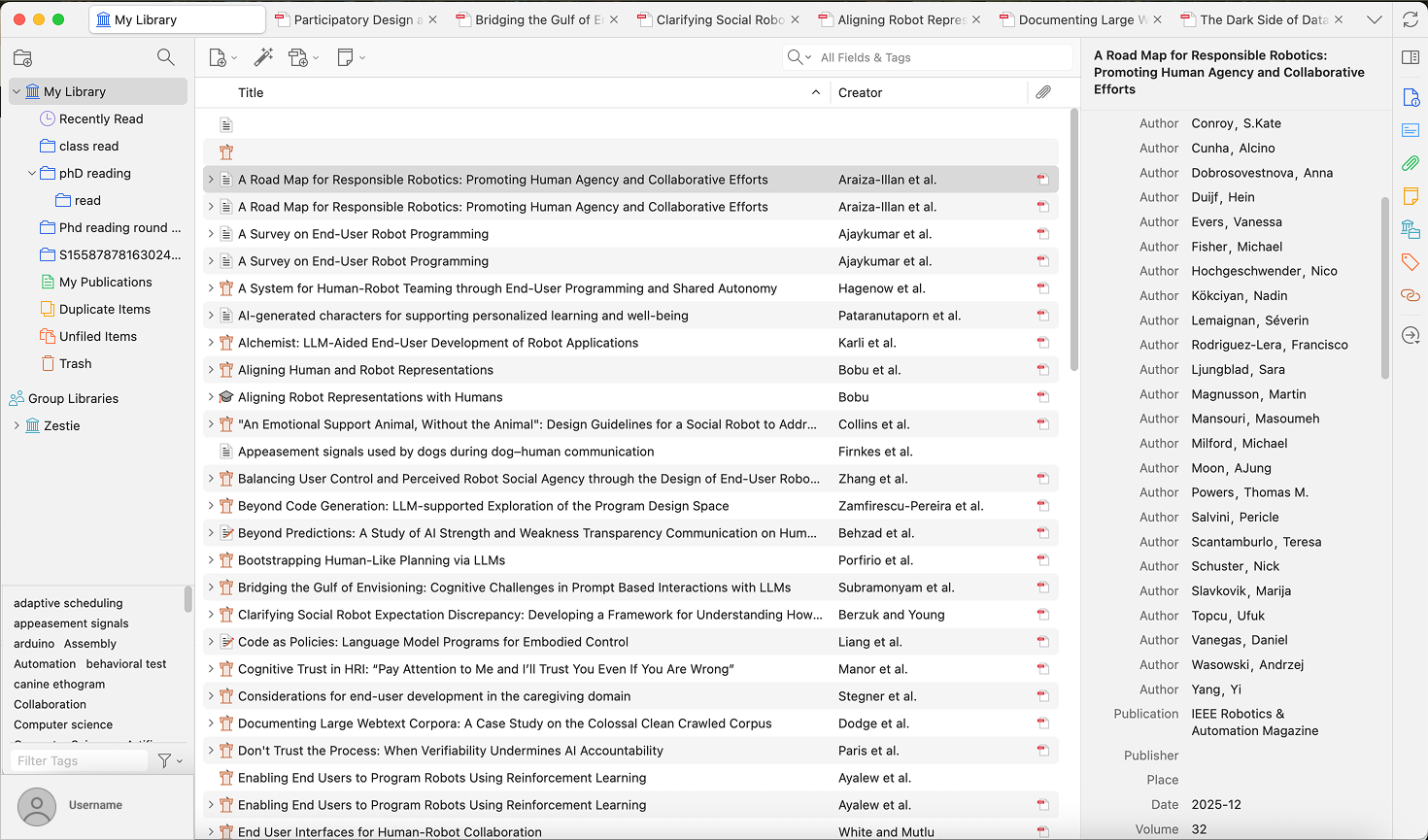
This usability issue can be mitigated through a relatively minimal design: Adding a profile tab with a username in the bottom-left corner. This addition generally fits the existing convention of design for text-reading apps and can offer strong discoverability immediately.
In Conclusion
Zotero provides a very accessible platform for researchers to manage their reference sources. The navigation processes for adding, opening, and annotating PDFs are relatively intuitive. However, the workflow for managing account information still has room for usability improvements. The addition of a profile signifier could bridge the gulf of execution by improving discoverability, but further tests are needed.