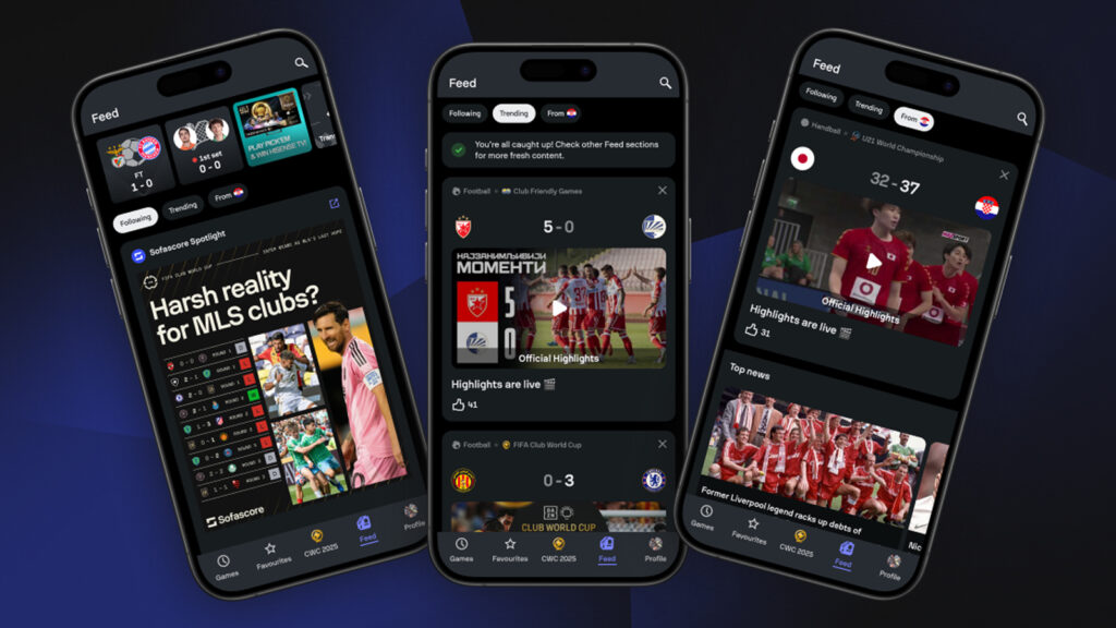
Sofascore is an app offering detailed graphical statistics for athletes and teams, along with live, upcoming, and finished scores across more than 25 sports. Its most famous feature is the Sofascore rating: during a match, an algorithm assigns each athlete a score from 1 (lowest) to 10 (highest) based on performance. As of June 2026, it has 35 million active users.
Conceptual Model
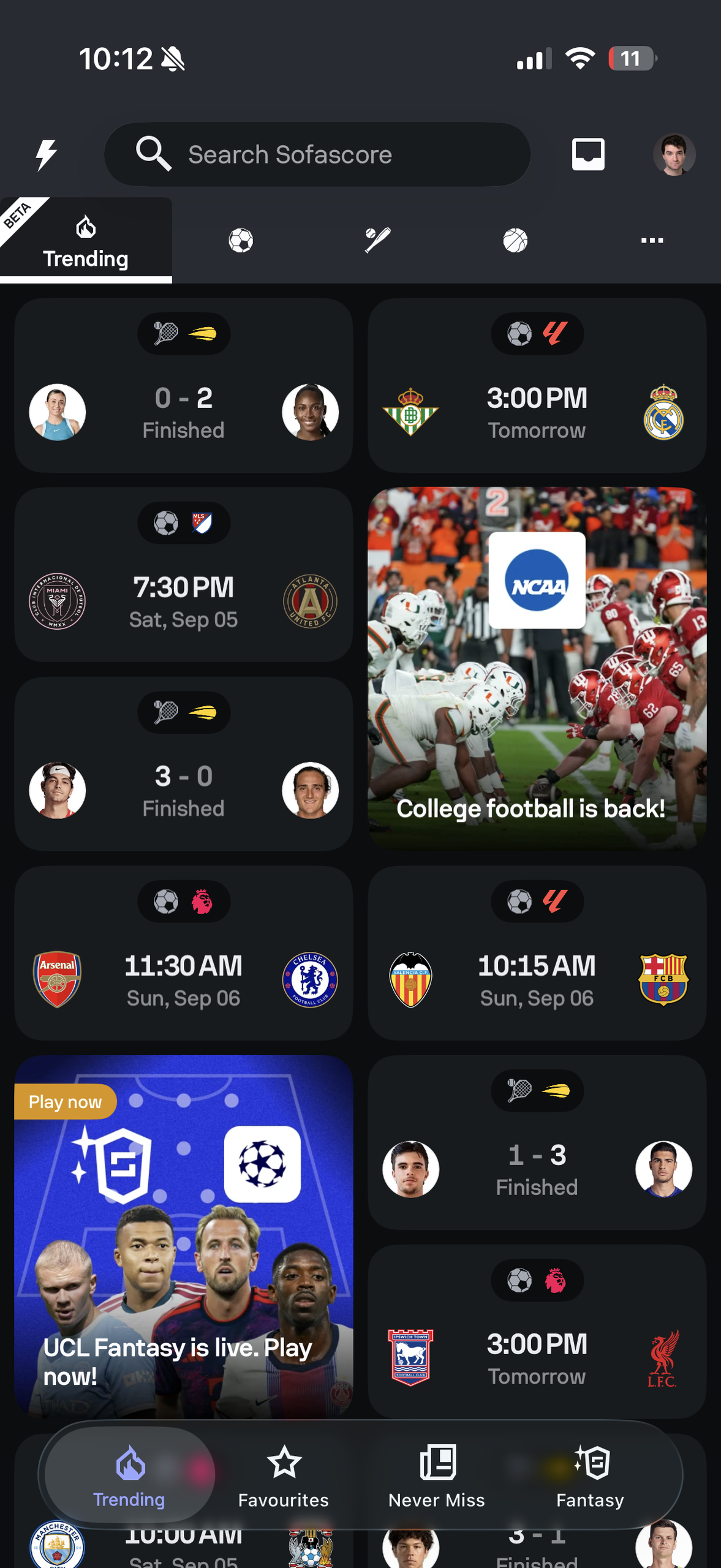
Immediately, what appears on the first screen does not fulfill a conceptual model for the user. Sofascore intends to provide match scores and statistics, ideally in a personalized way. A user opening the app would logically expect this in some form. As of September 2026, the first page has a grid that, in no particular order, has scores with dates, times, team logos, advertisements, etc. An organized layout would solve this issue. It could be sorted by date, time, and sport. Instead of having ads interspersed among the scores, they could be separated and grouped together in a row at the top or bottom of the page.
Affordances and Signifiers
Noticeable affordances are limited. While it is clear that sports scores are on the page, it is unclear whether they appear elsewhere in the app. Or what, if anything, appears in addition to scores. Under the search bar, the page includes a row of icons that represent sports: a soccer ball, a baseball bat, a basketball, and an ellipsis. The meaning of the ellipsis is unclear. For a new user, this can mean anything. It could lead to giving an additional selection of sports, a new unrelated page within the app, an external page outside of the app, etc. Aside from the ellipsis, these serve as appropriate signifiers, indicating that tapping an icon will likely bring up a related page. To fix the ellipsis issue, a label reading “more sports” would be effective.
Constraints
However, a drawback of this is the cultural constraints. Icons representing different types of sports, with no clear labeling attached, rely on the expectation that sports and their associated symbols are known and understood worldwide and across cultures. Similar to the ellipsis scenario, a logical approach would be to add small text labels attached to the icons to clarify their meaning for users worldwide. For example, “Baseball” would be attached to the baseball bat icon.
Feedback
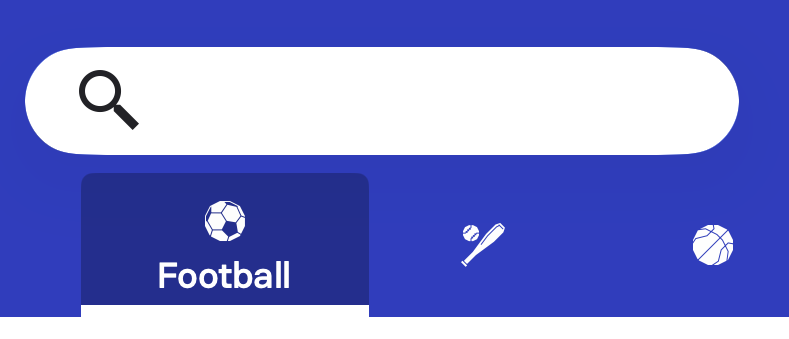
Relatedly, feedback is appropriate and satisfying when users tap individual icons. When tapped, the icons below the search bar enlarge, become underlined in bold white, and text with the name of the sport each icon represents appears. This is effective, as it closes the gulf of evaluation by confirming the tap and clarifying which sport the icon represents. Additionally, tapping the icons leads to their related pages. If the name text appeared at all times, regardless of feedback, this would fulfill the recommendation intended to address the cultural constraints.
Knowledge in the Head vs. Knowledge in the World
Meanwhile, before feedback, it is unclear where those icons lead, and users need knowledge in the head to understand which sports the icons represent. The page provides a degree knowledge in the world, including scores, times, and match dates.
Tradeoff
This translates to a tradeoff. An approach with minimal text and simple icons may benefit an experienced user. That user can open the app and, with some knowledge in the head, quickly find what they need with a small gulf of execution and clear next steps. If the user needs to find a baseball score, they would logically tap the baseball bat icon. However, this minimal approach does not benefit new users or users who lack knowledge in the head needed to fully understand the icons. The learning curve is there for them, not the experienced user. A potential bridge would be an option in a settings page that toggles between an “Icon only” view and an “icon with text” view. This could satisfy both new and existing users.