I have used Pokémon GO to catch Pokémon, complete Research tasks, manage my Pokémon, and explore different locations while walking around. Because the game combines a real-world map with menus, icons, animations, and different gameplay systems, its interface needs to communicate a large amount of information without becoming overwhelming. Pokémon GO succeeds at making its core gameplay easy to understand, but certain interface elements create opportunities for confusion. Looking at the game through Don Norman’s The Design of Everyday Things and Nielsen’s usability heuristics reveals both effective and problematic design decisions.
The Bottom Navigation
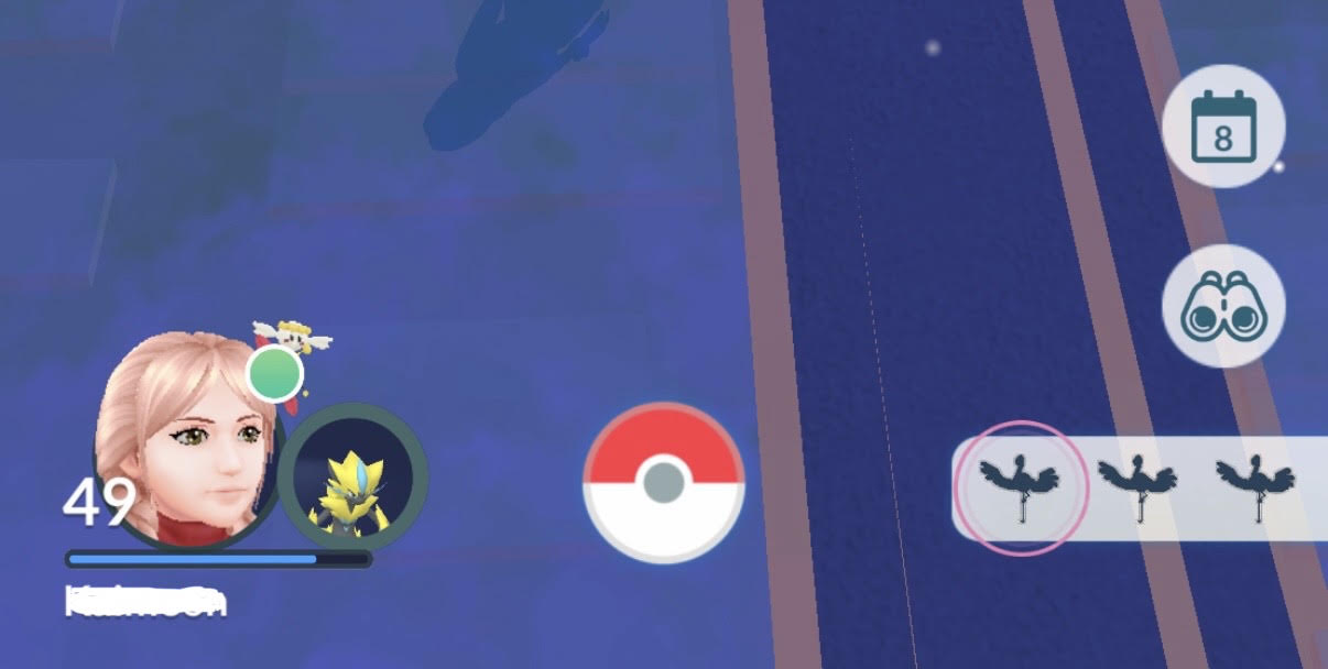
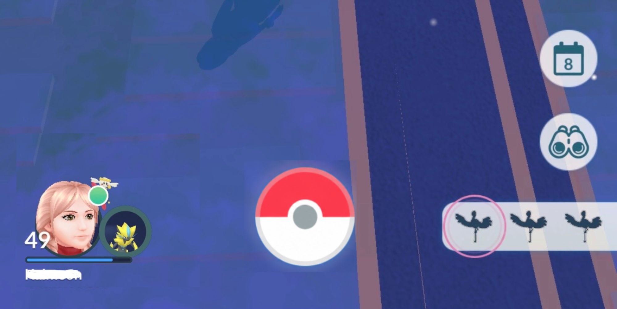
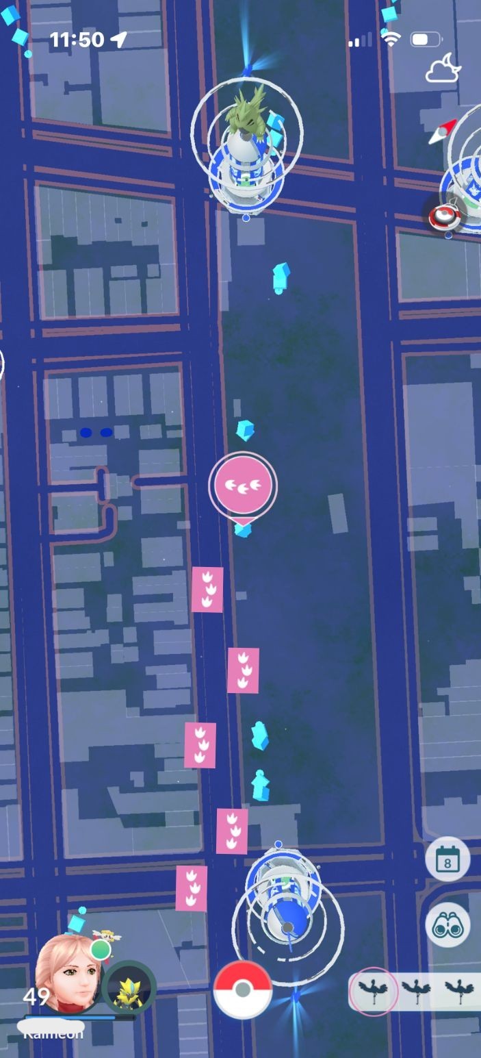
The bottom navigation on the main map creates a confusing visual hierarchy. The player’s avatar on the left is much larger and more visually detailed than the Poké Ball in the center. The avatar includes the character, level, Buddy Pokémon, and other information, immediately drawing attention. However, the Poké Ball serves as the Main Menu, providing access to settings, the Pokédex, Item Bag, shop, Battle menu, and Pokémon inventory.
The difference in visual prominence creates a weaker signifier for the Poké Ball’s navigational role. Its recognizable shape communicates that it is interactive, but its smaller size makes its importance less immediately apparent. This affects discoverability and relates to Nielsen’s Recognition Rather Than Recall, since important actions should be recognizable from the interface rather than requiring users to remember where they are located.
A specific improvement would be to slightly increase the visual prominence of the Poké Ball or reduce the amount of information surrounding the avatar. This would create a clearer hierarchy and strengthen the Poké Ball’s signifier.
Catching Pokémon
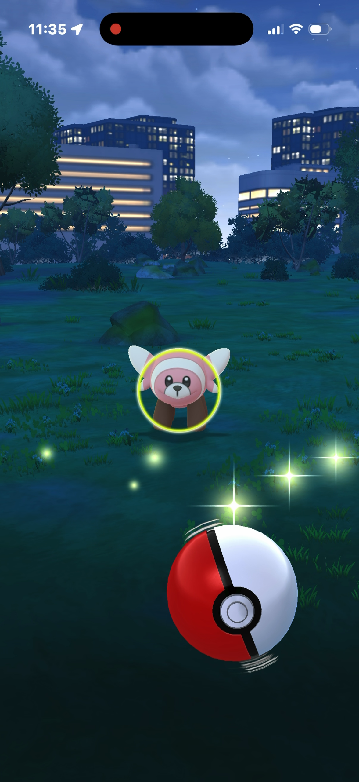
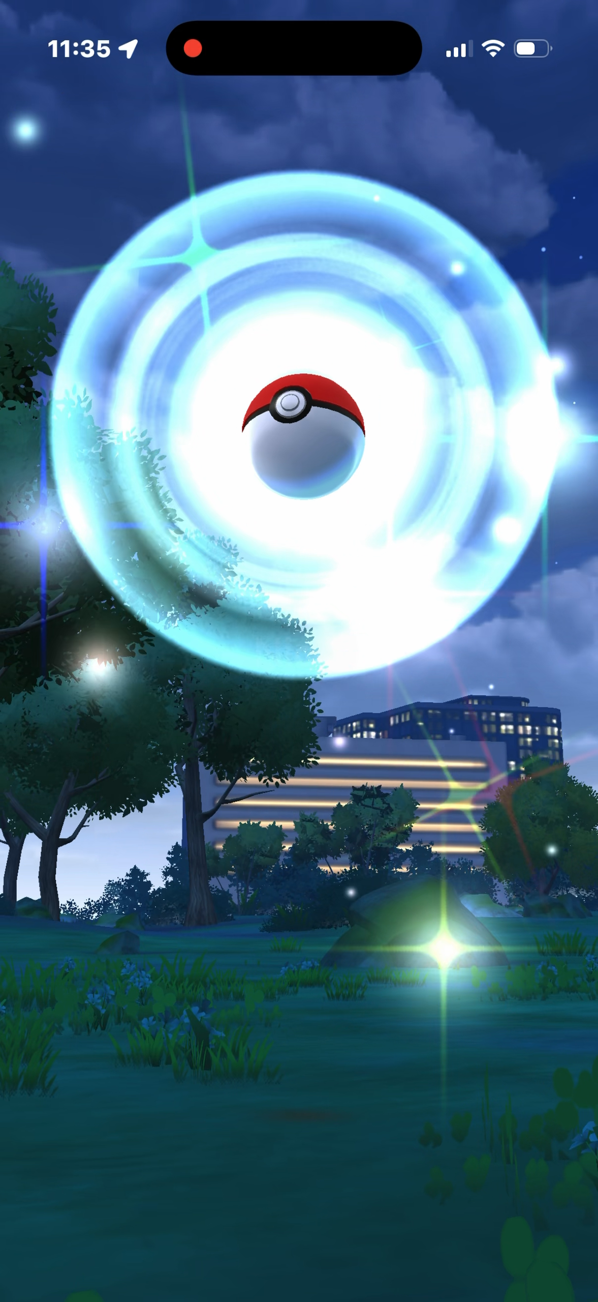
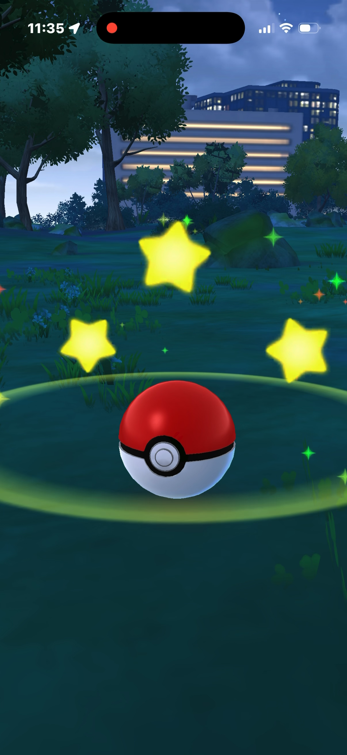
The Pokémon-catching interaction has a clear mapping between the Poké Ball and the Pokémon, but the actual throwing mechanic is not immediately obvious to a first-time user. A player might initially assume that swiping the Poké Ball straight toward the Pokémon will throw it directly. However, the ball needs to be spun first and then swiped in a curved motion to perform a curveball. This creates a gap between the user’s expected action and the action the game actually requires. The mechanic is learned through experimentation rather than being immediately communicated by the interface.
The game does provide strong feedback once the ball is thrown. Animations, sounds, vibrations, and the Pokémon’s reactions communicate what happened, but the outcome is not always clear immediately because the player has to wait for the Poké Ball to finish shaking before knowing whether the Pokémon was successfully caught. This makes the Gulf of Evaluation slightly larger, since the player must wait for the system to fully communicate the result. It still follows Nielsen’s Visibility of System Status by providing feedback throughout the interaction, but the final result could be communicated more clearly and quickly.
The interaction therefore creates a conceptual model that becomes simple after learning: spin the ball, curve the throw, and aim toward the Pokémon. However, this model is not necessarily obvious to a first-time player. A small visual cue showing the spinning and curved throwing motion could make the mechanic more discoverable without requiring players to learn it through trial and error.
Nearby Menu
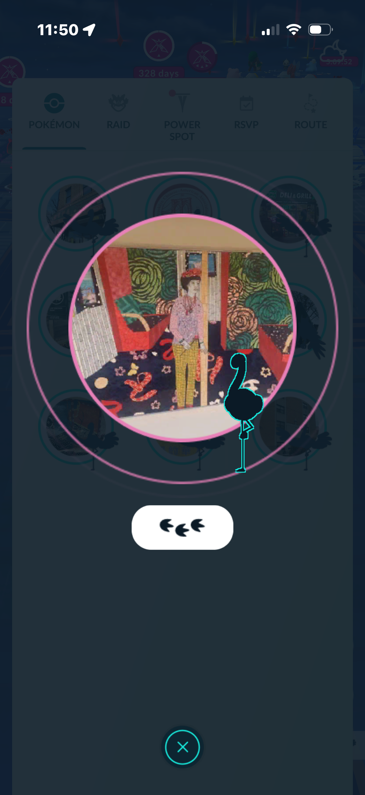
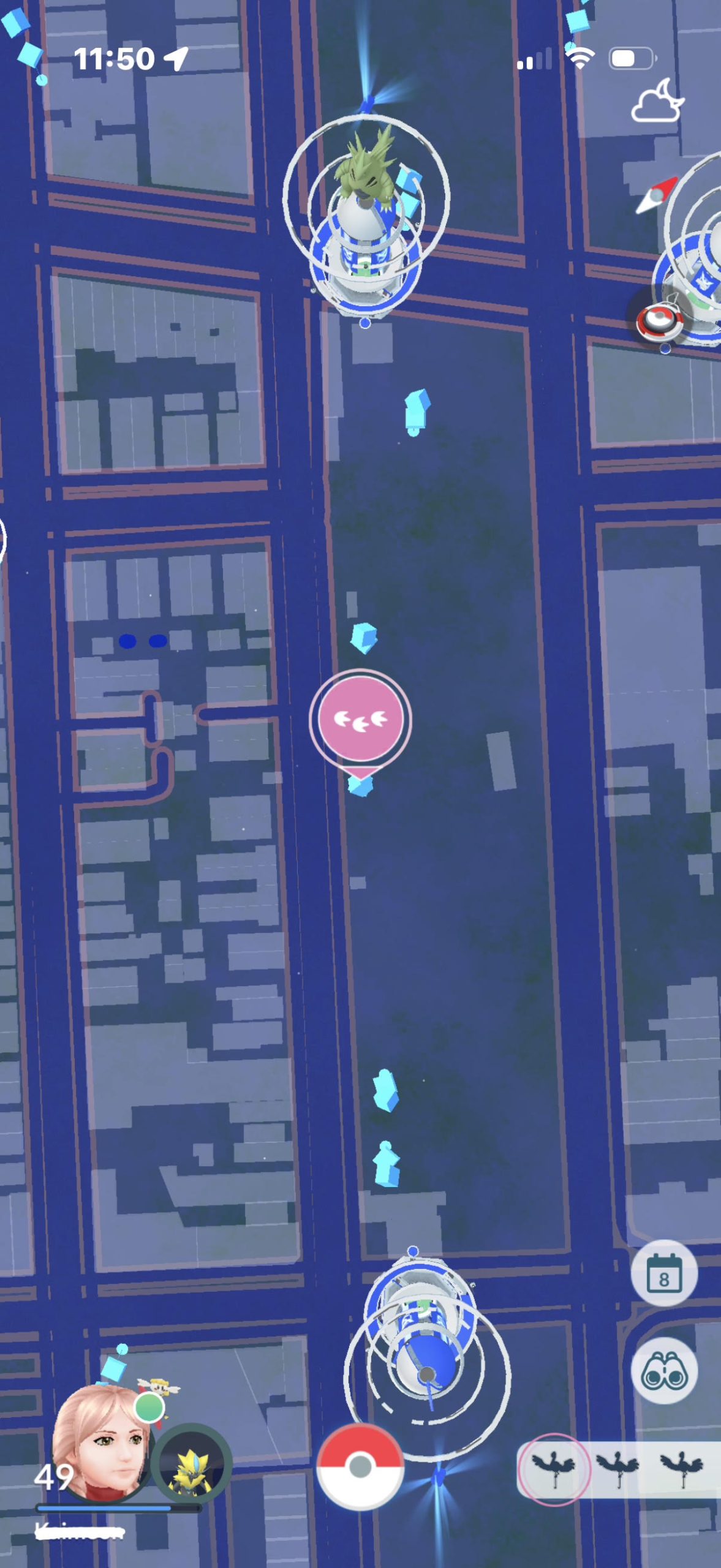
The Nearby Menu is useful for finding Pokémon, but the process of locating one is less direct. The menu shows Pokémon that are nearby, but a player who wants to find a specific Pokémon must select it, view the associated PokéStop PhotoDisc, and then use the Footprint button to reveal the PokéStop’s location on the map, which only pans over for a few seconds.
This creates a larger Gulf of Execution because the player’s goal is simply “find this Pokémon,” while the interface requires several intermediate actions to reach its location. The system’s mapping between the desired goal and the available control is therefore less direct than the catching interaction.
It also relates to Nielsen’s Match Between the System and the Real World. A player looking for something nearby would naturally expect the interface to show its location as directly as possible.
A specific improvement would be to add a visual walking path from the player’s current location to the PokéStop where the Pokémon was detected. Instead of only highlighting the location and requiring the player to find it themselves, the map could display a path or series of footsteps showing the direction to walk. This would reduce the Gulf of Execution by connecting the user’s goal of finding a Pokémon directly to the action needed to reach it. It would also make the relationship between “nearby Pokémon” and “where to find it” easier to understand.
Conclusion
Pokémon GO demonstrates how an interface can make its core interactions engaging and easy to learn while still creating usability challenges. Its strongest designs use mapping, feedback, affordances, signifiers, and a clear conceptual model to support the catching experience. At the same time, the interface can create issues with visual hierarchy, discoverability, and the Gulf of Execution, particularly when navigating the main screen or finding specific Pokémon. Applying Norman’s concepts alongside Nielsen’s usability heuristics shows that effective game design is not only about making interactions engaging, but also about making actions easy to recognize, understand, and complete.