
About Vinted
Vinted is an online secondhand market that allows people to buy and sell things such as clothes, shoes, bags, electronics, and more. Users can buy items or sell items that they no longer want. It runs as both a website and mobile app. For this critique I will only be focusing on the mobile app.
Navigation:
The navigation tab on the bottom includes important functions for both selling and buying. It has good discoverability especially since the tabs are written out in text along with the icons. For example “Home” has a house icon and the plus sign has “Sell.” This minimizes the chance of confusing people if it only had icons and no text.
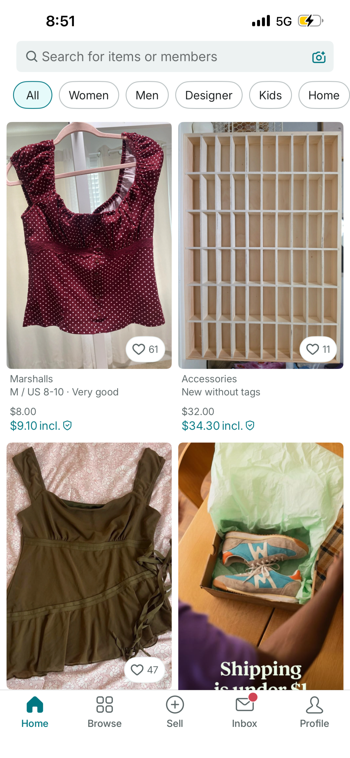
Home
Listings:
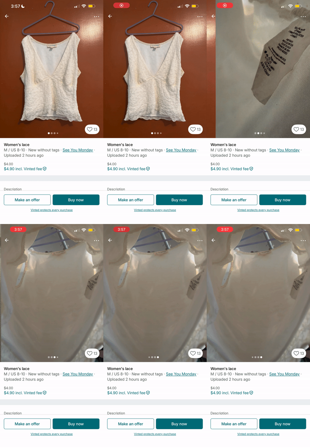
The images of listings have good mapping. On the button of the images, there are dots that indicate how many images there are. On the behavioral level it also plays well into people’s expectations, when you swipe right the dot moves to the right and vice versa. When you’ve come to the end of the image carousel, not only does it show that there aren’t any more dots, it also puts a constraint on the swipe itself. Users are unable to swipe when they’ve come to the end of the carousel.
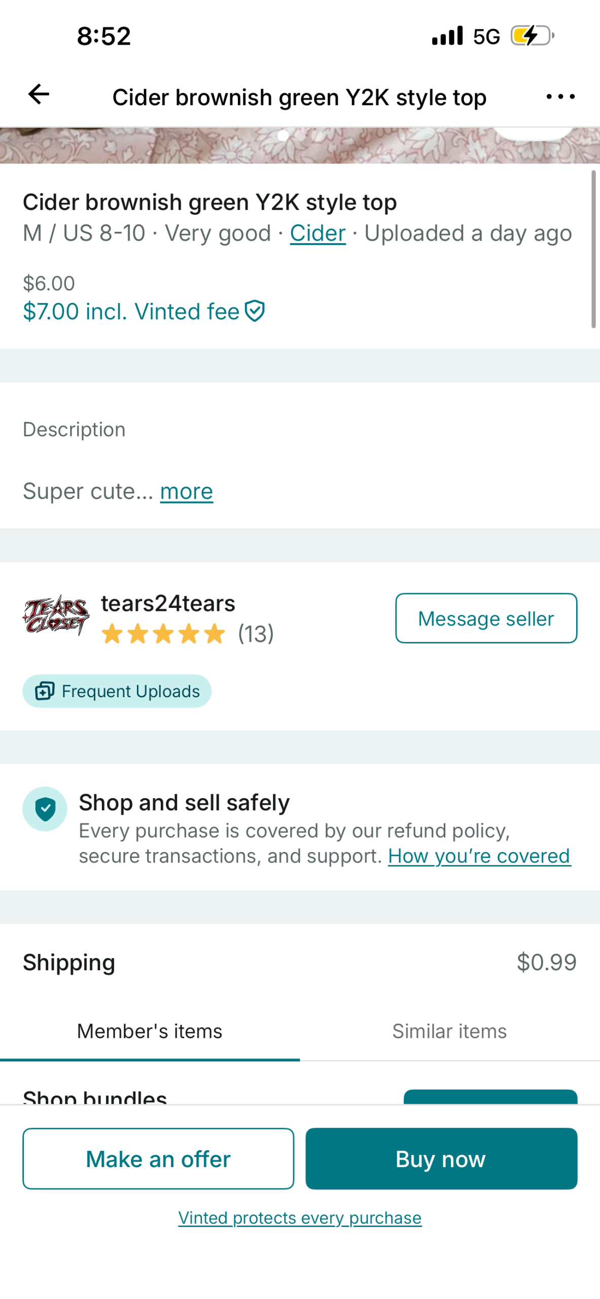
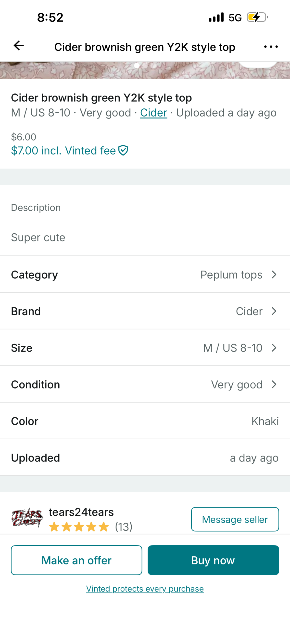
The categories in the description section can be accessed with users clicking on “…more.” It’s straightforward because it’s fairly easy to spot with the hyperlink styling and different coloring. However, once users click to expand the description, they cannot hide it anymore. This doesn’t align with people’s mental model of being able to “read more” and “read less” with online texts that are long. Additionally if users accidentally click “…more” there is no way to undo that action unless they go back to Home and click back into that listing.
Browse
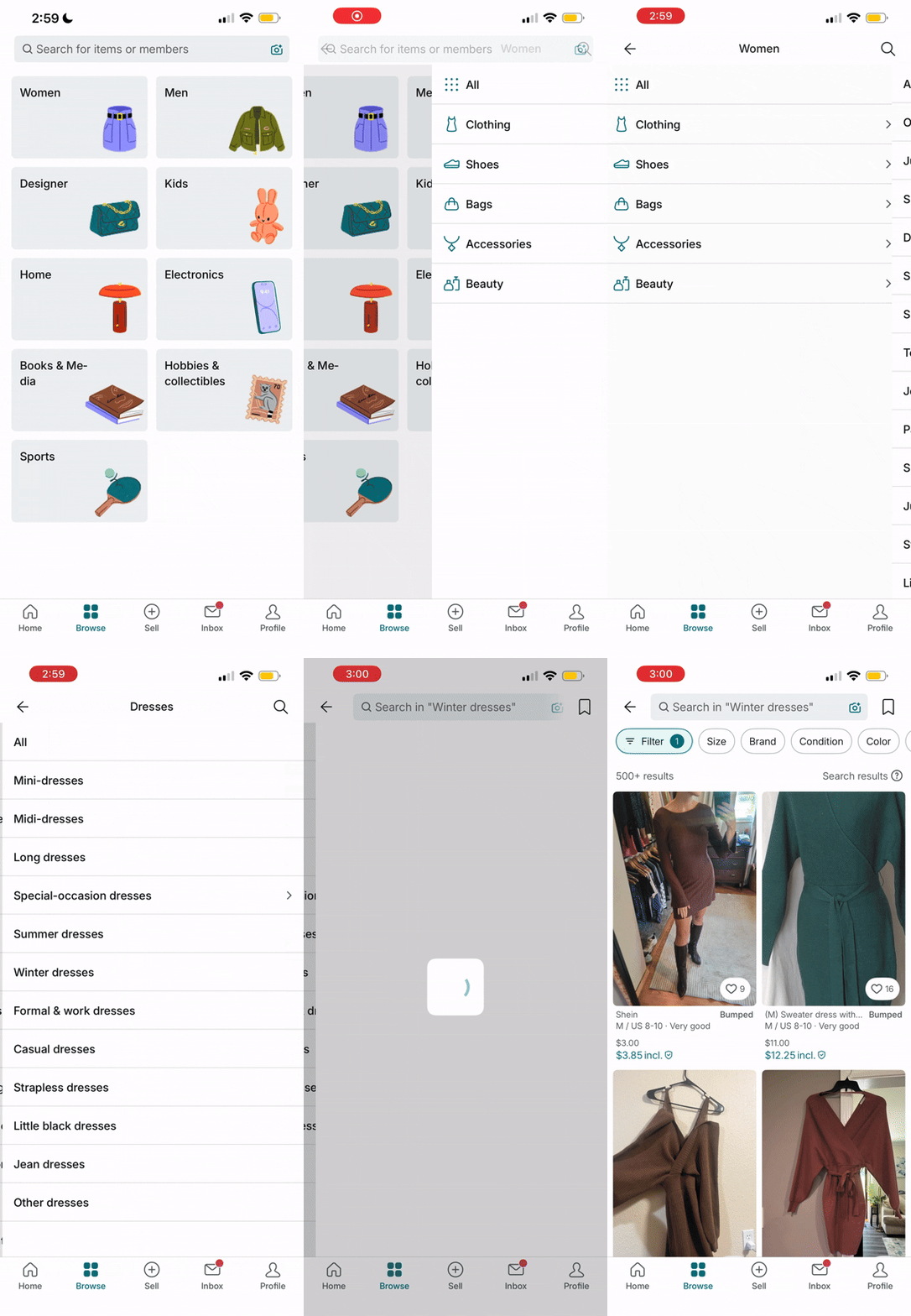
The Browse section allows users to discover items based on categories. I think it’s redundant with the Home page. On Home there is a search button where users can simply search for what they want. The browsing experience doesn’t really feel like browsing. I expected pictures of listings, but instead I was greeted with a lot of text. It relies on users needing to know what they are looking for in the first place. If anything, Home gives more of a browsing experience. I think they could add the Browse feature into the Home page as a separate tab. Instead of text, they could benefit by adding images to the text or make it similar to the Homepage where it shows a bunch of listings.
Sell
The Sell feature is similar to a lot of other selling platforms. In terms of learning how to use this feature, it’s fairly simple because sellers typically already have some knowledge in the world of how this process works.
There are some things that could potentially make it a smoother.
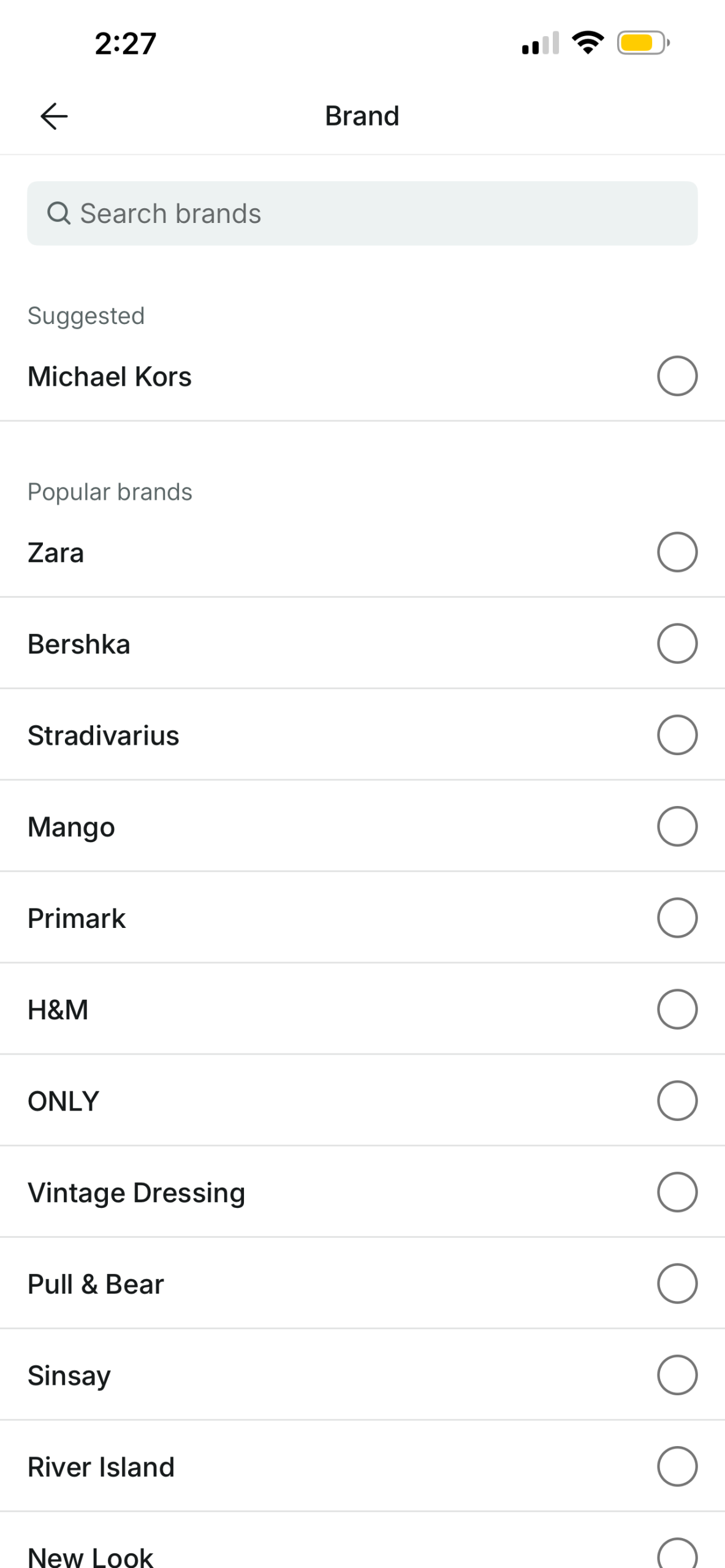
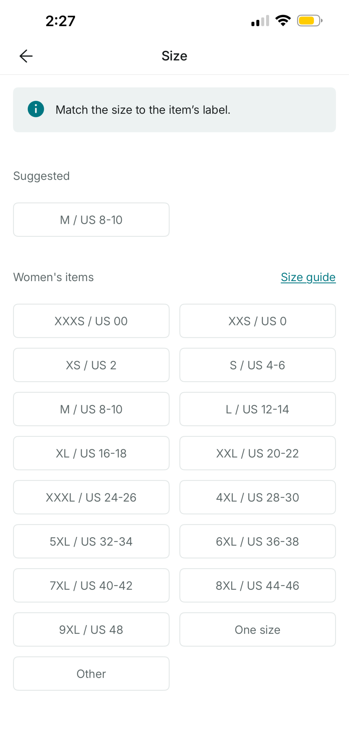
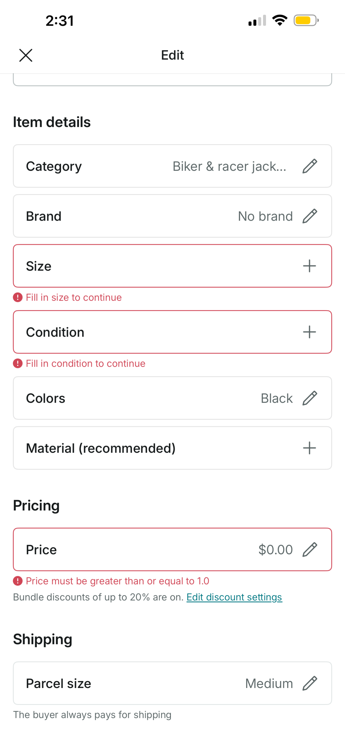
What is great about Vinted is that if you provide a detailed enough description of the items, the Item Details like Category and Material will suggest options that match the description when you click into it. However you still have to select the actual choice. It would be better if it was auto-filled and sellers only need to click into what information is inaccurate because the suggested choices are usually correct. With less clicks, this would speed up the uploading process significantly especially if sellers are uploading 10+ items at once.
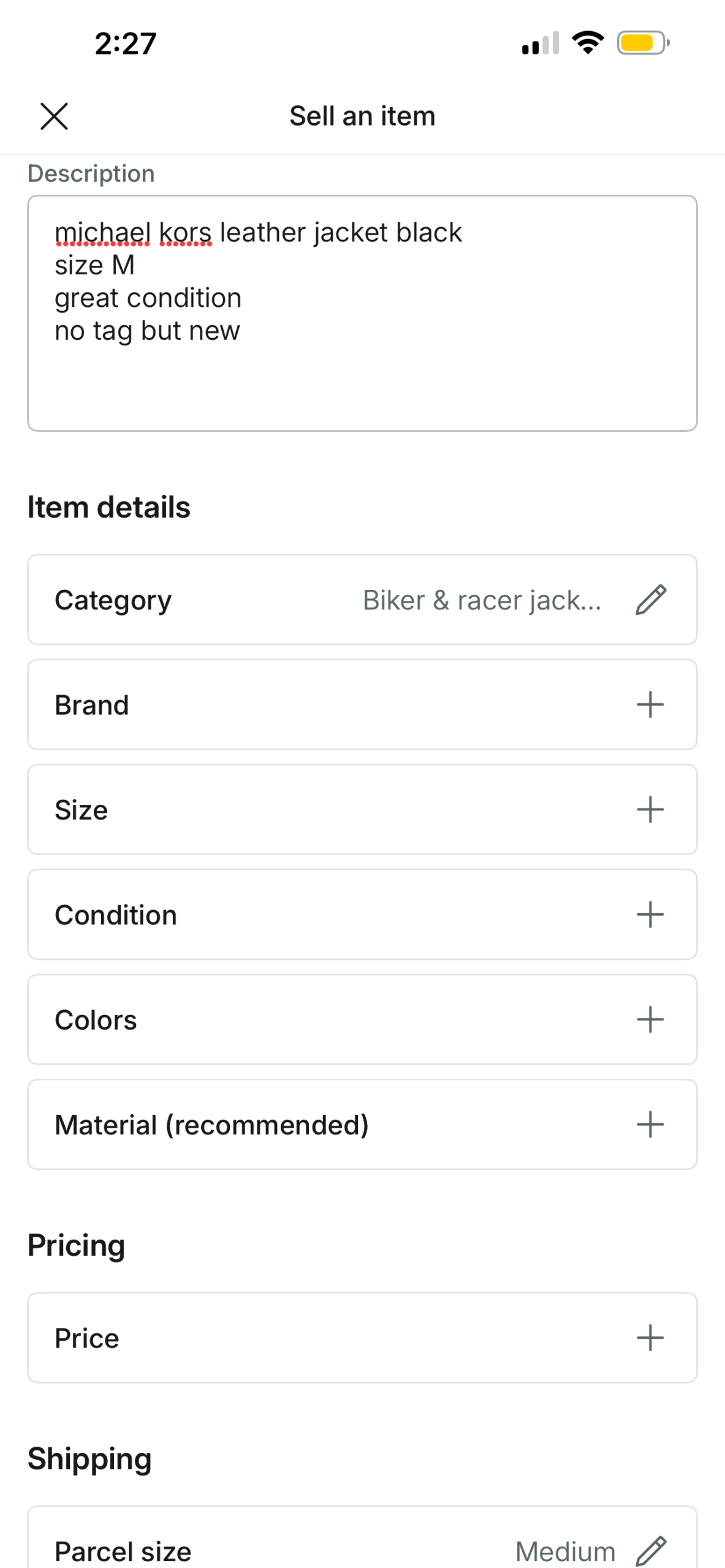
Lastly, there are constraints on when you’re able to upload a listing. It’s required for users to fill out all information but there is no way to know this until you attempt to upload with a half-filled listing. Then there are error messages that show you what is required. While the error messages are good feedback, a simpler way to show this could be to add an asterisk to required fields as a signifier. This would shorten the Gulf of Evaluation by helping the user perceive this requirement earlier on.
Inbox
Notifications are embedded in the Inbox tab, but signifiers make it easy to find because of the red notification dot. An animation plays emphasizing how many notifications there are which draws attention to that spot when you first open the app.
Unfortunately the Inbox section feels very cluttered. Every offer I send to potential customers shows up as their own message block. This makes it hard to differentiate between actual messages and messages that are only offers. On Vinted, 80% of the time potential buyers never respond to the offer, so it’s not that important of a message.
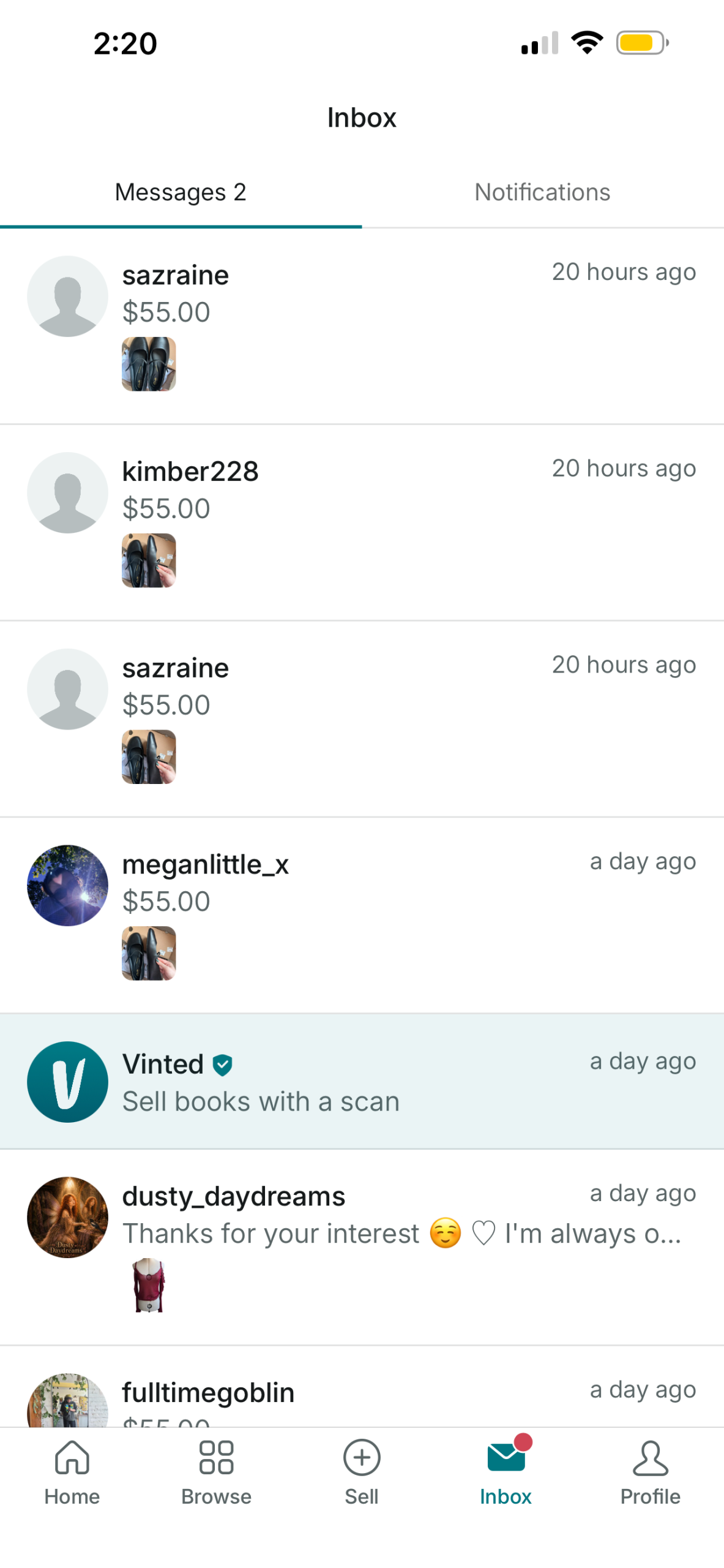
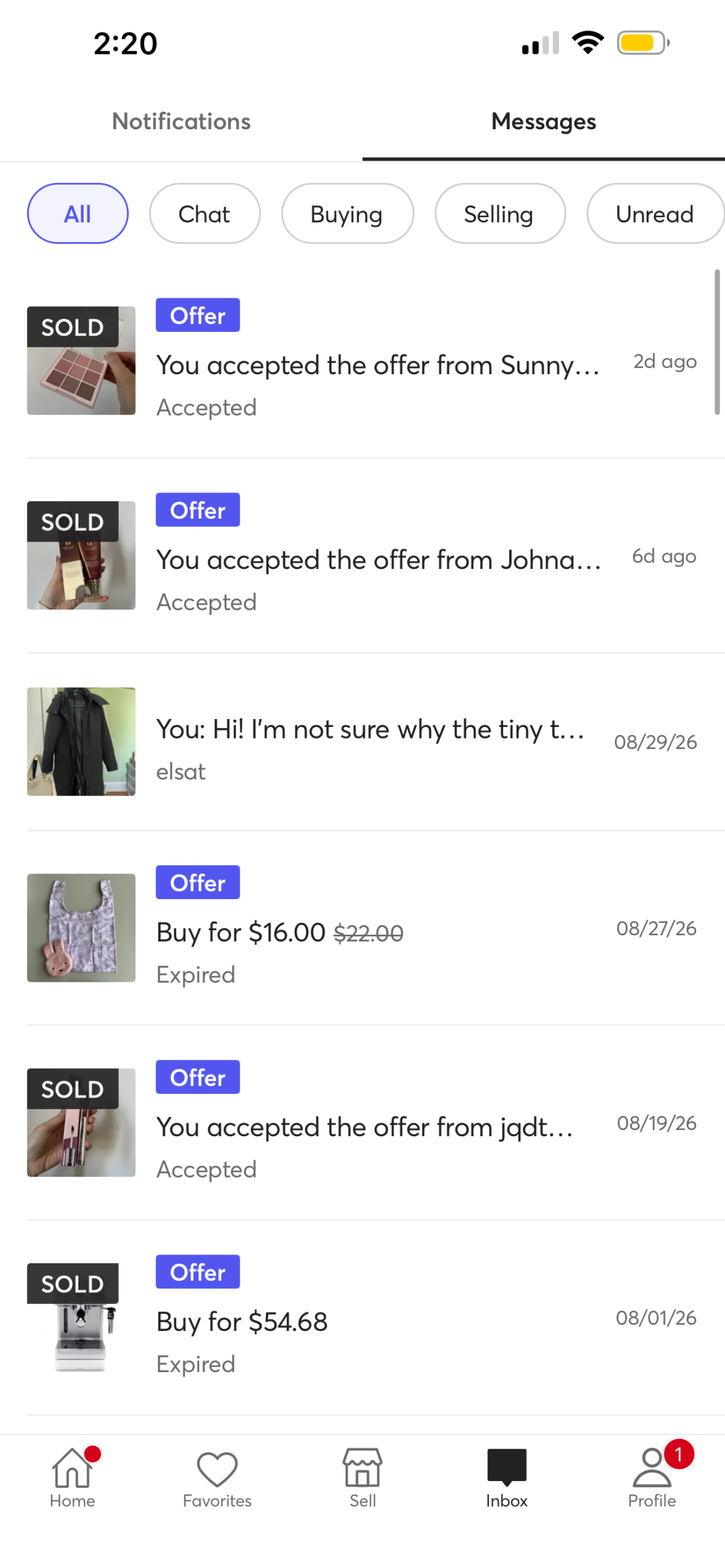
They could group together all messages that contain only offers in its own tab inside Inbox, or they could also tag the messages with “Offer” like Mercari (another secondhand online marketplace). This would make it easier to differentiate at a glance.
Profile
On the Profile page it’s very difficult to find my listings mostly because it’s written in a lighter color right underneath my username. I expected it to be its own separate tab similar to other selling apps like eBay or Mercari. Both of these apps label the listings section as “Selling” whereas Vinted labels it “View my listings.” Naming it “Selling” feels more intuitive for sellers.
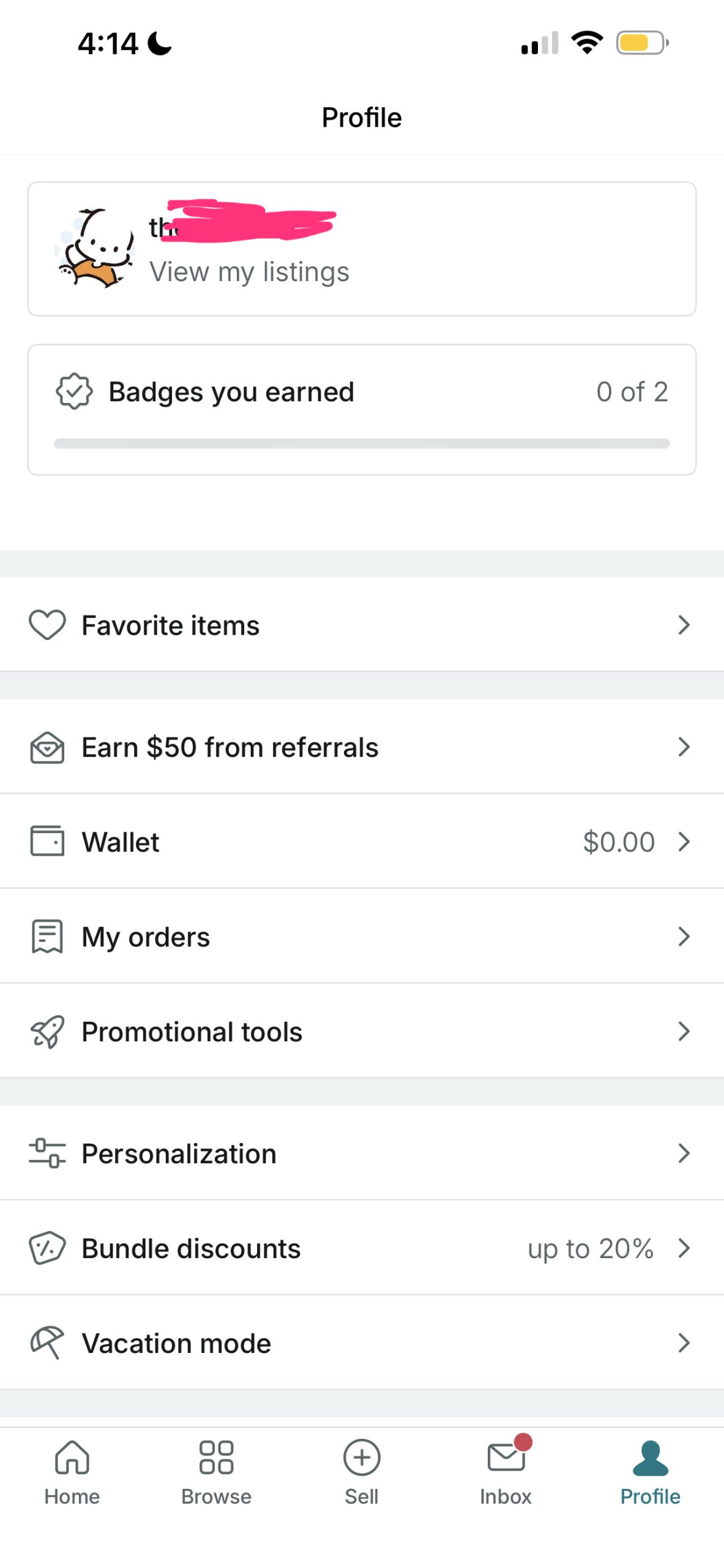
Even though Vinted has all of the items in Profile as icons with text, it’s still difficult to look for specific information. They group certain items together by using a wider gray space in-between but all the functions still look as if they have the same importance and hierarchy. They could benefit by adding headlines to these groups. Currently it’s hard to tell how they grouped it or their logic behind why they grouped these specific sections together. This is the main reason why I have a hard time finding my own listings despite doing it multiple times over a course of a couple weeks. I still find myself re-learning how to do this. It really disrupts the Gulf of Execution because I cannot even find what I need to execute the simple action of finding my listings. It creates a frustrating experience.
Compared to Mercari I never had any trouble finding it. Mercari uses different layouts and colors to differentiate information on their Profile page.
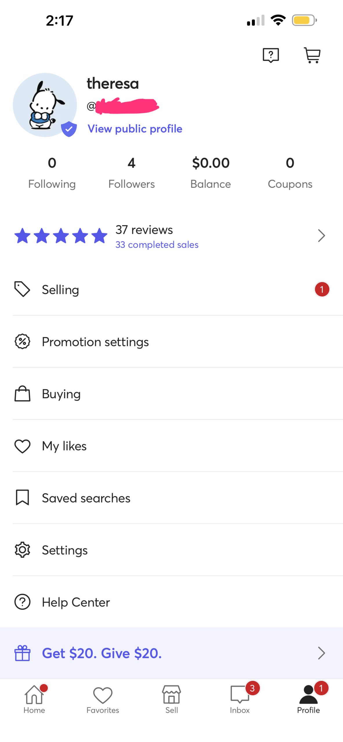
Vinted could group the information by Seller and Buyer. For example “Wallet,” “Selling,” and “Bundle Discounts” can go under Seller and “Favorite Items,” “Personalization,” and “My orders” can go under Buyer. Some miscellaneous items can go under another section called More or Settings.
Conclusion
Vinted is great secondhand online market. The mobile app is easy enough for both sellers and buyers to use. However, improving on the browsing experience and certain functions, such as better message groupings and prominent listings button, can elevate the user experience by reducing friction and frustrations.