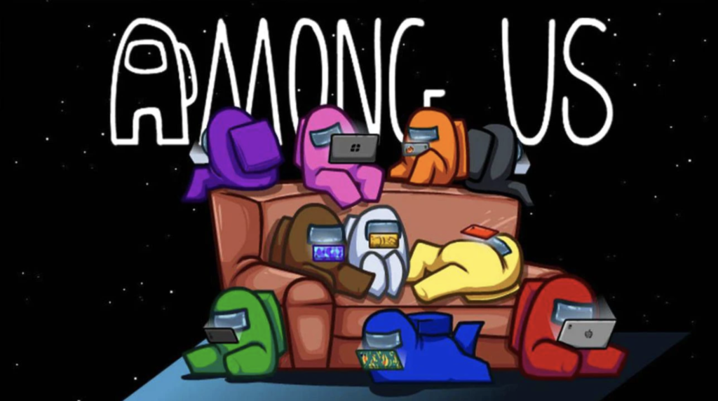
Design Critiques

What makes some designs good and others bad? Why do some designs work while others don’t? Posts in this category offer thoughtful design critiques of modern digital interfaces, with commentary inspired by Don Norman’s “The Design of Everyday Things.”

Design Critique: Co-Star (iPhone App)

Co-Star is a popular astrology app for Gen Z (18-25 in the US) iPhone users, for it’s ability to provide easy to digest birth charts, advice for the day based on your planet transits, and a social aspect to compare and contrast charts with your added friends. (It should be noted that these daily horoscopes have been criticized for promoting negativity in users in the past.)

Design Critique: Co-Star (iPhone App) Read More »

Design Critique: Ebay.com (Desktop Website)

Ebay.com is a US-based e-commerce company where sellers sell and buyers buy both new and used items, such as clothing, accessories, home decor, furniture, electronic equipment, cars, sporting goods, collectibles, and more. This critique will be from the viewpoint of a user shopping for women’s clothing. The Main Homepage The homepage (Figure 1) is loaded

Design Critique: Ebay.com (Desktop Website) Read More »