Assistive Technology: OMNY, MTA’s Contactless Fare Payment System
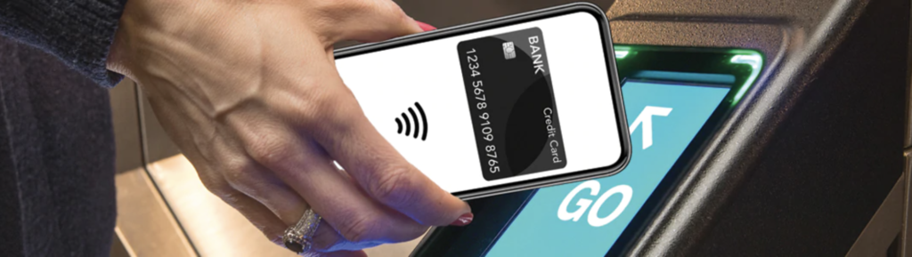
As I go about my daily life, an assistive technology that stands out to me is the MTA’s contactless payment option, OMNY. Through OMNY, passengers riding the subways and Metro busses can pay the fair through a variety of credit and debit cards and devices like cell phones and smartwatches that support contactless payment options.
Assistive Technology: OMNY, MTA’s Contactless Fare Payment System Read More »