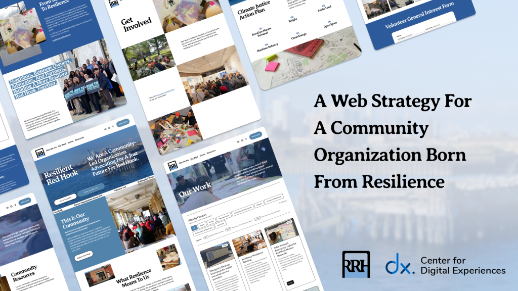
Discovering Gutenberg Technology’s AI Tools

Within eight weeks, my team and I uncovered four severe usability and discoverability problems within Gutenberg Technology’s AI tools utilizing several research methods like eye-tracking studies, retrospective think-alouds, and SUS scores. Overall, the AI tools suffer from low discoverability and a lack of systemic clarity, negatively impacting the overall experience of the platform. Along with the insights, we provided excellent recommendations that will alleviate some of the main pain points that we found.

Discovering Gutenberg Technology’s AI Tools Read More »

Banner for a Pokémon Shuffle design critique blog, featuring the Pokémon Shuffle logo with colorful letters, popular Pokémon characters in the background, and the text 'Design Critique' in bold white font.

Design Critique: Pokémon Shuffle (Mobile App)

Introduction Pokémon Shuffle is a mobile puzzle game where players line up Pokémon icons to battle opponents and progress through levels. It blends casual match-three gameplay with RPG elements like team optimization and collecting Pokémon. The game succeeds in keeping players engaged, but its registration, onboarding, and interface design also reveal notable usability challenges. Registration

Design Critique: Pokémon Shuffle (Mobile App) Read More »

Design Critique: CapCut (Mac App)

Introduction CapCut for Mac is a desktop video editor that aims to make video editing fast and approachable while offering a broad set of features. The experience is sleek and simple, but some design choices create friction around onboarding, visibility, sharing and error recovery especially for new users. Getting Started: Registration & Onboarding
 Right away,

Design Critique: CapCut (Mac App) Read More »

Design Critique: Feeld

INTRO Feeld is a dating and social discovery app designed for people interested in exploring alternative relationship models, including ethical non-monogamy, polyamory, and kink. Unlike traditional dating apps, it emphasizes openness, inclusivity, and curiosity, allowing singles and couples to connect with others who share similar values around relationships and intimacy.  Due to the nature of

Design Critique: Feeld Read More »

Mockup of the Planta app onboarding screen with a green ‘Get Started With Planta’ button, plant care notification, and design critique title with leaf logo

Design Critique: Planta (iOS App)

Picture having a caretaker who knows when your plant needs water, soil, or care when sick. That’s the essence Planta aimed to offer with schedules, reminders, guides, identification, and a light meter. This critique takes a beginner’s view, focusing on adding plants, reminders, and the homepage, using ideas from Don Norman and Jenny Davis. Onboarding

Design Critique: Planta (iOS App) Read More »

Design critique: Hume AI’s Hero Section

Hume AI is a text-to-speech (TTS) product whose primary selling point is its advanced emotional intelligence (EI). Emotion is, after all, the most powerful tool of voice—amplifying meaning, tone, and impact in text. Since achieving natural-sounding TTS has become largely a solved problem, the differences between products in basic voice quality are shrinking (or just

Design critique: Hume AI’s Hero Section Read More »

A person holding a smartphone displaying the Stellarium app, showing constellations against a starry night sky. Large white text on the left reads “Design Critique: Stellarium.

Design Critique: Stellarium (iOS App)

Stellarium is a mobile planetarium app that allows users to explore the night sky in real time. By pointing their device upward, they can identify stars, planets, and constellations through a realistic visualization. The experience feels immersive and inspiring, but certain design choices introduce challenges around discoverability and ease of use, particularly for beginners. Onboarding

Design Critique: Stellarium (iOS App) Read More »