
Founded in 1998, OpenTable is a web service that allows users to book restaurant reservations online. Through their website and mobile app, users can view restaurant menus, reviews, photos and earn reward points through using the platform to make reservations. Based in San Francisco, this free service has expanded to include restaurants throughout the United States and now offers its services globally in countries such as Canada, Mexico, Japan and the United Kingdom. This post will critique the design of OpenTable’s mobile application.
Home Screen:
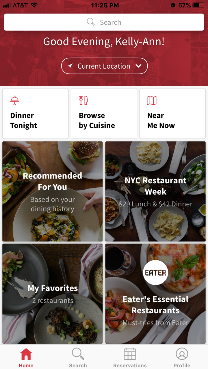
When the user opens OpenTable’s mobile app, they are taken to the home screen, to a greeting message and multiple signifiers providing discoverability. The four buttons at the bottom are each labeled with text and images providing the user with two signifiers for each icon. The decision to only have four icons to navigate allows for easy usability. These selections are easy for the user to memorize, allowing effective navigation through the app. If the user is on a specific screen the color of the navigation icon changes from grey to red. This signifier provides the users with feedback that illustrates what page is being viewed.
On the home screen, the option to search is placed in two locations: at the top of the screen and at the bottom, as one of the main navigation icons. This leads to more discoverability for the user. The bar is labeled “search” and has an image. The user is aware that they can perform an action within the search box to get a form of feedback. Once the user taps inside the search box, the app automatically redirects them to a page where the user can search by food type or restaurant name.
OpenTable also provides buttons labeled “Recommended for You” and “Near Me Now” where they provide compilation lists of restaurants fitting these specific descriptions. By doing this OpenTable reduces the time the user would spend searching for a restaurant with these characteristics. This design feature is an example of great user experience. It provide discoverability while engaging the user in a fun, exciting way. Designing a feature that provides recommendations leads to an emotional connection with the user.
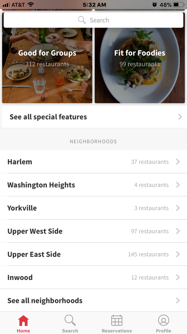
The home screen does contain one design issue. There are no signifiers informing the user that the page can scroll up and down, leading to other features such as searching by other compilation lists, cuisines, and neighborhoods. Other pages of the app include signifiers for scrolling. I would add this feature to the home screen as well.
Searching for a Restaurant:
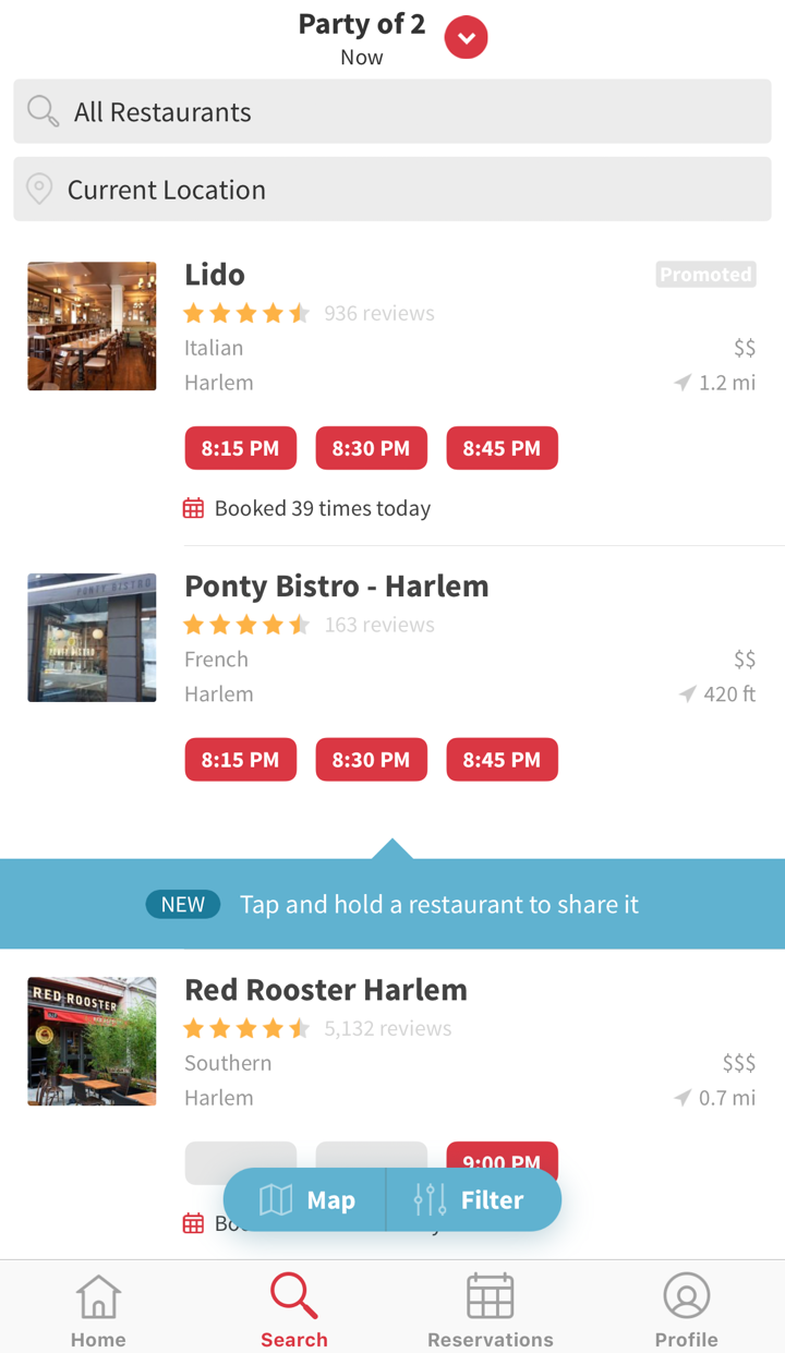
OpenTable design provides multiple ways for the user to search for a restaurant. Once the user clicks on the search bar, the design provides feedback, taking the user to the search page. On the mobile app, the design automatically provides restaurants in the local area of the user. This can be seen as a problem. Users may perform an action slip where they are only searching local restaurants without realizing. I would change this feature by giving the user the option of typing in the location they desire from the beginning.
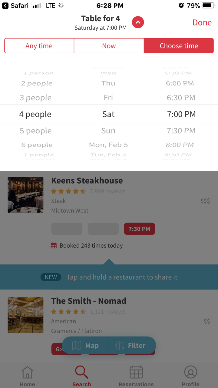
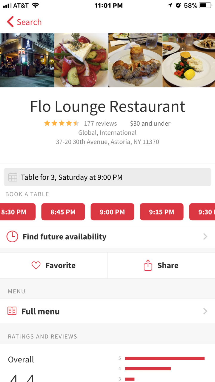
At the top of the search page, the user can modify the number of people, date and time of the reservation by clicking on the red arrow. This signifier is very small and can be easily missed by the user. However, the contrast in color between the arrow button and the rest of the screen page is an affordance for the user to know that this icon provides feedback. Once the user taps the red arrow, a scrolling menu drops down giving the user the option to modify their reservation details. The natural mapping of this scrolling menu is straightforward. As the user changes the number of people, date and time of the reservation, the information above the scrolling menu changes as well.
Booking a Reservation:
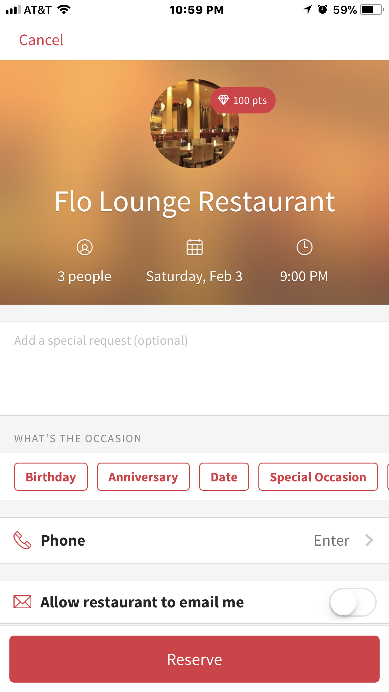
Once it is time to book a reservation, the user navigates to the restaurant page to reserve an available time. The affordance of the time options allows easy gulf of execution and feedback. Once the user selects the desired reservation time, they are automatically taken to the final step where they complete the reservation process. OpenTable provides a small gulf of evaluation through its reservation screen. The information for the user’s reservation is displayed, allowing for easy interpretation. Overall, the OpenTable app offers a good user experience through its design.