About the Project
The School of Visual Arts Library is a major resource for art and design study, developed over the course of 60 years to foster the college’s intellectual and creative life. Its rich print and digital collections directly support SVA’s undergraduate and graduate curricula, and provide inspiration, establish context and widen perspectives. Library instructional services have been developed to sharpen students’ critical thinking and provide information literacy for lifelong learning.
My Role
We were total 4 members in the team. I was primarily responsible or involved in for brainstorming on the user tasks, conducting user tests, analyzing the collected data, coming up with the recommendation, designing the final report and delivering a presentation to the client.
Discipline
UX/UI design, User Research, Usability Testing
Team Members
Siddharth Asawa, Nitya Iyengar, Yolanda Tian, Hannah Mahoney
Design Tools
Adobe Photoshop, Microsoft Word.
Reseach Methods
Surveys, Interviews, User Testing
Challenge
Help SVA Library recognize usability issues and make recommendations to improve the website’s user experience.
Process
The following approach was followed in our project to solve the problem:

Methodology

Evaluation Method
We endeavor to explore the potential improvement of the School of Visual Art’s library website using the in-person user test at the SVA main library. The benefit of user testing at the SVA main library is offering natural feedback from users where they are in their own comfortable environment. Participants during the user testing were encouraged to think out loud which helped the usability experts to figure out the pain points of the website.
During this process, a moderator facilitated the user through tasks while they interact with the website. This method encourages the user to give live feedback that enables you to get a broader understanding behind their thought process.

Target Users
As suggest by our client Phoebe Stein, our team of four usability experts chose to examine the students of SVA, particularly. We narrowed down the participants to students of SVA pursuing their degree to test the website and certain features.

User Recruitment and Breakdown
We recruited eight student participants to partake in the research. The experts connected with multiple potential participants via an email newsletter sent to the entire student body. Some user tests were successfully scheduled via the email service. When the users did not show up, the experts took to recruiting within the main library asking students if they wanted to participate in a study. The users received a $10 Amazon card for their completion of the user test.

Demographics
With the motivation to understand our user better, we created pre-test questionnaire.
We found 7/8 participants are in one of the libraries at least once a week, and they all use the library website at least a few times throughout the semester.
Half of the selected participants are design majors, and the other half are photography students. One student was in the first year of their Masters, while the other seven were in their sophomore or junior years of their undergraduate degrees.
There was a wide range of ages, spanning from 19 to 27. All eight participants had been to the Main library (where the user tests took place) and half of them have used Library West.
User Tasks & Results

Tasks
After talking to the client and based on her problems or needs, the team mainly focused on the landing page, office hours, inter-library loan forms, librarian services and study spaces & created the task according to that. The task are as follows.
Task 1
Can you tell me what are the hours of the library today?
Can you tell me what are the hours of the library are for tomorrow?
Task 2
Can you show me how you would chat with a librarian?
You have questions about a research project and want to make an appointment with a librarian. Can you find how to contact Phoebe Stein?
Task 3
You need to put in a request for inter library loan, starting from the home page can you show me how to get there?
Task 4
You need to book a private study space, how would you do it?

Result
Task 1
For this task, the majority of the participants (3 out of 8) which is 37.5% thought it was moderately difficult.
The other majority (3 out of the remaining 5) which again is 37.5% thought it was very easy to complete while stating that making the hours on the top left of the website clickable would make the task a lot easier.

Task 2
For this task, the majority of participants (4 out of 8) which is 50% of the total participants, rated this task as difficult to complete while suggesting highlighting of the appointment with librarian feature.

Task 3
For this task, only 3 out of 8 people, which is 42.9% of the total participants, rated this task to be very easy to complete while pointing out the need for more information on Inter Library Loans.

Task 4
For this task, 5 out of 8 participants, which is 62.5% of the total participants rated this task to be very easy to complete while conveying that the fact the page opens up in a new tab is a feature they were in favor of.

Findings & Recommendations
Finding #1: Need more info on what is ILL and make it more discoverable.
Before this task, participants were asked “Have you ever used Inter Library Loan before?” and the result shows that 62.5% of them never used inter library before. Also, many of them had difficult to follow the information available in SVA library website. One of them mentioned that:
“As English is not my first language, I didn’t know what Inter-library Loan means and also the information present for Inter-Library Loan didn’t give me the clear idea.”
– Participant
While analyzing the test results we found that participants were having a difficult time finding the ILL – Although, 62.5% were able to find to ILL option but they took a lot of time (approximately 3 minutes). One user described that
“I don’t know where I’m looking for, I’m just scrolling finding the keyword ‘Loan’. (After 3 minutes, he founded) It’s hard to find this feature, It can be easily findable if it was on the home page “
– Participant
Also, after examining the path participants followed while performing the task participants were looking for Inter-library loan option when they weren’t able to find the book they wanted through search.
“I thought I would see Loaning option when I’m not able to find the book I was searching for.”
– Participant
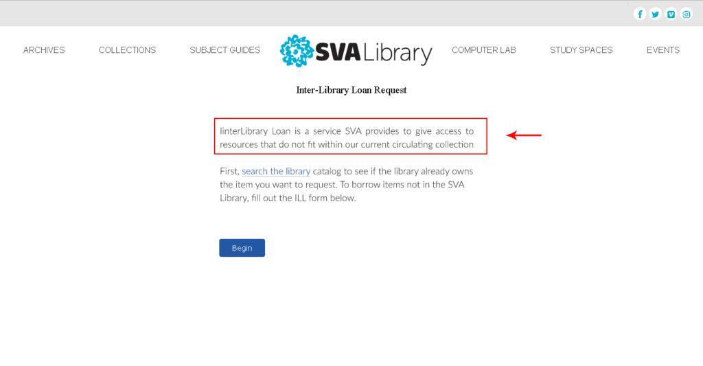
Recommendation #1a – Provide more Information on Inter-Library Loan
As SVA consists of many international students, It becomes necessary to add enough information, so that services like Inter-Library Loan can be accessible to all the students. Our team came up with recommendation to put sufficient details on the Inter-Library Loan Request page.
Recommendation #1b – Make ILL easily discoverable
As the result shows people were consuming more time finding these services, we came up with the suggestion of adding FAQs on home page where it can be made easily discoverable.

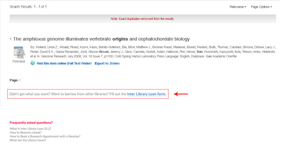
Recommendation #1c – Give a direct link below the search results
As the result shows people were consuming more time finding these services, we came up with the suggestion of adding FAQs on home page where it can be made easily discoverable.
Finding #2: Need to make the hours clickable, adding days of the week, changing the color
Two participants couldn’t look for tomorrow’s hours and two participants intuitively click the today’s hours on the top left corner. They assumed the today’s hours on the homepage is clickable and it is more obvious to understand the important information such as the time on the homepage. One of the user quotes
“Put the main hours on the homepage, so we don’t need to look for that”
– Participant
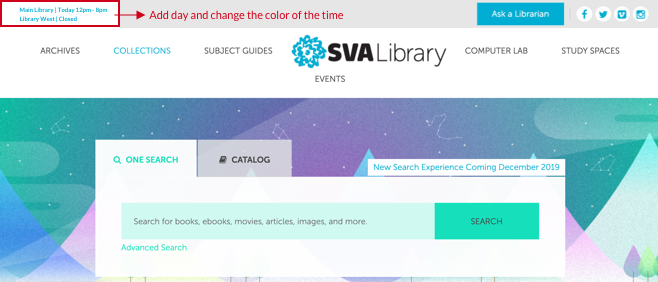
Recommendation #2: Make clickable opening hours on the top left corner and Add days of the week on the top left corner and change to obvious color
However, some of the participants tried to look for the hours in the visit us section, although they find the time successfully, it takes additional step to find the information. Under this scenario, the first recommendations for this findings are to make the important information obviously in order to improve the user journey’s effectiveness. After users right click through today’s hour on the top left corners, users are able to see the list of opening hours each day and receive the basic understanding for further explorations. Nevertheless, another benefit to make today’s hour clickable is that it is shorten the steps of search journey rather than putting another opening an hour tab on the menu.
Another adjustment we recommend is to add the day beside the time and change the color of the time on the top left corner. The time is still clickable and this adjustment enables users to notice more easily.
Finding #3: Need to add a make an appointment button with a librarian
When prompted to make an appointment with a librarian, many of the users struggled to complete this task. The three main quotes from the users when asked to complete this task were:
“Would like to make an appointment with the librarian button more visible”
– Participant
“Would like to highlight where to make an appointment with the librarian”
– Participant
Recommendation #3: Add a make an appointment button with a librarian
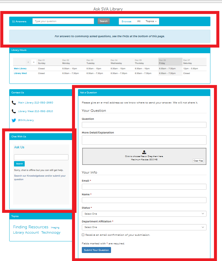
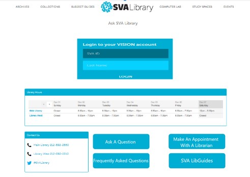
When considering how to make scheduling appointments and contacting the library easier, the expert’s recommendation is to simplify the contents of the “Ask A Librarian’ page.
Takeaway
What I learnt
This project was invaluable to me as it helped me to grow quickly as a researcher. I was able to overcome many obstacles, change my perspective on the project and gain a deeper understanding of user experience. The most important thing I learned was to consider every factor in a user’s experience. Every moment shapes a user’s overall satisfaction, so it is crucial to identify with how they are feeling, what is their mental model and what their intentions are.
