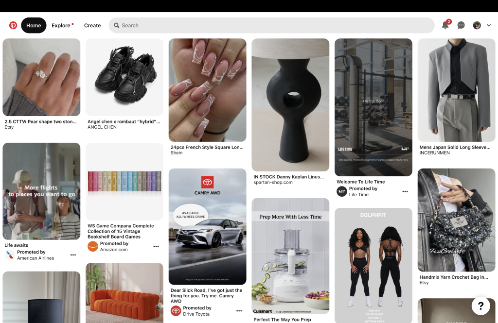
Pinterest is a social media platform where users can discover and save ideas for various interests such as recipes, home decor, fashion, and more. The desktop version of Pinterest provides a user-friendly interface with features like creating boards, searching for ideas, and exploring content based on categories.
What is the Purpose?
People use Pinterest for inspiration, planning events, and organizing their interests. Users create boards to organize and share their collected images and links, known as “Pins.” Users can also follow others, repin content, and engage with others to share creative and informative content.
Landing Page Evaluation:
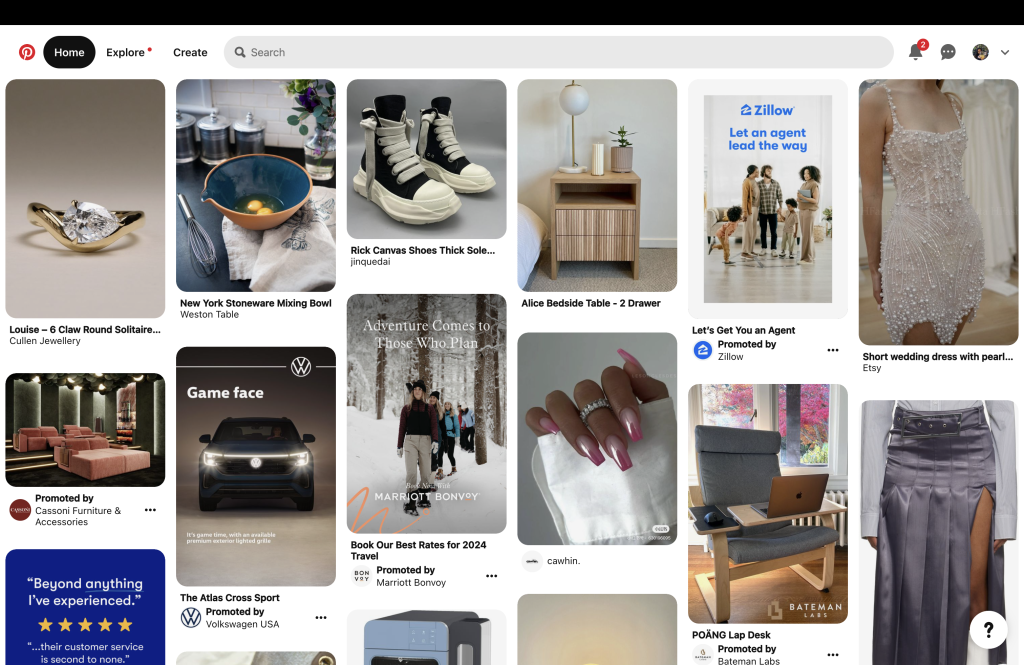
Pinterest’s homepage (Figure 1) design aligns with Norman’s good design principles, including explicit affordance for searching (the search bar) and signifiers (the magnifying glass icon and placeholder text), making it intuitive for users to initiate and understand the search functionality.
- Affordance: The prominent search bar at the top of the page allows users to search for specific topics, ideas, or content. This element’s high visibility makes the search function easily discoverable.
- Signifier: The magnifying glass icon within or near the search bar is a signifier, indicating that users can interact with the search functionality. Additionally, placeholder text or any prompts in the search bar guide users on what they can search for.
Pinterest arranges pins in a grid-like layout on its landing page, mirroring the physical organization of a bulletin board. This layout draws from the conceptual model of a bulletin board where users commonly pin images or notes. The digital boards on Pinterest are virtual equivalents to physical bulletin boards, with each pinned item transforming into a digital pin on its respective board. This setup allows users to intuitively understand and navigate their content, establishing a connection between the digital interface and the familiar spatial arrangement of a physical bulletin board. By leveraging this knowledge from the physical world, Pinterest enhances the overall user experience, providing users with a seamless and intuitive platform.
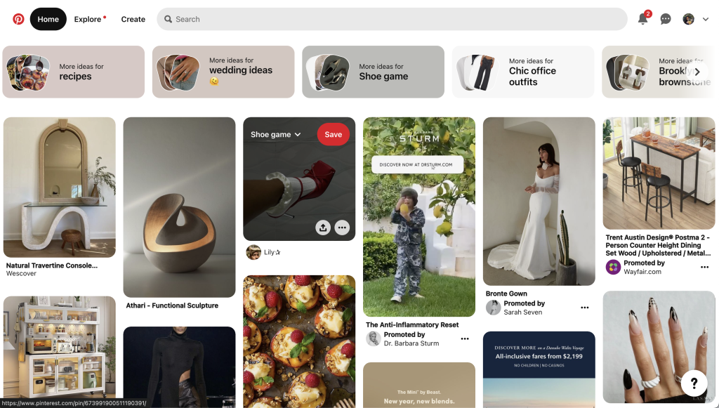
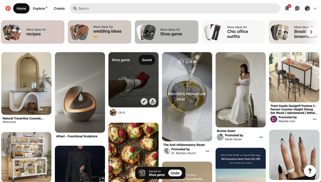
Source: Pinterest.com Left (Figure 2) and Right (Figure 3)
Pinterest’s “Save” feature implements effective constraints to prevent common errors (Figure 2), adding a layer of protection against unintentional actions. A seamless process unfolds when a user activates the “Save” button: the selected pin is securely stored within the chosen board (Figure 3). Concurrently, a user-friendly pop-up materializes at the bottom of the screen, affirming the completion of the action and presenting a readily accessible undo option (Figure 3). This pop-up provides users immediate and clear feedback about completing the saving action. These feedback elements and constraints act as a safeguard, ensuring users don’t accidentally delete or modify saved items without explicit intention.
The constraints contribute to reducing the cognitive load on users. Limiting the number of options users have to navigate within the “Save” feature creates a sense of confidence and reduces anxiety about making irreversible mistakes.
Failures in Accessibility Coding:
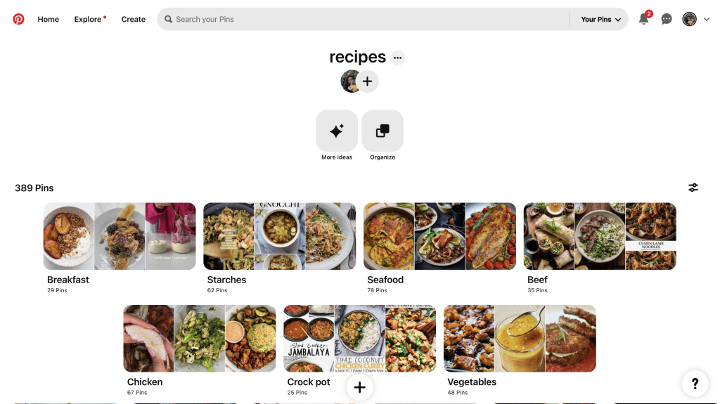
While the application of affordances, signifiers, and conceptual modeling effectively creates a user-friendly interface, there is room for improvement in providing more nuanced and inclusive feedback. Most feedback mechanisms discussed primarily cater to visual feedback, potentially overlooking users with diverse abilities. For example, while the plus sign at the bottom of the screen serves as a signifier for creating a new pin or board, it may not be helpful for users with specific disabilities (Figure 4).
To enhance the accessibility of the interface, it’s crucial to ensure that all interactive elements are properly labeled in HTML. Feedback should not solely rely on visual cues but should also be conveyed through text or sound. During an evaluation of the website’s code, AccessScan found that Pinterest does not label its titles as headings (Figure 5). Headings are essential for providing structure and organization to web content, aiding users in navigating and understanding the page’s layout. Assistive technologies, such as screen readers, rely on headings to convey the document’s structure to users. When a title appears as a heading but is coded with a non-heading HTML tag (like a <p> tag), it may not be adequately recognized by assistive technologies, leading to confusion or difficulty in navigating the content.

Source: AccessScan (Figure 5)
Additionally, it’s crucial to ensure that all interactive elements on a webpage can be accessed using keyboard commands alone. Many users navigate the web solely using their keyboard, especially those with motor disabilities who may have difficulty using a pointing device. Interactive elements such as links (<a>), buttons (<button>), and form fields (<input>, <textarea> , <select>, etc.) are designed to be focusable. AccessScan found that Pinterest has 3 failures in the area (Figure 6).
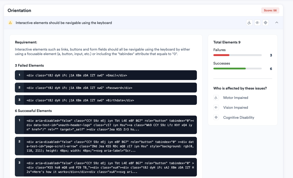
Enhancing the accessibility of interactive elements and ensuring proper labeling of titles as headings are essential steps towards creating a more inclusive and user-friendly experience for all users. By addressing these areas of improvement, Pinterest can further solidify its position as a leading platform for discovering and saving ideas, while ensuring that its interface is accessible to users of all backgrounds and abilities.
