The Thyssen-Bornemisza National Museum asked our team to evaluate how well their website supports international visitors planning a trip. Through seven in-person and remote user test sessions conducted on mobile devices, we identified three critical usability issues around hours of operation, navigating through the “Masterpiece” section of the website, and the ticket and checkout process. Our most significant finding was a confusing ticket structure that overwhelmed every participant, leading to a recommendation that could reduce drop-off and confusion at the most important step in the planning journey.
Client: Thyssen-Bornemisza National Museum, Madrid
Method: Moderated usability testing on mobile devices
Team: Michael Bove, Yuxuan Xia, Anli Huang
Course: INFO 644 – Spring 2026
The Problem
Is the Thyssen-Bornemisza Museum Website Working for Its Users?
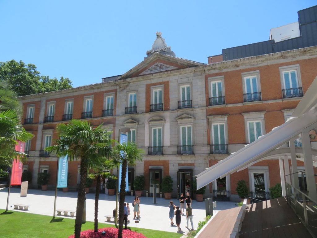
The Thyssen-Bornemisza National Museum in Madrid is home to nearly 1,000 paintings spanning seven centuries of Western art. It draws visitors from all over the globe. However, the website meant to support these visitors in planning their trip made this process much harder than it needed to be.
Our client contact was Elena Villaespesa, the museum’s Head of CX, CRM and Digital Analytics. She came to us with a goal of assessing the usability of three key areas: finding the museum’s hours and free entry information, exploring the Masterpieces and Gigapixel feature, and navigating the ticket selection and checkout process. All with the aim of making it easier for international visitors to plan their trip.
The museum wanted to target US-based visitors between the ages of 18-45, most of whom plan their trips on a mobile device and either have a formal art background or visit museums and travel often. That context shaped how we found and recruited participants for the study.
From there, we landed on three core research questions. Could visitors find basic information like hours and free entry opportunities? Could they discover and explore the Masterpieces collection? And could they successfully identify the right ticket for their visit?
I worked on this project alongside two teammates: Yuxuan Xia and Anli Huang. My individual contribution included leading the client intake process and note-taking, building the screener questionnaire and moderator script, conducting two of our seven user test sessions, and taking primary ownership of the Task 3 ticket findings and recommendation, which ended up being the most significant finding of the entire study.
The Process
Meeting With the Client
We started with a kickoff meeting with Elena to align on scope and tasks before doing anything else. Walking away from that conversation with a clearly defined target user and three specific sections of the website to evaluate made every following decision much easier to make.
Recruiting the Right Participants
We recruited participants through a private panel using a screener questionnaire that I drafted and refined. The screener was designed to find people who matched the museum’s target profile: US-based adults between 18 and 45 who visit museums at least once a month or have a formal education or career in art, research trips online, and are comfortable using their phones to purchase tickets. Anyone who didn’t meet those criteria was screened out before being invited to participate.
Together, these participants closely matched the profile Elena described in our kickoff meeting. I personally moderated two of the sessions in person, with participants I’ll refer to as P1 and P2, both of whom closely matched the museum’s target user profile with age, art background and how often they visit museums.
How We Ran the Sessions
My group ran a pilot test before the real sessions began. The pilot helped us catch a small issue in Task 3’s wording that could have confused participants, and it gave the moderator a chance to practice the think aloud prompt before it mattered. We adjusted the task before any real sessions ran.
Each session was built around three tasks. The participants were asked to imagine they were planning a trip to the museum. The first task asked them to find the museum’s hours and any free entry opportunities. The second asked them to find and explore the Masterpieces section of the website. The third asked them to identify the correct ticket for a visit that included both the permanent collection and a specific temporary exhibition.
We decided to test participants using a mobile device because the client knew that most visitors plan their trip on their phone, and we wanted participants to be in a condition that matched reality as closely as possible. We had each participant use their own mobile device to ensure they were using something they were already comfortable with.
We chose the think-aloud method because it allowed us to understand what participants were actually looking for in the moment, what they expected to find, and why they made the decisions they did. Rather than just observing where people clicked, we could hear their reasoning in real time. That context made our findings much richer than observational data alone would have.
My two sessions were conducted in person specifically because in-person testing makes it easier to pick up on nuances that don’t come through on a screen. Things like a pause, facial expressions, and hesitations are all signals that told me a lot about how a participant was feeling as they moved through the tasks, all things that are much harder to observe via Zoom.
Each participant was given the mentioned scope and tasks, and asked to think aloud, verbalizing all reactions, frustrations, and decisions as they navigated through the tasks. We used a moderator script to ensure consistency across all sessions that included pre-test warm up questions to understand each participant’s relationship with museums and travel planning, three core tasks, and post-task follow ups probing difficulty and expectations.
The Results
The Content Is Strong. Getting There Is the Problem
Throughout all seven sessions, participants consistently praised the visual design and aesthetic of the site noting that it felt clean and museum-like. As far as the tasks went, the site performed well on the Masterpieces section, struggled on the operating hours, and failed on the ticket and checkout section.
Task 3 was the most universally problematic with seven out of seven participants expressing confusion or frustration. Task 1 saw four out of seven participants miss Saturday free entry hours, and three out of seven struggled to locate basic hours information at all. Task 2 was the strongest performer, though three out of seven participants hesitated in the navigation and two out of seven never discovered the Gigapixel feature.
Critical Fixes:
- Surface hours directly on the Visit page
- Redesign tickets as a base ticket plus add-ons, and rename the duplicate “Full Access” ticket
High Priority Fixes:
- Make free admission days and hours of operation prominent and easy to find
- Condense exhibition, ticket and hours of operation information to reduce back and forth
Medium Priority Fixes:
- Add sorting and filtering on the Masterpieces page
- Clarify difference between Collections and Exhibitions
- Add a 12-hour clock toggle for US visitors
Task 1: Hours Buried, Free Entry Missed
The first task had participants attempting to find the hours of operation of the museum, and when, if at all, they could visit for free. Finding this basic information turned out to be surprisingly difficult. The hours and pricing information was located at the bottom of the Visit page after multiple links were followed. Several participants scrolled past it entirely before backtracking, and all participants either voiced frustration or showed visible signs of confusion along the way.
“it shouldn’t be this hard to find when this museum is open.” – P2
“Also see hours and fees! Buried at the bottom. Wow, that was hard.” – P1
Free entry information added another layer of confusion. Four out of seven participants were only able to identify Mondays as a free admission day, missing that Saturday evenings are also free. Two participants were misled by a banner promoting a MasterCard partnership, leaving them unsure whether free entry was universally available or restricted to cardholders. Two US-based participants also noted that the 24-hour clock format used throughout the site was unfamiliar and inconvenient.
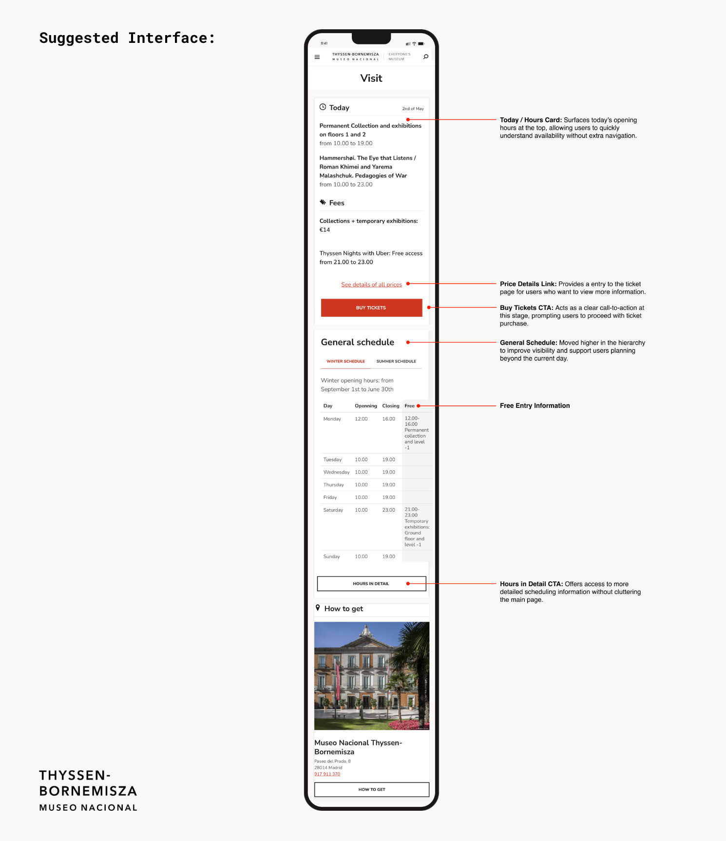
In our tests, every participant navigated to the Visit page first when looking for the hours of operation, so our recommendation was to surface hours and free entry information prominently at the top of the Visit page, rather than requiring visitors to navigate through multiple links to find it. Free entry opportunities should be clearly labeled and separated from promotional partnerships like the MasterCard banner.
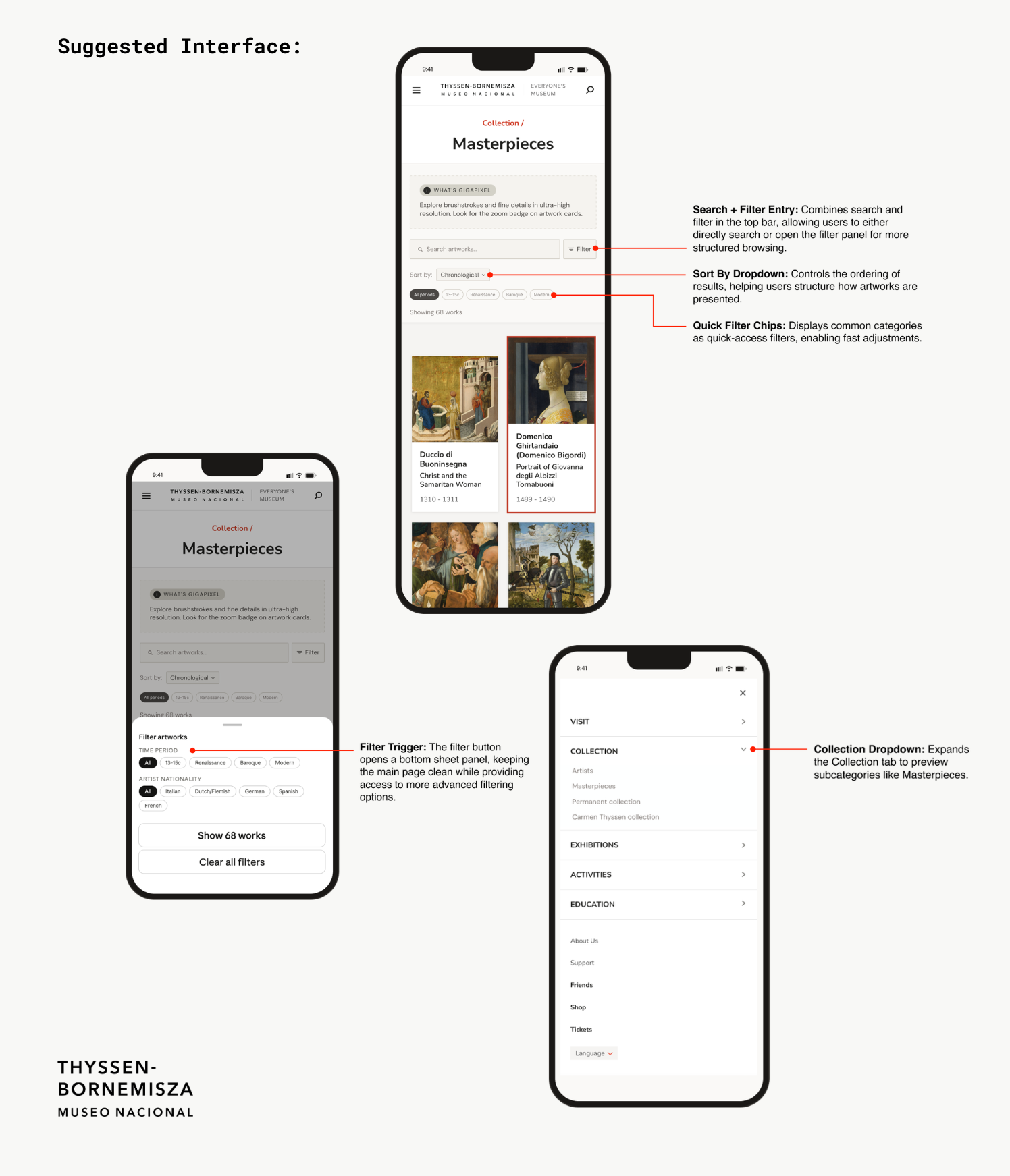
Task 2: The Masterpieces Page Had Hidden Potential
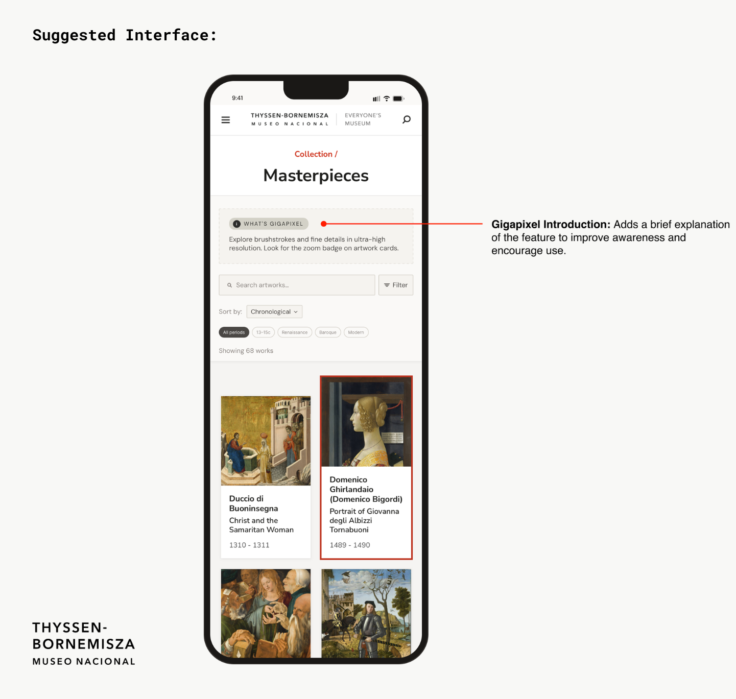
Task 2 was the most positive result of the study. Participants were asked to find the Masterpiece section of the website and explore it. Most participants were able to locate the page and responded enthusiastically to what they found there. Participants felt engaged by the page and happy with the amount of information provided for each piece. That said, getting there wasn’t always smooth, and the Gigapixel feature that allows users to zoom in on artworks in high definition was often missed. Although the page was dense in information, it lacked in organization.
Our recommendations for this task focused on three areas. First, expanding the Collection tab in the navigation to show subcategories like Artists, Masterpieces, Permanent Collection, and Carmen Thyssen Collection, so users could see where to go before clicking in. Second, adding a brief Gigapixel introduction at the top of the Masterpieces page so users knew the feature existed and were encouraged to use it. Third, adding search and filtering by time period and artist nationality with quick filter chips, giving visitors a more organized way to explore the collection.
Task 3: The Ticket Page Lost Everyone
Task 3 was the most significant finding of the study and the one I took personal ownership of. Participants were tasked with finding the ticket page and selecting a ticket that would allow them to view the permanent collection. The ticketing page presented participants with an overwhelming number of options, most of which were not clearly differentiated from each other. Two tickets with identical names, both called Full Access, combined with an overwhelming number of options led to decision paralysis on nearly every session. Seven out of seven participants expressed confusion or frustration, making this the clearest and most consistent finding of the entire study.
Six out of seven participants either selected the wrong ticket, expressed significant confusion before choosing, or gave up entirely. There was too much information, poorly organized, with labels that did not help users distinguish between their options.
“There are so many options I might just give up and get the full access ticket.”
– P1“I am a bit confused on why there are two full access tickets and what the difference is.” -P2
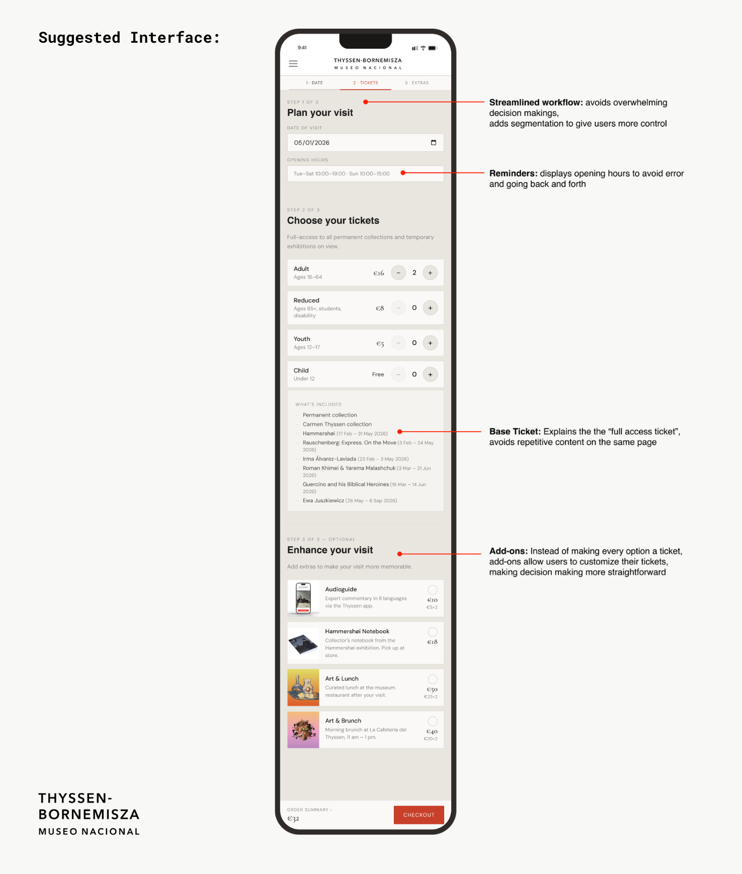
Our recommendation was to simplify the ticket structure by replacing the multiple similarly named tickets with one base ticket that includes full access to the permanent collection and all temporary exhibitions on view. In order to get rid of the overwhelming amount of ticketing options, we decided to make them optional add-ons for their base ticket. These add-ons included an audioguide, a Hammershoi notebook, Art and Lunch, or Art and Brunch, all of which were originally different tickets. This eliminates the confusion caused by duplicate ticket names, reduces the overwhelming number of decisions a visitor has to make on mobile, and also gave visitors the option to mix and match and ultimately customize their visiting experience the way they wanted.
You can view our full report and presentation slides here:
Full Report
Presentation Slides
The Conclusion
Delivering the Findings and Looking Ahead
We delivered our findings to Elena Villaespesa and two of her colleagues over Zoom on May 13th, 2026. The presentation including questions ran about an hour. Elena validated all three findings, saying the team already knew these were weak areas but was glad to finally have concrete evidence behind what they suspected. They were particularly interested in the participant quotes, asking if we had more beyond what was included in the presentation. They loved every recommendation and asked several clarifying questions, but never pushed back. Hearing this feedback was very satisfying and I felt proud to contribute to the betterment of the museum.
If we were to continue working on the project, the next step would be to prototype and test all three recommendations with a new group of participants. We would want to know whether surfacing the hours information, reorganizing the Masterpieces page, and simplifying the ticket structure actually reduced confusion and improved the overall planning experience for visitors.
Looking back on the project, a few things stand out as the biggest takeaways. First, pilot testing was an important part of the process. Our pilot session caught a problem with Task 3’s wording, and if left uncorrected, would have made the finding harder to interpret. Second, this was the first in-person test we did throughout our projects in this class, and in-person testing added a layer of insight that remote testing could not replicate. There were moments in my sessions where a pause or a frustrated expression told me something was wrong before the participant even said it out loud.