Design Critiques

What makes some designs good and others bad? Why do some designs work while others don’t? Posts in this category offer thoughtful design critiques of modern digital interfaces, with commentary inspired by Don Norman’s “The Design of Everyday Things.”

Design Critique: Strava for iPhone

Strava is an exercise tracker app and social networking tool in one. Users can track their own activities, like and comment the activities of their friends, join groups and complete challenges. Strava’s goal is to provide an easy way to track your activities and see your progress while also allowing you to join groups of likeminded exercisers and encourage your friends.

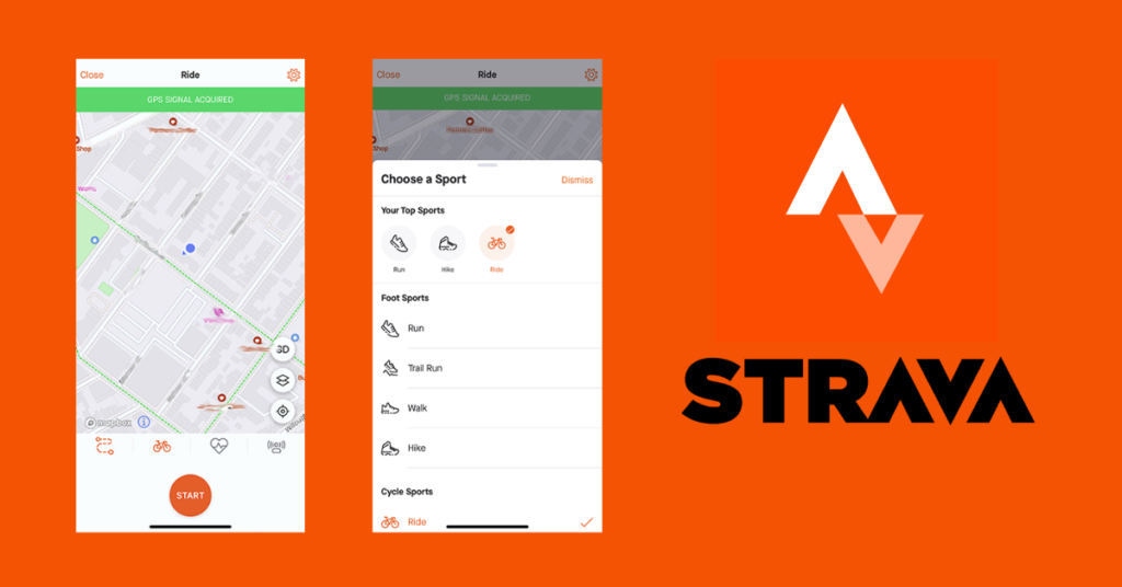
In this design critique, we’ll examine the user journey for starting an activity in the Strava iOS app.

Design Critique: Strava for iPhone Read More »

Design Critique: Toddle – Teaching & Learning platform

Toddle is an all-in-one platform that simplifies curriculum planning, project and portfolio management, assessment and reporting, and online learning. It provides a comprehensive suite of tools to help educators and administrators manage the curriculum development process. The website designed by Toddle is a great example of good design that follows many of the design principles outlined by Don Norman in his book Design of Everyday Things.

Design Critique: Toddle – Teaching & Learning platform Read More »

relay app logo

Design Critique: Relay Delivery App (rider side)

Relay is an independent courier company who contracts directly with restaurants, liquor stores, among others. They manage all the delivery system for the restaurant through an app, and having the riders available all over the areas of operation. Thus, the riders can pick up the food and delivery it as soon as possible. Relay operates

Design Critique: Relay Delivery App (rider side) Read More »

Design Critique – Notion, desktop app

Notion is a project management and note-taking software platform designed to help members of companies or organisations coordinate deadlines, objectives, and assignments for greater efficiency and productivity. Critiquing design is always a process of identification, analysis and evaluation. Before having the insights, wells-structured in The Design of Everyday Things, these processes afforded questions and judgements

Design Critique – Notion, desktop app Read More »

Design Critique – Podcasts (Apple desktop app)

This Apple system application serves as a platform for users to access Podcasts, born digital audio programs streamed or downloaded from the internet. This article examines some of the in-built app’s (Version 1.1.0)features, specifically the exploration options, from a usability perspective. Listen NowThis landing page serves to introduce users to the application and present them

Design Critique – Podcasts (Apple desktop app) Read More »