Design Critique: UniFi OS (web)
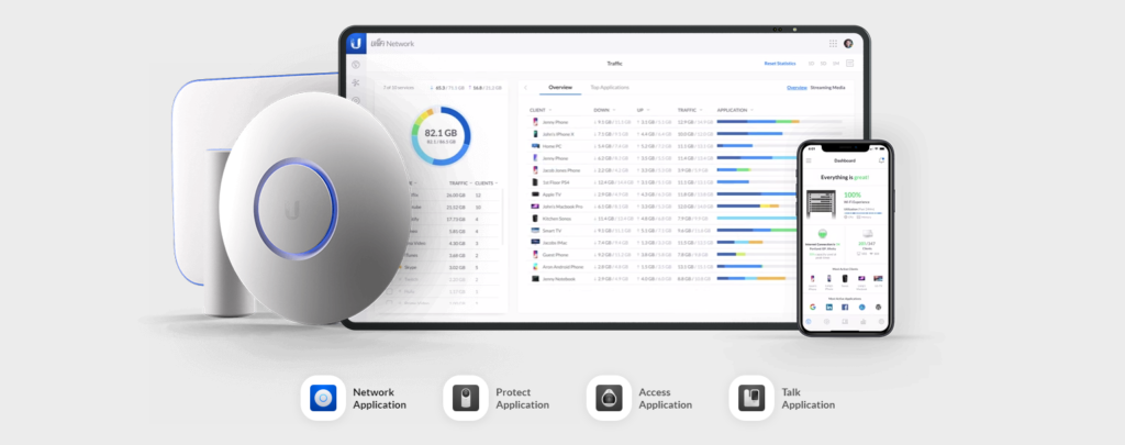
Ubiquiti Inc.’s UniFi OS is an all-in-one network device managing software. UniFi OS allows users to set up connected Ubiquti devices such as network routers, switches and wireless access points. Users can also monitor network traffics and client devices, while having advance features such as port forwarding and network isolations for a robust network setup. […]
Design Critique: UniFi OS (web) Read More »