Design Critique: Zoom Handy Recorder (iOS)
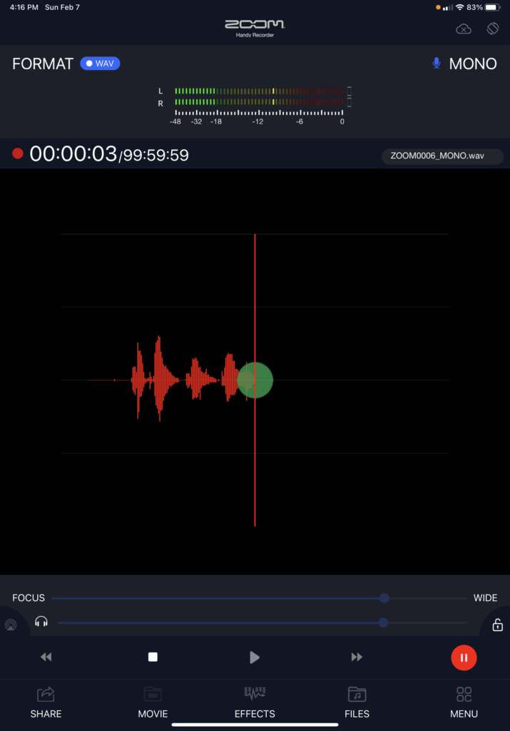
The Zoom Handy Recorder app is designed to facilitate audio field recording on iPhones and iPads. It supports recording via an internal iPhone/iPad mic, or via an external microphone, which can be purchased separately as an upgrade to provide greater fidelity and/or stereo recording. Field recorders focus on utility; field recorders must work quickly and […]
Design Critique: Zoom Handy Recorder (iOS) Read More »