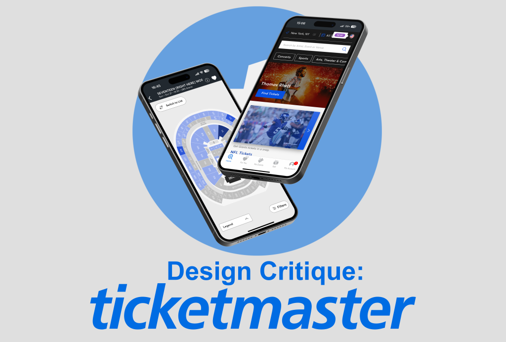
Design Critiques

What makes some designs good and others bad? Why do some designs work while others don’t? Posts in this category offer thoughtful design critiques of modern digital interfaces, with commentary inspired by Don Norman’s “The Design of Everyday Things.”

Design Critique: rateyourmusic.com (desktop version)

The digital interface I chose is the website rateyourmusic.com (RYM), which I have been using since high school to discover new music and keep track of the records I have listened to. It allows you to rate albums, singles, and individual tracks, make lists, write reviews, and browse the vast database of records it hosts. […]

Design Critique: rateyourmusic.com (desktop version) Read More »

Design Critique: Google Search Engine

The Google Search Engine is a sophisticated platform designed for searching and retrieving information across the internet. It provides quick, relevant results to user queries, offering features like predictive text, voice search, and image search, all within a user-friendly and minimalist interface. This tool has become essential for navigating the vast digital landscape of information.

Design Critique: Google Search Engine Read More »

Hero Image of Guided Frame by Google

Assistive Technology: Guided Frame (Google Pixel)

In the ever-evolving world of smartphone technology, Google’s commitment to accessibility takes a giant leap forward with the introduction of Guided Frame. This innovative feature, part of the Pixel 7 series, demonstrates Google’s dedication to creating an inclusive camera experience, particularly for individuals with visual impairments. In this blog post, we’ll explore how Guided Frame, a harmonious blend of hardware and software, is revolutionizing the way blind or low-vision individuals capture the perfect picture.

Assistive Technology: Guided Frame (Google Pixel) Read More »

Design Critique: ChargeSPOT (iOS APP)

source Introduction ChargeSpot is a portable charger rental provider that offers cross-countries services currently with over 35,000 rental spot worldwide. Its easy rent/return process and reasonable rental prices attract individuals with high demands for charging their phones while on the go. The rental services process can be easily divided into 3 steps: 1. Use the

Design Critique: ChargeSPOT (iOS APP) Read More »

Design Critique: Fear of God (Shopping Website)

Fear of God is known for its high-end streetwear and often blends elements of luxury fashion with casual and athletic aesthetics. The Fear of God collections typically feature oversized silhouettes, minimalist designs, and a focus on quality materials. In addition to its physical stores and presence in high-end fashion boutiques, Fear of God also operates

Design Critique: Fear of God (Shopping Website) Read More »

Knowunity’s Quest: Navigating the US EdTech Landscape for Homework Success

A Comprehensive Case Study on Homework Habits, Usability Insights, and Enhancing Student Engagement CLIENT: Knowunity ROLE TIMELINE 5 Weeks TOOLS TEAM MEMBERS View Presentation About Client Knowunity is Europes fastest growing EdTech app with now 9 million users across Europe (and now also the US). Knowunity was founded 3 years ago by former high school

Knowunity’s Quest: Navigating the US EdTech Landscape for Homework Success Read More »

Design Critique: Nike Training Club (iPhone app)

Introduction: The Nike Training Club (NTC) app is a fitness application that is designed to help users achieve their fitness goals with the help of guided workouts led by professional trainers and athletes. NTC also offers training plans that include a set of workouts within a specific time frame to target different goals such as

Design Critique: Nike Training Club (iPhone app) Read More »