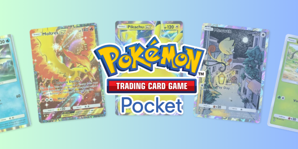
DON NORMAN

Design Critique: LibraryThing (iOS App)

Introduction LibraryThing is a free book and movie cataloging website and app made specifically for personal and independent libraries. The application is praised for its simplicity, not using any library software to work and only requiring a username and password to begin. LibraryThing uses thousands of database systems like Library of Congress, Amazon, and public

Design Critique: LibraryThing (iOS App) Read More »

Design Critique: Procreate App

Procreate’s UI stands out for its simplicity and aesthetic appeal. It doesn’t overwhelm users, avoids screen clutter, and gives the feeling of working on a real canvas. However, this “clean” and “minimalist” interface design can present a steeper learning curve for newer users, especially those unfamiliar with Procreate’s layout.

The critique focuses on the user experience for newer Procreate users, including seasoned artists unfamiliar with the app and novice artists testing it for the first time.

Design Critique: Procreate App Read More »

Design Critique: The Domino’s App (iOS)

Domino’s is the largest pizza chain in the US and the world over. They are industry leaders in terms of innovation, marketing, supply chain management and coming up with innovative campaigns such as the recent ‘Domino’s Pinpoint Delivery’ service that delivers pizza to you anywhere you like, without requiring your address.This along with their market position and popularity should ideally mean they have an extremely efficient, user friendly and responsive website and app interface.And through this design critique, I shed light on some key usability issues I noticed in the Domino‘s app interface.

Design Critique: The Domino’s App (iOS) Read More »

Design Critique: Resy (iOS App)

Introduction Resy is a digital platform that allows users to seamlessly reserve tables at restaurants or tickets to events/experiences. The platform provides restaurant details, menu highlights, images, and user ratings – all of which enhance the reservation experience. This article critiques the Resy App using the principles mentioned in Don Norman’s “The Design of Everyday

Design Critique: Resy (iOS App) Read More »

Design Critique: The Amtrak App (IOS)

Introduction: Amtrak is an application that mainly serves for customers looking to purchase tickets, check train statuses, and manage users’ travel plans with America’s national railroad service. This critique focuses on the application’s user experience based on Don Norman’s design principles as outlined in his book “The Design of Everyday Things”. As a frequent user

Design Critique: The Amtrak App (IOS) Read More »

The landing page of Merlin Bird ID app by The Cornell Lab, an open source Bird guide and identifier.

Design Critique: Merlin Bird ID App

The Cornell Lab of Ornithology adopted a clever way to answer the question “What’s that bird?” making the wealth of knowledge in ornithology accessible to the general public. This critique provides user-centric insights on how usable the Merlin Bird ID app is for a user interested in identifying and learning more about birds around them.

Design Critique: Merlin Bird ID App Read More »

LinkedIn Design Critique

Design Critique: LinkedIn Website

Introduction: LinkedIn is a professional social networking platform designed primarily for career development and networking. Users can create their custom profile to showcase their skills, experience, and education. They can further connect with industry peers and potential employers, making it a hub for job searching, recruitment, and business networking. It also allows the users to

Design Critique: LinkedIn Website Read More »