Assistive Technology: FreeWheel
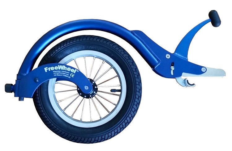
The FreeWheel is a wheelchair attachment for rigid frame or folding manual wheelchairs with a footrest below 4-3/4″ and a footrest angle less than 12%. It attaches to the front of the wheelchair, lifting the wheelchair’s casters off the ground so it becomes a three-wheeler, allowing it to move across surfaces it otherwise couldn’t.
Assistive Technology: FreeWheel Read More »