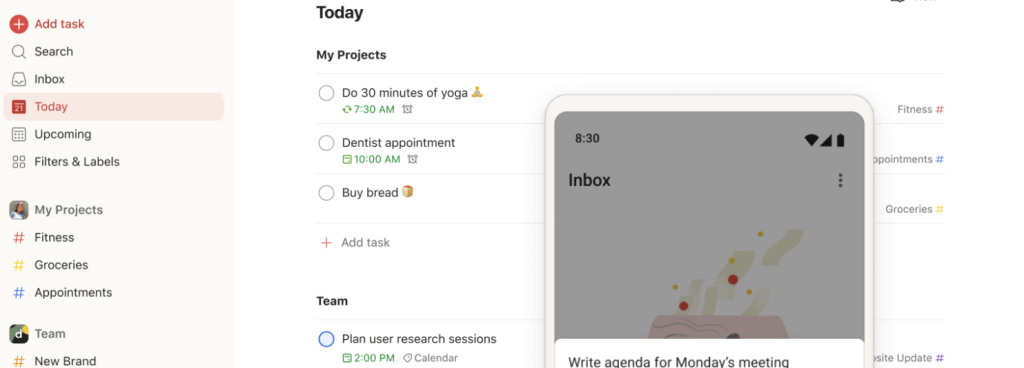
Design Critique: Reminders (iPhone app)

Reminders app helps people remember things they can easily forget, such as grocery lists. It gives users interface with daily checklist without making any additional effort. Throughout this blog, I will review the Reminders app in correlation with  Don Morman’s ‘Characteristics of good design’, mentioned in his book “The Design of Everyday Things.”

Design Critique: Reminders (iPhone app) Read More »

A flightpath drawn over a hazy landscape implies travel enabled by the kayak app.

Design Critique: Kayak (Android App)

The Kayak Android mobile app provides an easy way to find flights, hotel stays, and rental car services. Kayak excels at creating a clear conceptual model of how to set up and run a search, but not of the entire scope of the app’s features. A streamlined interface may also be a trade-off for invitations to human error. It is interesting to note that Kayak was one of the earliest exemplars of creating more usable graphical interfaces for travel booking, but now may be extending its feature list too far.

Design Critique: Kayak (Android App) Read More »

Design Critique: NYCourts.gov

For any juror summoned to serve in New York State, the NY Court website is the main artery through which one can uncover information about serving on a jury (or find any other court-related information.) This includes critical updates about whether or not one is called to serve on their expected summons date, or whether they are dismissed from being summoned.

Design Critique: NYCourts.gov Read More »